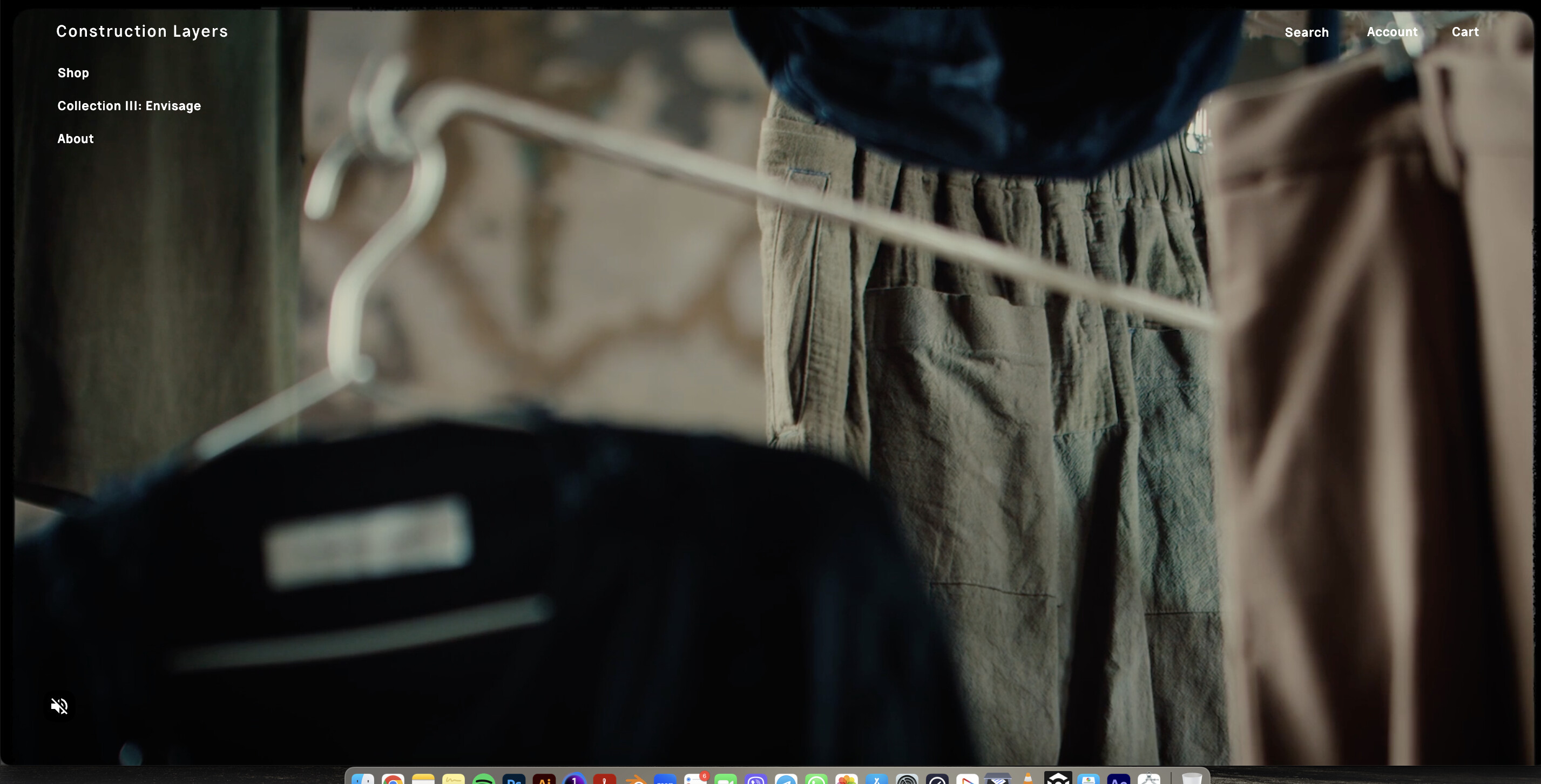
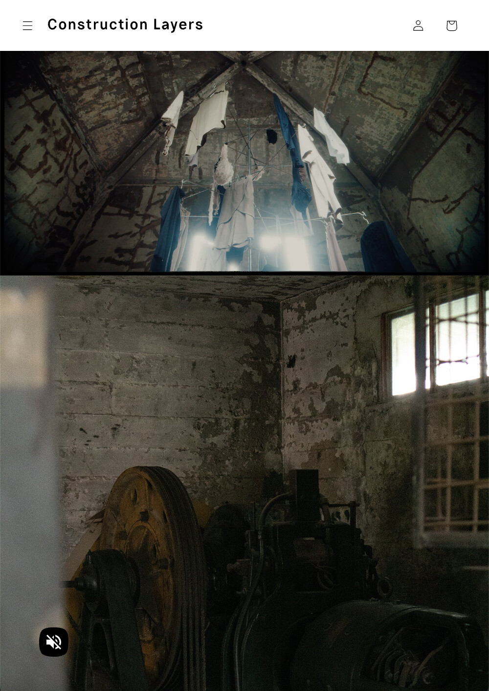
Hi, I need help in making adjustments in the video proportions of my website. Desktop version works just fine. But when it comes to my mobile version it’s too small and i would just like it too be zoomed it to fit on my homepage
Desktop
Mobile
How I want it to be
www.constructionlayers.com
PW: CollectionThree
Hi,
To achieve your expected, you can follow this:
- Go to Themes → Edit Code → assets/base.css file, then add script at line to bottom of that file.
.video-container iframe, .video-container video {
   object-fit: fill;
}
@media screen and (max-width: 768px) {
   .video-container {
        min-height: 450px;
   }
}
Hope it’s helpful to you
Hello it ends up distorting my page. I dont want it distorted