Roy37
March 12, 2023, 10:29pm
1
Hi everyone,
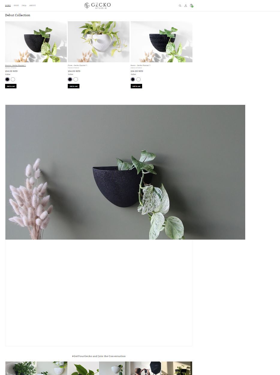
I have embedded an mp4 video on my homepage using some custom code to remove the youtube and vimeo interface (it links directly from Shopify file repository).
The problem: The video section does not automatically resize or align to fit the theme:
In desktop, the video is off centre.
In mobile, the video does not resize, and it simply shows a corner of the full size video section.
Store: geckostudio.nz
Password: gecko
Any help is greatly appreciated
Hello @Roy37 ,
Greetings from the Store Watchers Support Team! Happy to help you today.
Go to Online Store → Actions → Edit code. Then find theme.liquid.
In your theme.liquid file, please paste the code below before the tag.
{% if template == 'index' %}

{% endif %}
Let me know if need further assistance
Regards,
1 Like
Hi @Roy37
This is Victor from PageFly - Shopify Page Builder App, I’d like to suggest this idea:
Online Store ->Theme ->Edit code
Assets ->Base.css
.global-media-settings video {
    width: 100% !important;
}
.global-media-settings {
    padding-bottom: 0px !important;
}
Hope you find my answer helpful!
Best regards,
Victor | PageFly
1 Like
Hi @Roy37 ,
Glad to support you today.
You can check out my suggestion below to get your concern resolved.
Go to Edit code on Online Store :
add my code above the
Hope you find my answer helpful!
Kind & Best regards,
1 Like
Roy37
March 13, 2023, 7:46am
5
Thanks for your suggestion, I pasted it in but it has not fixed the issue.
Roy37
March 13, 2023, 8:04am
6
@PageFly-Victor This is helpful! The video no longer looks uneven because it is using the entire width of the page, and it is resizing properly on mobile! Thank you! However the video still looks HUGE on my homepage when viewing on desktop. Is it possible to reduce this at all?
If you view the store on a desktop i’ve published the theme there. I attach a screenshot of the homepage. You can see when I zoom out, the other sections get smaller but the custom video section stays the same size:
FYI I am using a custom section to embed the video, if that makes a difference. Using the instructions posted here .
Roy37
March 13, 2023, 8:21am
7
Thanks @GemPages This has produced the same outcome as my other reply below. Video looks huge. Does it matter that my video is now in a custom section “homepage-video.liquid” ? It is comprised of this code:
{% schema %}
{
"name": "Homepage Video",
"class": "index-section index-section--flush",
"settings": [],
"presets": [{
"name": "Homepage Videos",
"category": "Text"
}]
}
{% endschema %}
{% stylesheet %}
  .section-homepage-video{
  width:100%;
  }
  .video-homepage{
  width: 100%;
  height: auto;
  }
{% endstylesheet %}
{% javascript %}
{% endjavascript %}
@Roy37 I’m sorry but this is out of my scope. You may try contacting Shopify support or finding another expert regarding this issue.


