Hello,
My website looks really big on a mobile phone and I cannot get it any smaller. I already tried some CSS (not the best with that) but asked ChatPGT for a CSS. However, it does not affect the site.
Could someone help me out, please?
Hello,
My website looks really big on a mobile phone and I cannot get it any smaller. I already tried some CSS (not the best with that) but asked ChatPGT for a CSS. However, it does not affect the site.
Could someone help me out, please?
Hey @estiekn1fes
Could you please provide your Store URL and, if applicable, the Password too? Your cooperation is greatly appreciated!
Best Regards,
Moeed
Hey @estiekn1fes
Follow these Steps:
Go to Online Store
Edit Code
Find theme.liquid file
Add the following code in the bottom of the file above tag
RESULT:
If I managed to help you then, don’t forget to Like it and Mark it as Solution!
Best Regards,
Moeed
Thank you so so much! It helped.
Hi @Moeed
Perhaps you can help me, I have a similar problem:
I would like to know how to fit this wide menu on the mobile version.
Any suggestions?
Perhaps I can:
Change the location of the country/region selector - e.g. remove it from the header and place it somewhere else? How if it doesn’t appear in the footer and mind you, this is not the basic language selector?
Adjust the width of the header?
Reduce the size of the drop down menu?
Remove the search logo?
Any suggestions please?
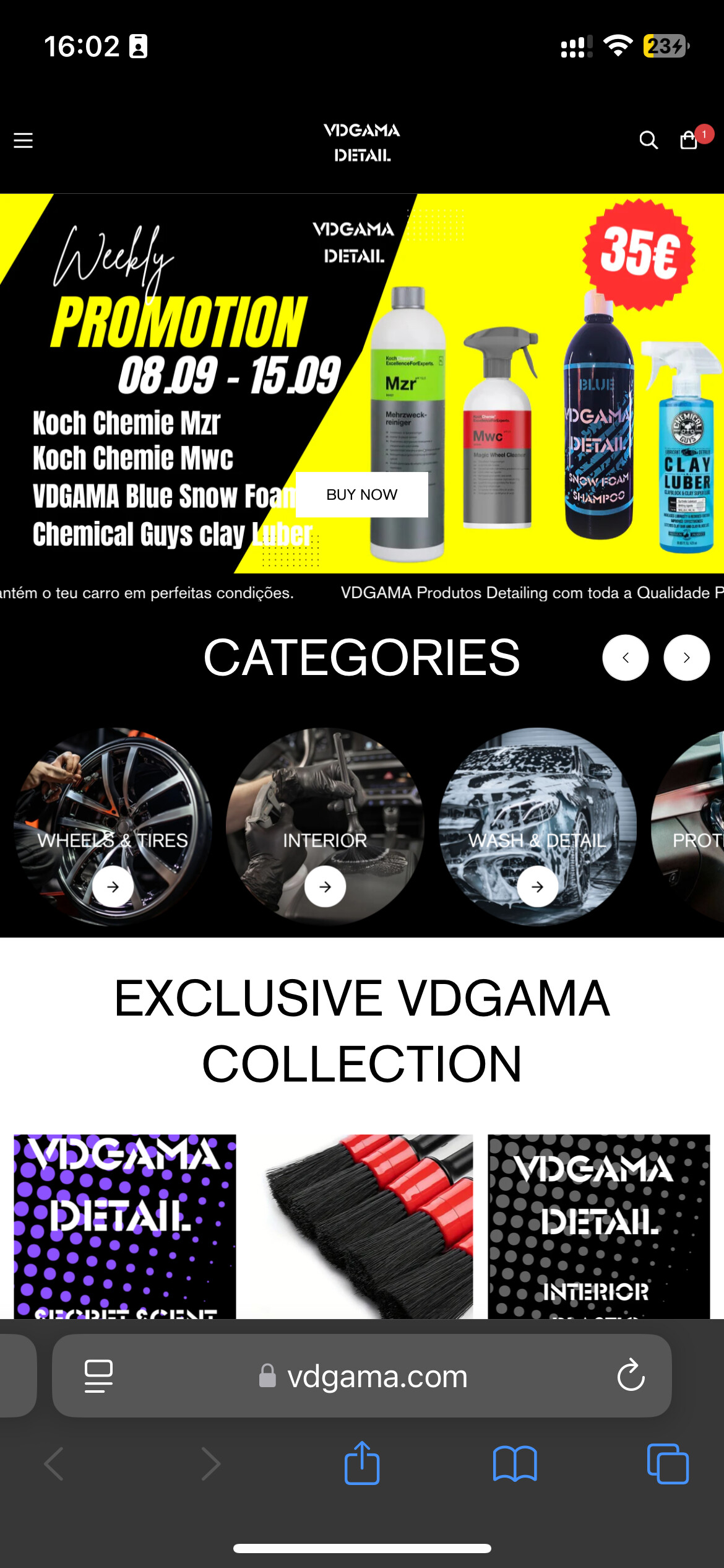
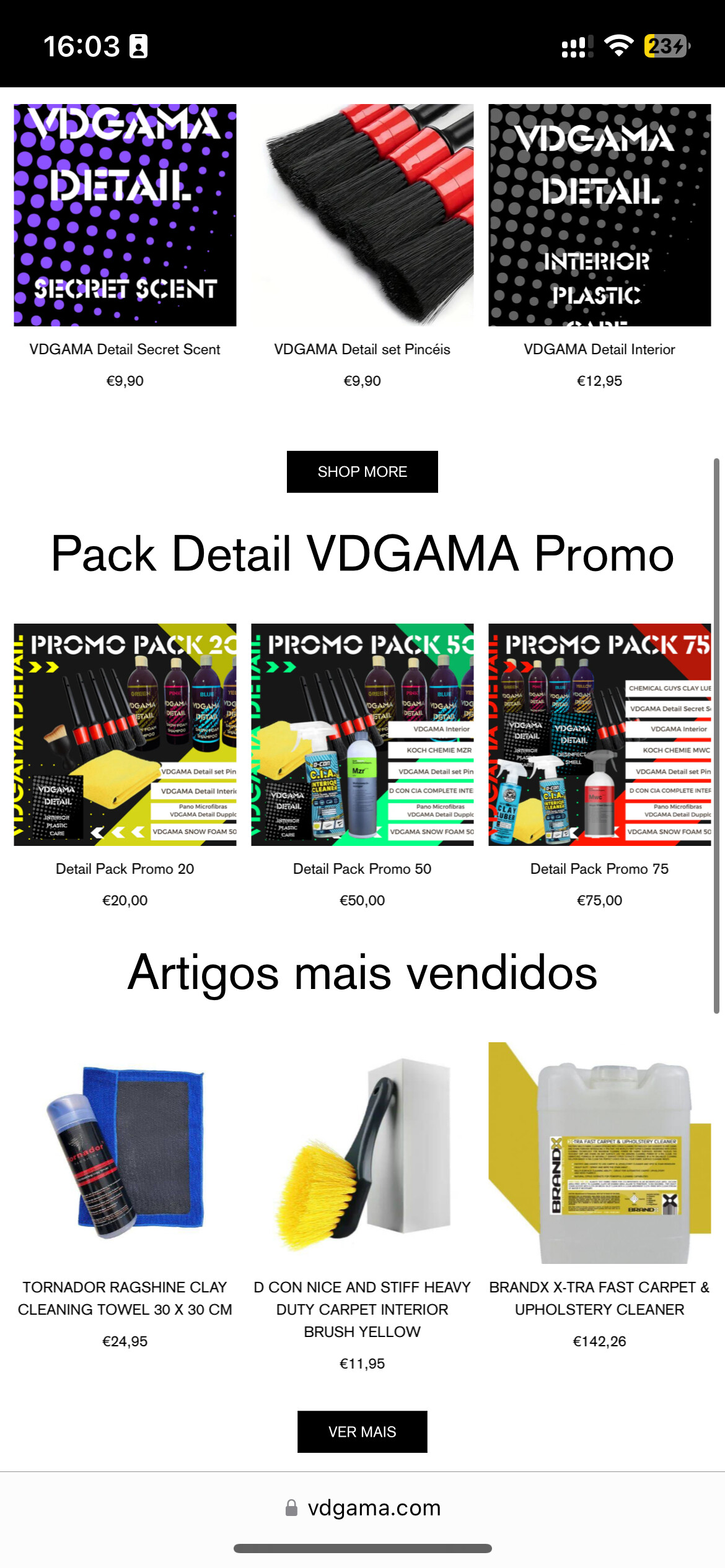
Hello Moeed,
I have a similar problem that my website looks like zoomed in on Mobile.
If i zoom out to 60% my mobile browser then it looks perfect.
my website is vdgama.com
here are also some img how i would like to have it.
And this is how it looks like now.
would appreciate your help