Hi the overall design is quite nice,
but despite what has been already mentioned I would definitely rework your product page:
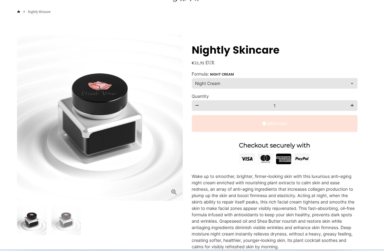
1.) The add to cart button has such a light tone. My first impression was this button is inactive, maybe the product is out of stock. Others might have similar thoughts, which result in a high bounce rate.
2.) The price is very small. It should be a lot bigger so everyone knows exactly how much they are paying upfront. I do not know this market but one comment already mentioned your prices are not competitive. If your prices are too high, this might also be the reason why nobody is buying.
3.) No information about shipping fees and shipping price. Give people the information they care about, otherwise they drop off during the checkout process.
4.) You have only 2 images. That are exactly the same. Invest in different angle shots and lifestyle shots. Also show in your images your USPs. There are AI tools who can help you with the lifestyle images if you can’t afford a photographer currently. Also keep an eye out on Google Ad’s newest release, which is going to offer that for free soon.
5.) You have a lot of unstructered text. Break it up in tabs, like ingredients, how to use, etc.
6.) You’re customer reviews are at the bottom but should be in a prominent position at the top. I know you might not have many at the moment but you should consider this for later
7.) I can’t see any USPs. I mean you use word like luxurious and premium quality but in the end they are meaningless if you can’t back them up. What does make it premium? Why is it luxurious?
8.) Your homepage banner has what seems like wedding rings on it and a cell phone. What does that tell me? Are you positioning yourself for the wedding niche?
I know this seems like a lot and I am sorry when it sounds harsh but you actually do have a quite good website. So I hope you can take some of this pointers and improve it.
All the best.
Gerd Tittel-Feller
GTFdigital