Hello Team,
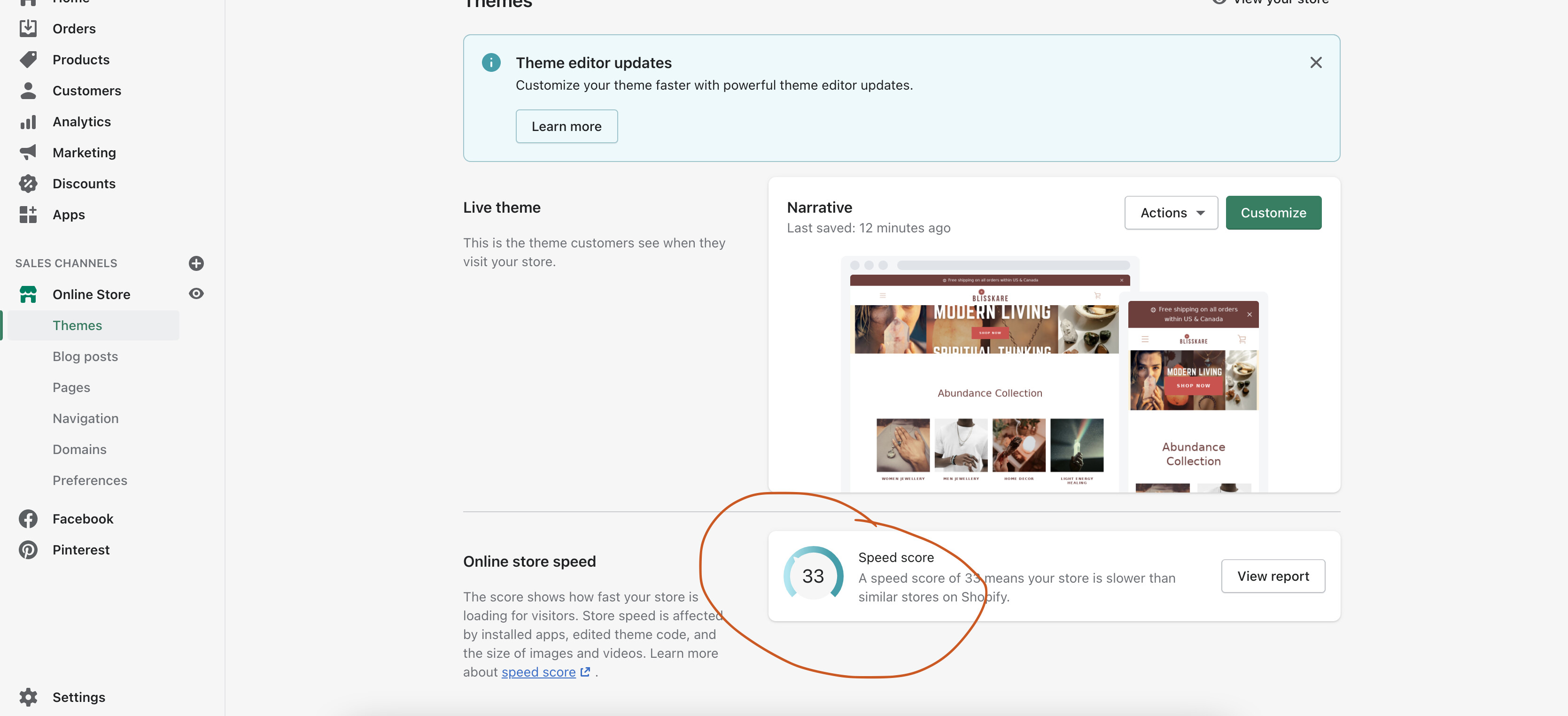
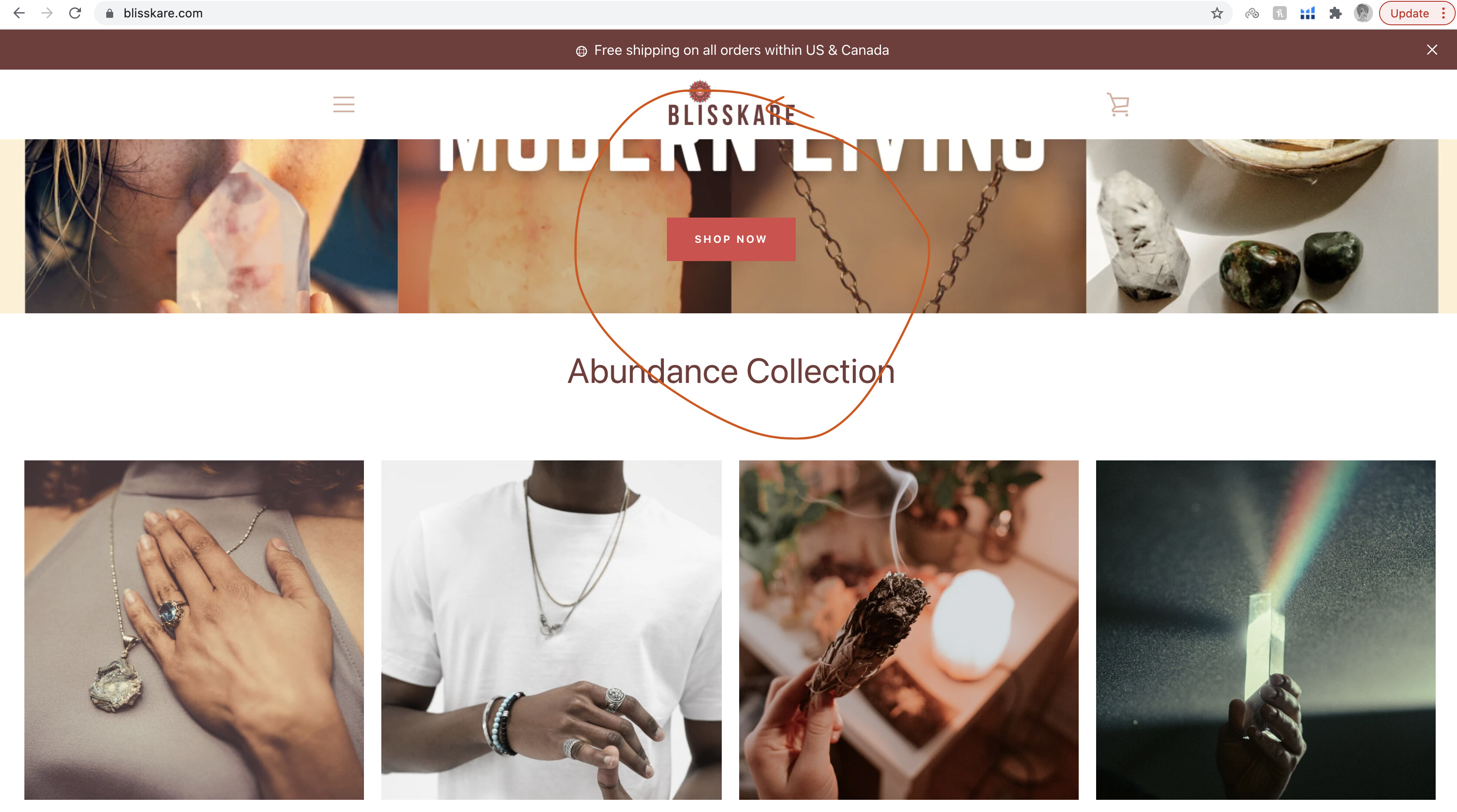
I am seeing a lot gaps on left and right margin where I am showing collection. Also, there is a lot of space within the sections horizontally on my Homepage. I am attaching the screenshots for your reference. Please let me know how can I see the image on the full screen - images look small and yet, speed score for my store is 33 and that is low. Please suggest me ways to fix that. My store is www.blisskare.com
hii, @blisskare
Do you want to like this?
Thank You.
Yes! that’s great! thanks 
Please add below code in bottom of assets/theme.scss.css file
@media only screen and (min-width: 750px)
.collection-list {
padding: 50px 0 0 0;
}
1 Like
hii, @blisskare
Paste this code on top of the theme.scss file.
@media only screen and (min-width: 992px) {
.grid.grid--uniform {
    margin-left: -23% !important;
    width: 144% !important;
}
.collection-list {
    padding: 40px !important;
}
}
Thank You.
1 Like
@blisskare
add the following code at the bottom of your assets/theme.scss.liquid
@media only screen and (min-width: 992px) {
.grid.grid--uniform {
    margin-left: -23% !important;
    width: 144% !important;
}
.collection-list {
    padding: 40px !important;
}
}
Thanks!
1 Like
Hey, thanks for help, that code fixed the issue. However, that cropped my top-most image. Could you please fix that?
Also, could the collection list images be organized with lesser margin on both sides (to get aligned with top most image)?
@dmwwebartisan Hey, thanks for help, that code fixed the issue. However, that cropped my top-most image. Could you please fix that?
Also, could the collection list images be organized with lesser margin on both sides (to get aligned with top most image)?
@blisskare
add the following code at the bottom of your assets/theme.scss.liquid
#shopify-section-16303822977c348706 .page-width {
    zoom: 1;
    max-width: 75% !important;
    padding: 0px 30px;
    margin: 0 auto;
}

#shopify-section-1630218769e2c16f7f .page-width {
    zoom: 1;
    max-width: 75% !important;
    padding: 0px 30px;
    margin: 0 auto;
}
1 Like
Amazing! Thanks @dmwwebartisan a lottttt! However, my topmost image is still cropped. Could you fix that as well? It will be immensely helpful.
Thanks a lottttt @dmwwebartisan for your quick support! My collection looks perfect now! So thankful to you! However, my topmost image is still cropped. Could you please help me fix that?
@blisskare
Try this css class
@media only screen and (min-width: 750px){
.hero--small .hero__inner {padding: 25% 0 !important;}
}
Thanks a lot @dmwwebartisan . It worked perfectly for the top most image! So thankful for your help!
1 Like
Sure ! @dmwwebartisan I would definitely like and recommend your solutions!