Why isn't my table visible on mobile view in Debut theme?

Hi there,

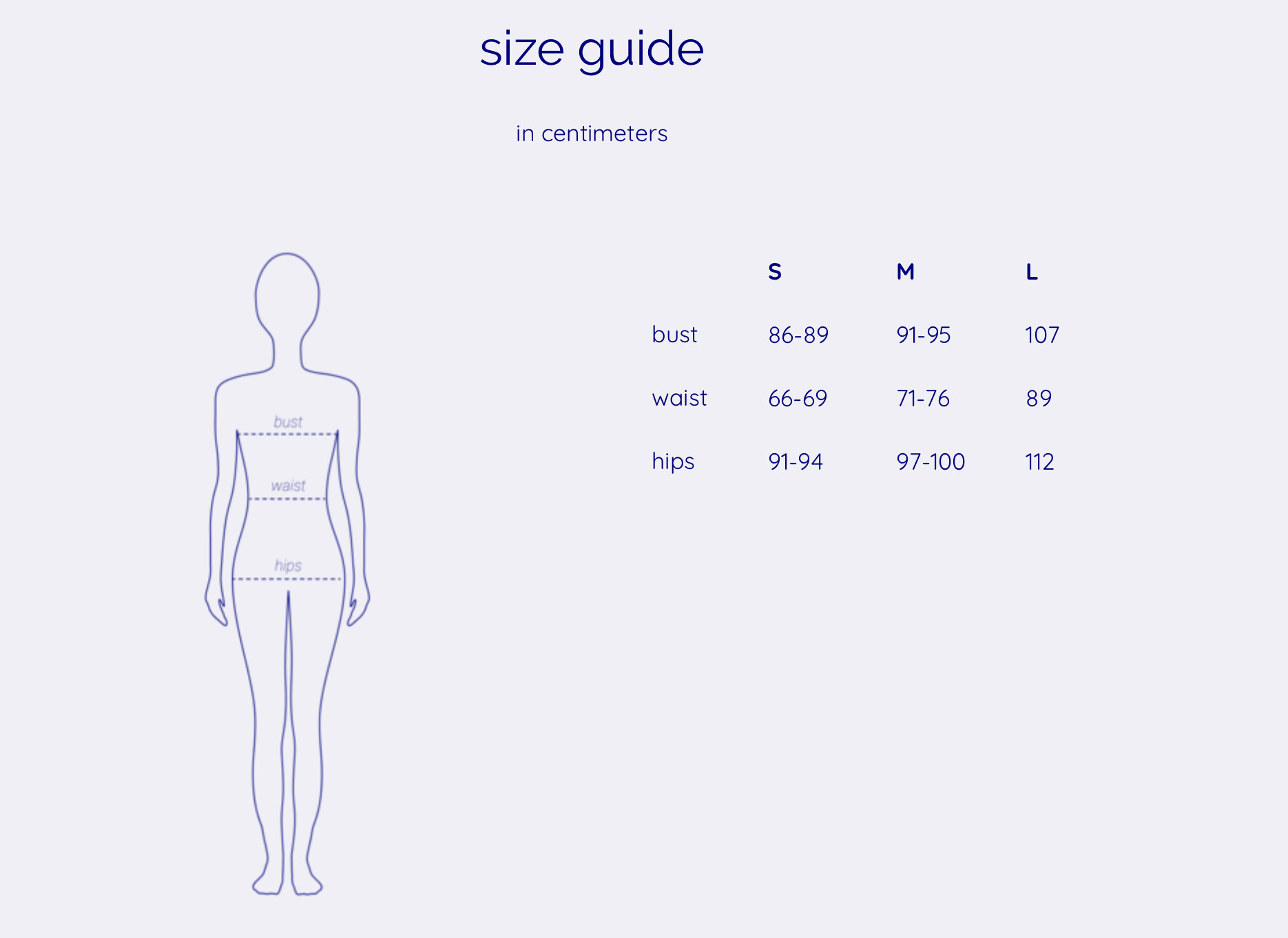
I managed to get the table to show to the right of the image on desktop (theme: Debut), however, it wouldn’t properly adjust to the mobile screen. Hence, the table is just invisible on the mobile. I must say that I was having issues with getting the table to show up next to the image on desktop at first and the way I solved is as follows: created the table > copied html > removed the table > added the image > added html table code. For some reason this was the only way to make it work as needed. Did anyone had similar issues, how did you resolve it? Thank you so much!

Desktop (looks as intended)

Mobile (no table)

Link to the page > https://orelse.studio/pages/sizing-chart

Hi @Yulz

Let me check it for you

Thank you so much @ahsaniub123

Please add this code at very bottom in theme.css file

screen and (max-width:767px){
.scrollable-wrapper { 
    width: 100%;
    margin-top: 20px;
    float: left;
}
.scrollable-wrapper table {   
    width: 100% !important;
    margin-left: auto;
    margin-right: auto;
 }
}

@ahsaniub123 it worked beautifully! Thank you so much!

HI

I done that above code into my theme CSS file also but

It still not align in my mobile view in properly

Refer :

https://prnt.sc/123dx0r - Destop view

https://prnt.sc/123e2xw - mobile View

Hi @Mani05

Need to add different css code for every theme. send me you page link I will send you working css code. Thanks

This is the page link https://www.work-tops.com/pages/world-stone-supplier-list