Hey there,
I would like some help with decreasing the font size of all the menu items in my main menu navigation of the header in the Zest theme.
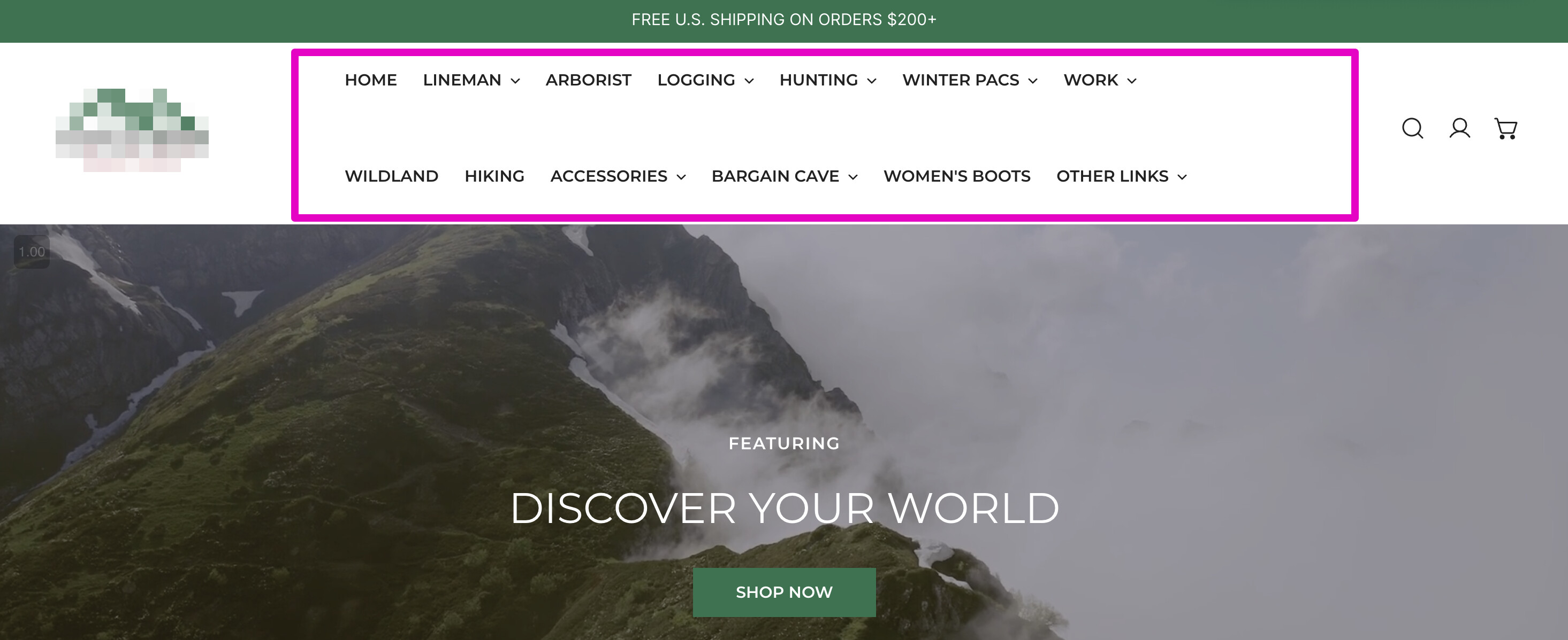
Currently, I have two rows of menu items (see screenshot below attached), however, I’d like it all to fit in one row – so it’s all symmetrical. Could someone please help me with this?
Here is the link to my storefront: https://hoffmanboots.myshopify.com/
2 Likes
Hi @wafasymcom ,
Use the following code in .css file to decrease the font size of menu:
.header__inline-menu .list-menu__item
{
font-size: 14px; (You can try 13px or 12px if needed)
padding: 0 10px; (Optional: reduce horizontal spacing)
}
If issue doesn’t resolve , use following code to reduce the size of logo:
.header__heading-logo
{
max-width: 120px; (Or reduce more if needed)
}
and
make container wider with this code:
.header__wrapper
{
max-width: 100%; (Instead of 1200px or similar)
padding-left: 20px;
padding-right: 20px;
}
Try this and let me know .
Thanks
Hey @Steve_172 ,
Thanks for helping me out with this!
I tried both the first and second options and still couldn’t get it all to fit.
Is this in the theme code under “theme.css” or “footer.css”? Also, do I paste this at the bottom of the code, or is there a specific place I should paste the code?
Best,
Wafa
Hi @wafasymcom
Welcome to the community.
For your issue, I do not think that the solution is to decrease the font. I tried to set it to 12px, and it is still too cramped.
So think you should try to re-organise menu a bit. Note that I think some time ago I read that the maximum number of menu items should be 7 but less is better. You have 13 and that is too many for a customer, too much options and not grouped in some way. Also, think of different screen sizes, on medium /small it will for sure go to 2 rows.
@wafasymcom
You can add this code at the bottom of your css file.
.f-site-nav__link{
font-size: 11px;
}
.flex-wrap{
flex-rap: nowrap !important;
}
Hope this helps.
Hello @wafasymcom
Go to online store ----> themes ----> actions ----> edit code ----> base.css
add this code at the end of the file and save.
ul.f-site-nav__list.flex.flex-wrap.h-full.list-none {
flex-wrap: nowrap !important;
font-size: 9px !important;
}
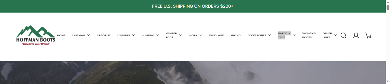
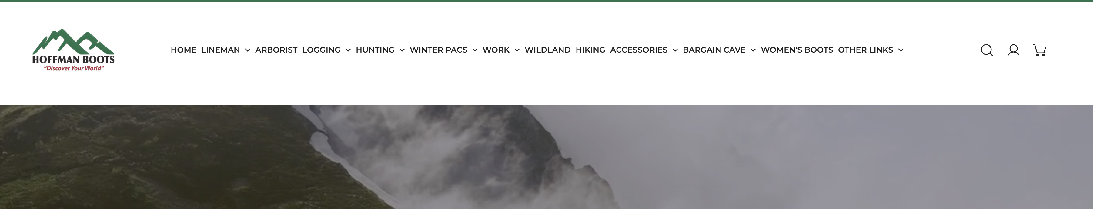
result
If this was helpful, hit the like button and accept the solution.
Thanks
Hi @wafasymcom
You can try to add this code to Custom CSS in Sales channels > Online Store > Themes > Customize > Theme settings
@media (min-width: 1024px) {
    html .site-header--design-1 .site-header__center {
        flex: 8;
    }
    html .site-header--design-1 .f-site-nav__link {
        padding: 0rem 4px;
        font-size: 12px;
    }
}