URL: mediemarketing.dk
Firstly, this shouldn’t look like this in mobile view. The menu only covers 50% of the screen and looks very odd.
Secondly, this collapsible content looks so weird now. It was an app that did this I believe, but now all the coding from the app should be gone as I have manually deleted every folder named something with this app (Swift). The problem is that it still looks as weird even though I deleted all the folders.
I really hope you can help me with these obstacles!
the faq page look good here is code for menu
- Go to Online Store-> Theme->Edit code
- Asset-> base.css ->paste the below code at the bottom of the file.
.menu-drawer{
	height: 100vh;
}
Thanks! But my collapsible content still looks so dumb
now menu drawer in covering the full height of mobile screen
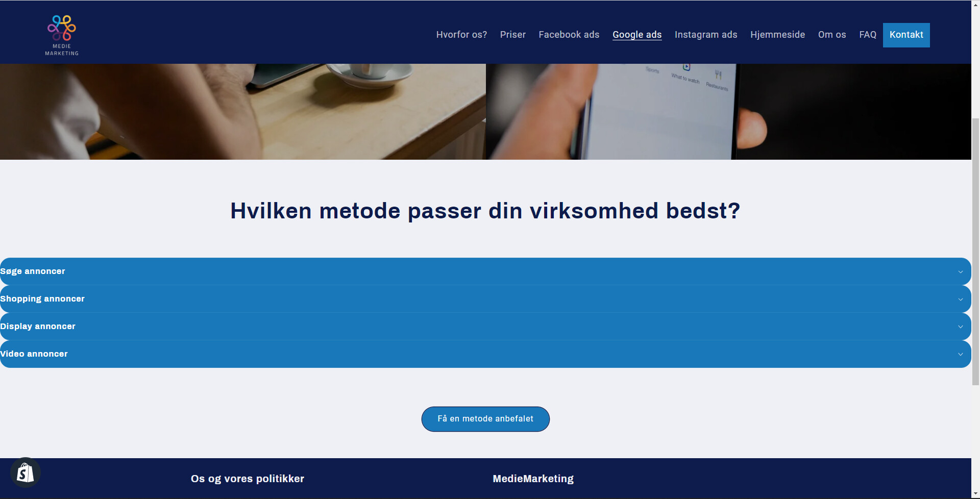
Yes, thank you! However, my collapsible content looks stupid as it is as wide as the screen. Please look at the second image i attached above 
plz send the url of that page
URL: mediemarketing.dk
Then go to the “google ads” page and look for yourself
plz try this
- Go to Online Store-> Theme->Edit code
- Asset-> base.css ->paste the below code at the bottom of the file.
.collapsible-content__grid {
    margin: 1.8em auto;
    max-width: 75%;
}
.collapsible-content__grid .accordion {
    margin: 10px;
    padding: 10px;
	border-radius: 8px;
}
Thank you so much! Solved it completely!
Hello again, it looks great on desktop but looks very odd on mobile as the content is way too narrow.
Is there a way to fix this?
plz try this
- Go to Online Store-> Theme->Edit code
- Asset-> base.css ->paste the below code at the bottom of the file.
@media(max-width:786px){
.collapsible-content__grid{
   max-width: 90%;
}
}
you can change 90% to your choice like 95% or 97%, as per choice.
1 Like
Perfect! Thanks for everything!