Hi,
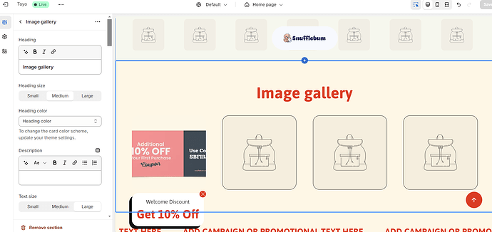
I am trying to use the “Image Gallery” section on my website to display discount coupons. After designing the discount coupons I realized that the Image Gallery section has no “Adapt to Height” option. And because of this, my coupons are not fully visible.
What the coupons should look like:
What they actually look like:
(Ignore the color of the coupon, I have used a different Image for representation purposes).
No option to enable: “Adapt to Height”:
I am using the following CSS within the editor:
@media screen and (min-width: 750px) {
  .gallery-grid {
    gap: 5rem !important;
  }
}
@media screen and (max-width: 749px) {
  .gallery-grid {
    display: flex;
    flex-wrap: nowrap;
    overflow-x: auto;
    gap: 2rem;
    -webkit-overflow-scrolling: touch;
    scrollbar-width: none;
  }
  .gallery-grid::-webkit-scrollbar {
    display: none;
  }
  .gallery-item {
    flex: 0 0 auto;
    width: calc(90% / 2 - 1rem);
  }
}
.product__media-toggle {
  display: none !important;
}
Requesting your assistance to achieve the desired result.
URL: snufflebum.com
Pw: bohtro
Hi @snufflebum ,
Here are the steps you can follow:
1, Navigate to Online Store > Themes > Edit Code.
2, Locate and open the base.css (or theme.css, custom.css) file.
3, Paste the code snippet provided below at the bottom of the file, then save your changes.
.gallery-item .product__media.media img {
    object-fit: contain;
}
Here is the result
We hope this assists in resolving the issue.
If you find our solution helpful, kindly consider Liking and Marking it as Accepted. Thank you!
1 Like
Hey,
Thanks a lot. Really appreciate your response. This did work:
But as you can see, this is leaving a lot of space between the Text and the Images and the Images and the bottom of the section. How can I reduce the space? Also, how can I increase the size of the images/image container? The images appear a little small
If you find our solution helpful, please Like and Mark it as Accepted. That means a lot to us. Thank you and have a great day!
Yes, I have done that. Thank you. Can you please help me with the spacing and the size of the images?
Hi @snufflebum ,
You can use this code snippet to change the gap between the heading and the images and make the image bigger
#shopify-section-template--17179139539118__image_gallery_cfjL3r .gallery-grid.desktop-grid-3.mobile-grid-2.image-square {
    gap: 0 !important;
}

.gallery-item .product__media.media {
    height: 200px;
    padding-bottom: 0;
}

#shopify-section-template--17179139539118__image_gallery_cfjL3r > div > div > div.gallery-grid.desktop-grid-3.mobile-grid-2.image-square {
    /* You can adjust this value to change the gap between the heading and the images */
    margin-top: 0px !important;
}
Here is the result
1 Like
Thanks again!!
This worked for the desktop view but hasn’t worked for the mobile view. Please suggest changes
You can add this code snippet to update the mobile view
@media screen and (max-width: 768px) {
    .gallery-item .product__media.media {
        height: 100px;
    }
}
Here is the result
1 Like
This snippet was successful in reducing the extra spaces, but the size of the image container is still small in the mobile view 
Hi @snufflebum ,
You can try applying this code snippet to make the images bigger on mobile view
@media screen and (max-width: 768px) {
    .gallery-item {
        width: 400px !important;
    }
    .gallery-item .product__media.media {
        height: 200px !important;
    }
    #shopify-section-template--17179139539118__image_gallery_cfjL3r .gallery-grid.desktop-grid-3.mobile-grid-2.image-square {
        overflow: scroll;
    }
    /* Hide scrollbar for Chrome, Safari and Opera */
    #shopify-section-template--17179139539118__image_gallery_cfjL3r .gallery-grid.desktop-grid-3.mobile-grid-2.image-square::-webkit-scrollbar {
      display: none;
    }

    /* Hide scrollbar for IE, Edge and Firefox */
    #shopify-section-template--17179139539118__image_gallery_cfjL3r .gallery-grid.desktop-grid-3.mobile-grid-2.image-square {
      -ms-overflow-style: none;  /* IE and Edge */
      scrollbar-width: none;  /* Firefox */
    }
}
Here is the result
Hope this will help you resolve your issue!
1 Like
Hey man, thanks a lot. You were super helpful! The code you provided did fix the sizing issue, but the spacing issue was still persistent.
I added the following css that fixed the spacing issue in the mobile view as well:
.title-wrapper .title {
    margin: 30px !important;
  }
  .title-wrapper {
    margin-bottom: -30px !important;
  }
Again, thanks a lot for your efforts. Really appreciate it.
1 Like


