Adjust slider dots on mobile only debut theme

Hi All,

Can anyone help with moving the slideshow dots & arrows on mobile only for debut theme ? Desktop version is all good but on mobile, the dots/arrow section cuts into the bottom of the image which looks silly. Can these be moved to below the image while still keeping the title & sub-title please ? I am currently working on a draft copy of my store treasureknot.com (https://0yoezbtx6v0nrqes-34503295108.shopifypreview.com)

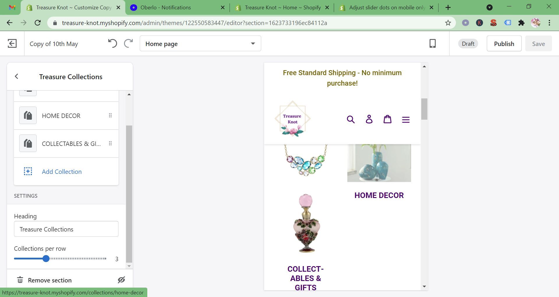
I also have a problem with my home page collections section on mobile only. As you can see from the attached, the title the first collection (jewellery) is missing.

1 Like

@Mareka

sorry for that issue please try this code

  1. Go to Online Store->Theme->Edit code
  2. Asset->/theme.scss.liquid->paste below code at the bottom of the file.
@media only screen and (max-width: 749px) {
.slideshow__text-wrap--mobile {top: 0;}
.collection-grid .grid__item {margin-bottom: 50px;}
}

@KetanKumar I am getting an error message when I try to save

1 Like

@Mareka

what’s error please show me

Hi @Mareka ,

Please follow the steps:

  • Step 1: Go to Online store > Themes > Actions > Edit code.

  • Step 2: Go to Assets > theme.css and paste this at the bottom of the file: https://i.imgur.com/7tm96JA.png

@media only screen and (max-width: 749px){

// slideshow

.slideshow__text-wrap–mobile {

top: 0 !important;

}

// collections section

.collection-grid-item{

margin-bottom: 55px !important;

}

}