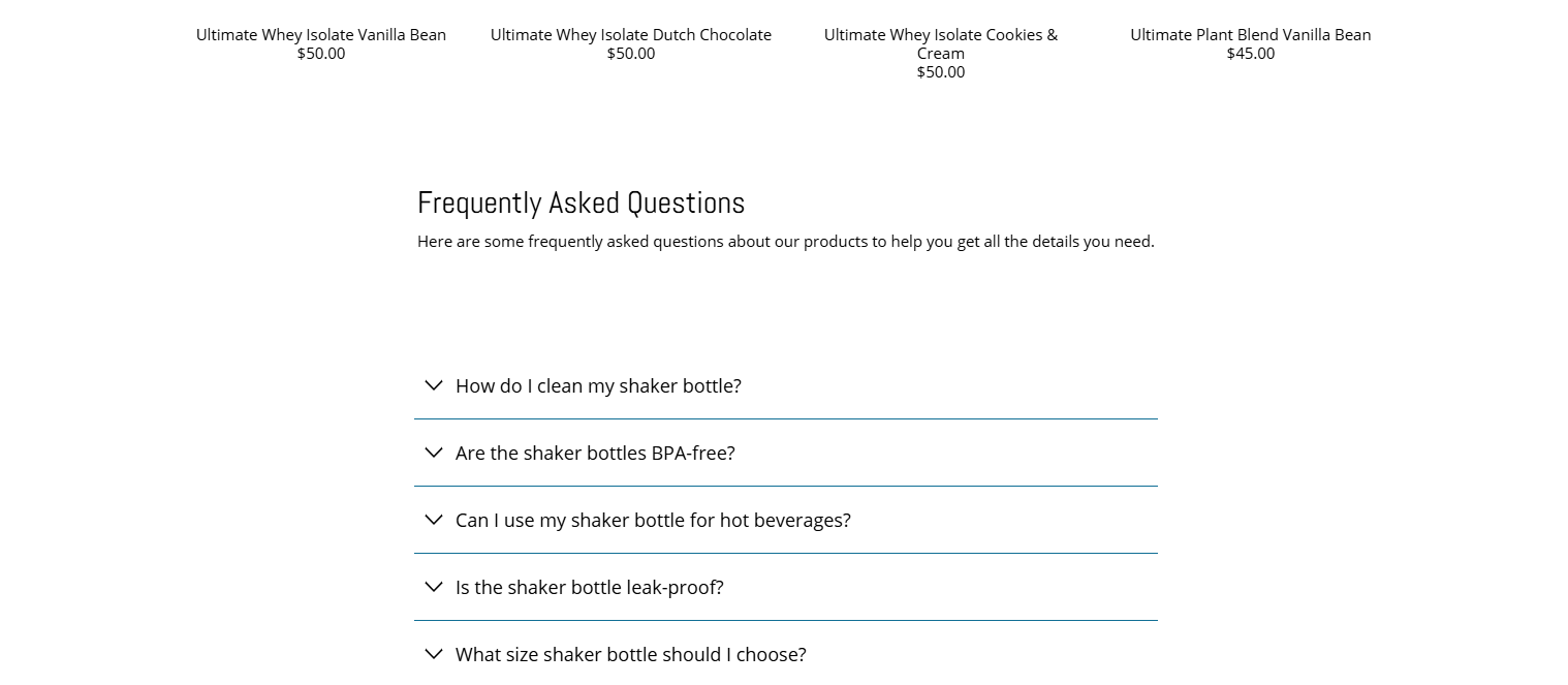
I need help adjusting the size of a section to align with the text above it. The screenshot below shows the approximate size I’m aiming for—I’d like it to fit within the green box shown.
Any assistance would be appreciated!
Link: https://testingstoresandthemes.myshopify.com/
storefront password: 12345
Hi @technase
You can achieve this by adding this CSS to your Theme.css / base.css File
.one-whole.medium-down--one-whole.column.faq.faq__column-1 { grid-column: 2/ span 6; }
.page-faq__column-wrap { display: grid; grid-template-columns: repeat(10, 1fr); }
If This Solution Works Kindly Like This and Mark This As A Solution Or Buy Me A Coffee
Hi @technase
Try this,
- From your Shopify admin dashboard, click on “Online Store” and then “Themes”.
- Find the theme that you want to edit and click on “Actions” and then “Edit code”.
- In the “Assets” folder, click on “base.css, style.css or theme.css” file, depending on which file your theme uses to store its CSS styles. At the bottom of the file, add the following CSS code:
.one-whole.medium-down--one-whole.column.faq.faq__column-1 {
    width: 60%;
}

.page-faq__column-wrap {
    justify-content:center;
}

div#shopify-section-template--18083220848885__index_heading_w9TfMj .container {
    justify-content: center;
    width: auto;
}

div#shopify-section-template--18083220848885__index_heading_w9TfMj .one-whole {
    width: auto;
}
Your Feedback Matters! Please mark the solution and give likes to posts that helped you. Your appreciation fuels our motivation to assist you better!
Hello,
Go to your assets/index.css file
Paste this code at the bottom
#shopify-section-template--18083220848885__index_faq_wnGjhQ {
  padding: 50px 240px;
}
Thank you for your reply.
I added the code you provided to the bottom of style.css file, but unfortunately, it didn’t make any difference.
Thank you for the feedback, Mehran. I added the code to the bottom of my style.css, but it’s not changing the size of that section.
Thank you so much. Unfortunately the code you provided doesn’t change the size of the section.
Please, try to add on the theme.liquid.
- From your Shopify admin dashboard, click on “Online Store” and then “Themes”
- Find the theme that you want to edit and click on “Actions” and then “Edit code”.
- In the “theme. Liquid” file. Find the tag and paste the code below before the tag.
And Save.
Your Feedback Matters! Please mark the solution and give likes to posts that helped you. Your appreciation fuels our motivation to assist you better!
Thank you so much! It fixes the desktop version, but there’s a lot of spacing on the left and right in the mobile version. Could you help reduce that spacing just for mobile?
Or, maybe is there a way to apply this code only to the desktop view?
The code is only minimum screen is 749px, add this one before the
@media (max-width: 748px) {
#shopify-section-template--18083220848885__index_heading_w9TfMj {
    width: auto !important;
    padding: 0 25px;
}
    .one-whole.medium-down--one-whole.column.faq.faq__column-1 {
        width: 100% !important;
    }
}
And Save.
The placement of the code is like this.
And Save,
Your Feedback Matters! Please mark the solution and give likes to posts that helped you. Your appreciation fuels our motivation to assist you better!
This is perfect, thank you so much.