Hi, I previously used a margin to make my logo go all the way to the left. I found out that on my screen it looked normal, but on smaller monitors, the logo was cut off all the way to the left and barely visible. How can I make my logo go all the way to the left and scale it to various screen sizes? URL is https://a-lineage-story.myshopify.com/. Password is ‘beckew’.

1 Like
you have added unnecessary code please revert and let me know so i will give full screen code
I have been working on the site for awhile, so I am unsure which line of code may have been unnecessary.
yes you have just revert code and fullscreen code that it
yes please remove and let me know
It is removed now
1 Like
yes, that looks great
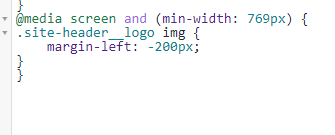
thanks for confirm yes please add this code
- Go to Online Store->Theme->Edit code
- Asset->/theme.scss.liquid->paste below code at the bottom of the file.
nav.grid__item {
    position: relative;
    right: 0;
}
.site-header__logo img {
    margin-left: 0;
}
.site-header .wrapper {
    max-width: 100%;
}
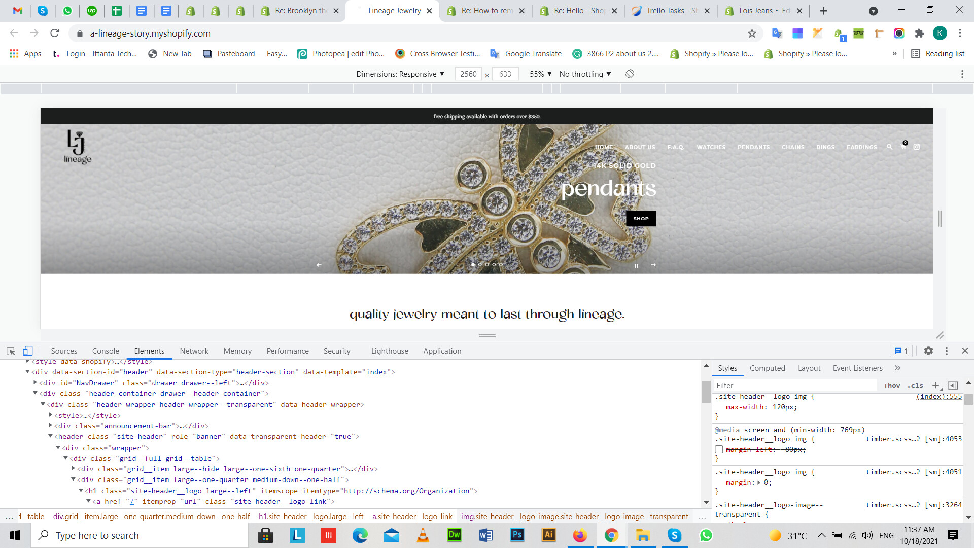
it works great for desktop, however my mobile is not centered anymore. do you know how to fix this? thank you!
1 Like
thanks can you please show me mobile issue image so i will guide you