I have the “Middle Left” Desktop logo position selected, which looks good on smaller screen sizes on desktop. However, when the screen size becomes larger (full screen), the logo starts to move towards the center. How would I keep the logo stuck to the left for larger screen sizes?
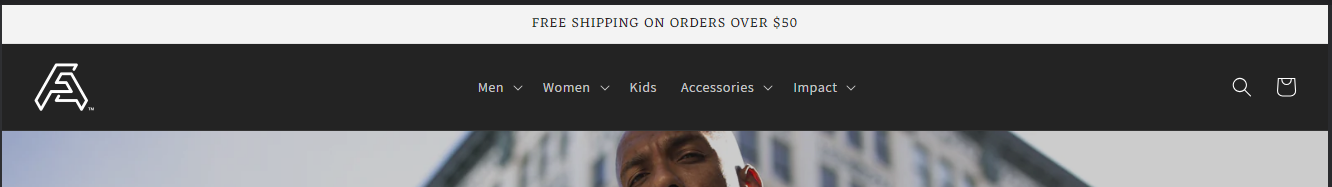
For example, the Adidas logo stays to the far left no matter how big you make the window size.
Below are the current edits I’ve made under base.css to keep the navigation menu items centered, which I would like to continue being centered:
@media screen and (min-width: 990px){
.header–middle-left {
grid-template-areas: ‘heading navigation icons’;
grid-template-columns: 1fr auto 1fr;
column-gap: 2rem;
}
}
1 Like
Hi @Nick1014 ,
Can I give a try? Would you mind to share your URL wbesite? with password if its protected. Thanks!
1 Like
Thank you for the information. I just like to clarify, the logo change position in smaller screen because of the burger menu. In the bigger screen you have nav.menu. Do you like the logo upper in the navigation menu? in bigger screen.
1 Like
Yes, once the screen gets small enough, it goes to my mobile view and the logo is centered with burger menu. I would like for my desktop view (once the logo moves back to the middle left configuration) to keep the logo all the way to the left instead of being pushed towards the center when the screen size is larger. And I would like the search and cart icons to stay on the right side of the screen by the same margins.
1 Like
I understand, what I did I put max-width so it wont automatically add margin when its larger screen.
- From your Shopify admin dashboard, click on “Online Store” and then “Themes”.
- Find the theme that you want to edit and click on “Actions” and then “Edit code”.
- In the “Assets” folder, click on “base.css” file, depending on which file your theme uses to store its CSS styles. At the bottom of the file, add the following CSS code:
- And Save.
header.header.header--middle-left.header--mobile-center.page-width.header--has-menu {
    max-width: 100%;
}
Result:
Screen size 1326px.
I hope it help.
1 Like
