Hey guys maybe someone knows the problem. I sell through Printful and there is a size guide. When I import the table into my shop, it is correctly displayed on the desktop but cut off on the mobile phone. Look at the picture. How do I make the table appear on the phone in full size?
Hello, @Wladi
Thanks for Post.
Please share your site URL,
So I will check and provide a solution here.
1 Like
Thank you. Heavyfit.de (wladwlad)
Here is the HTML-Code maybe it helps.
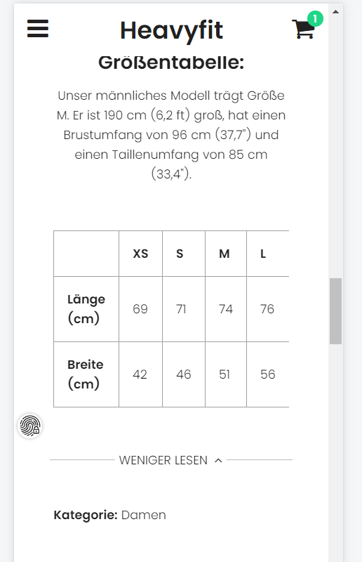
| XS | S | M | L | XL | 2XL | |
| Länge (cm) | 69 | 71 | 74 | 76 | 79 | 81 |
| Breite (cm) | 42 | 46 | 51 | 56 | 61 | 66 |
1 Like
1 Like
Yes of course password is wladwlad
1 Like
Thanks for URL.
- Go to Online Store->Theme->Edit code
- Asset->/timber.scss.liquid->paste bellow code at the bottom of the file.
@media screen and (max-width: 767px) {
.product-details-wrapper {
    padding: 20px 5px;
}
.table-responsive th, .table-responsive td {
padding: 8px;
}
}
if you have any issue let me know i can help you.
3 Likes
Thank you very much it works (:
1 Like
Hi - I’m trying to fix the same problem, make tables responsive for mobile but we have Mr Parker theme and there isn’t a timber.ccs
here’s the visual of the issue - on desktop we have a table with 2 images side by side

on the mobile it only shows 1 image and the edge of the 2nd

site is www.lindseybrown.com
hope you can help !
1 Like
Thanks for post
i have check this issue but sorry i can’t see any table on product page can you please share product URL if you have any table formate code
1 Like
Thanks for replying to my query @KetanKumar
it’s actually a page - not product page
https://www.lindseybrown.com/pages/beautiful-silk-maxi-dress
I was wondering if i should create a different page template rather than change the ccs for all tables?
1 Like
Thanks
it’s not image code that’s iframe so can you please change your code many inline CSS doesn’t properly work on mobile
1 Like
Ah I see - the images are embedded directly from instagram so I have copied the embed code directly
Here’s part of the code (I’ve taken out the a href details) - looking at it now, is it the width 100% that’s the issue?
1 Like
I thinks is fine can you try this
not seeing your suggestion? thanks again for helping !
I mean this current code you can please add
1 Like
That’s the code that’s already there ?
I created a table on the page - with one row - two cells
|
Then added in the embed code from instagram that starts |
1 Like
Hi - yes i’d worked that out, it’s worked although at the moment the two images are small (on a desktop) version so I’m investigating how I fix that if you have any suggestions?
1 Like
Thanks for update.