I have recently set up a shopify site using Brooklyn Theme. It looks great online, but when I look at it on a mobile device the slideshow at the top does not fit in the screen, can this be fixed??
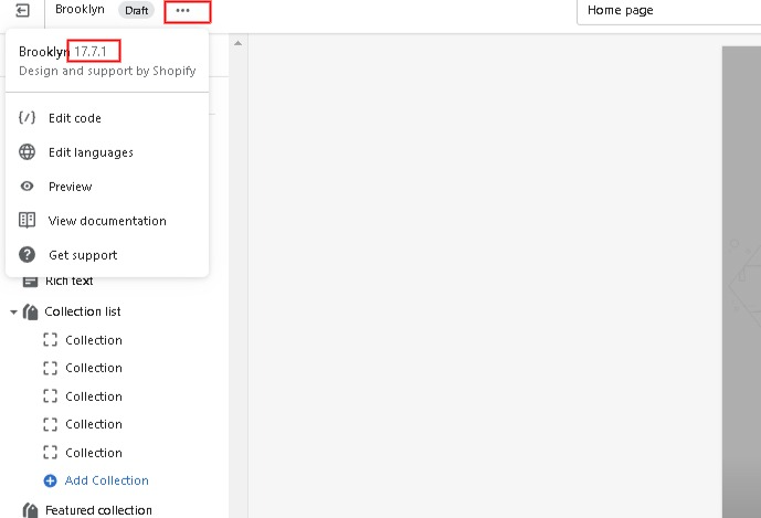
Which version of brooklyn do you have?(see embedded image to find it)
Did you recently install the theme?
Looking at the site I do not see a slideshow only a single hero banner.
When setting up in the visual theme editor for the slideshow are you setting the Slide-height to “adapt to first image” or “fullscreen”?
Are you using a properly sized image, i.e. not overly large just like ~1000px or ~2000px in width or less?
What type of setting are you using for each slide block?
This is the 2nd post I’ve seen with similar issues with brooklyn’s banner not behaving.
https://community.shopify.com/c/technical-q-a/brooklyn-theme-banner-is-not-responsive/m-p/1405325
See your theme version in the visual theme editor https://shopify.com/themes/current/editor by clicking the three dots dropdown near the theme name.
Please add following css code your assets/theme.scss.liquid bottom of the file .
@media screen and (max-width: 768px) {
.hero[data-adapt=false], .hero[data-adapt=false] .slideshow__overlay:before {
    height: 50vh !important;
}

.hero .hero__image {
    height: 100%;
    width: 100%;
    object-fit: contain !important;
    font-family: "object-fit: contain" !important;
}
}
Thanks!
Thank you!!!
This helped alot. Is there a code to change or add to make my words fit the screen better on my banner for mobile? Or do I just have to change the size of them overall?
1 Like
Please add following css code your assets/theme.scss.liquid bottom of the file .
@media screen and (max-width: 768px) {
.hero__text-align {margin-top: 40px;}
.hero--adapt .hero__subtitle, .hero__slide .hero__subtitle {font-size: .8375em;}
.hero--adapt .hero__title, .hero__slide .hero__title {font-size: 2.125em;}
.hero--adapt a.hero__cta, .hero__slide a.hero__cta {margin-bottom: 0; font-size: .6125em;}
}
Thanks!
Thank you so much!!!