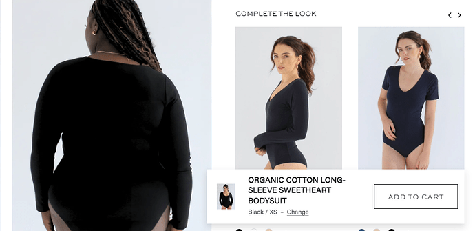
Hi community! On my product page I have a ‘complementary products’ carousel. I decreased the font size for the header in this section but the arrows now look really large compared, plus they overhang to the right of the products too. Could anyone help me figure out the best way to decrease the arrow size and how to make them in line with the product image below?
URL (Symmetry theme) – https://pantee.co.uk/?_ab=0&_fd=0&_sc=1&preview_theme_id=144118972631
Current Look (see carousel arrows) –
What I am trying to achieve –
Hello @emilyaugstudios
You can add code by following these steps
-
Go to Online Store → Theme → Edit code.
-
Open your theme.liquid file
-
Paste the below code before on theme.liquid
#shopify-section-template--18253913161943__main button.slider-nav__btn.has-ltr-icon[name="prev"] {
position: absolute;
right: 19px !important;
top: 0;
}
#shopify-section-template--18253913161943__main button.slider-nav__btn.has-ltr-icon[name="next"] {
display: inline-block;
position: absolute;
right: 1px !important;
top: 0;
}
#shopify-section-template--18253913161943__main button.slider-nav__btn.has-ltr-icon[name="prev"] svg, button.slider-nav__btn.has-ltr-icon[name="next"] svg {
height: 17px !important;
width: 17px !important;
}
}
my reply helpful? Click Like to let me know!
your question answered? Mark it as an Accepted Solution.
HEllo @emilyaugstudios
Go to online store ----> themes ----> actions ----> edit code ----> assets ---->main.css
add this code at the end of the file.
button.slider-nav__btn.has-ltr-icon[name="prev"] {
display: inline-block;
position: relative;
right: 22px !important;
}

button.slider-nav__btn.has-ltr-icon[name="next"] {
display: inline-block;
position: absolute;
right: -5px !important;
}
.no-wrap.slider-nav .icon {
width: 17px !important;
height: 31px !important;
}
result
If this was helpful, hit the like button and accept the solution.
Thanks


