Change the width of the form, Inline for Shopify Forms App

Can someone please help me solve this.

I use the Prestige Theme.

I am using the Shopify forms app and an inline form, I need to change the width of the form, it’s so small on the screen. Here is the link: https://us.onlyprohair.com/pages/application-process

Hello @larapretorius88

You can add code by following these steps

  1. Go to Online Store → Theme → Edit code.

  2. Open your theme.liquid file

  3. Paste the below code before on theme.liquid

._inline_whyqz_45 ._formContainer_whyqz_30 { max-width: 96% !important; /*adjust according to you*/ }

Was my reply helpful? Click Like to let me know!
Was your question answered? Mark it as an Accepted Solution.

1 Like

Hi @larapretorius88 ! You could try adding this code to the bottom of your theme.css file and clicking save:

._noImage_whyqz_158 {
    width: 75% !important;
    max-width: 900px !important;
}
  • Here is the solution for you
  • Please follow these steps:

  • Then find the theme.css file.
  • Then add the following code at the end of the file and press ‘Save’ to save it.
._inline_whyqz_45 ._formContainer_whyqz_30 {
 max-width: 65% !important;
}
  • “If you want it wider, increase 65% to a larger number, and vice versa.”

  • Here is the result you will achieve:

  • Please press ‘Like’ and mark it as ‘Solution’ if you find it helpful. Thank you.
1 Like

Thank you. I have tried all 3 ways and it is still not working. I don’t know what I’m doing wrong

Please inbox me so I can help you

2 Likes

Did you find a solution for this?

Hi all, adding to the question to find a solution.

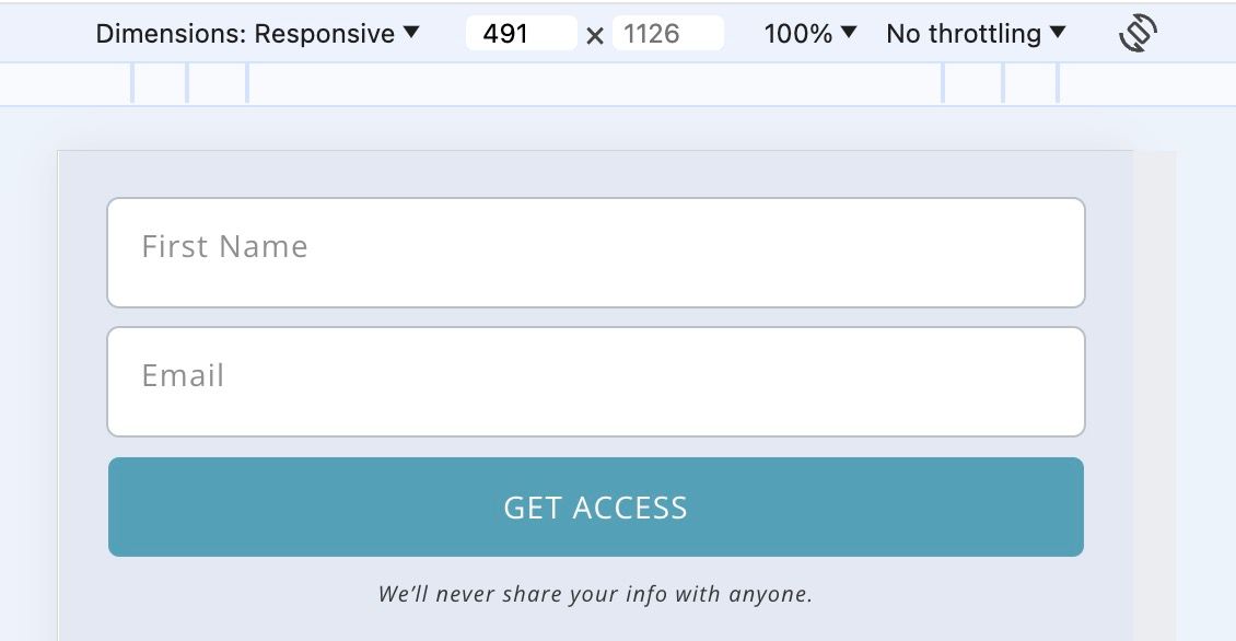
The main change I want to make is to get the form width to be max width on mobile. (I can get by with the lack of other css changes to shopify forms app, as they sometimes work in google inspector but don’t translate when I add it to shopify base css file, or within the theme css section.)

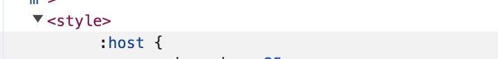
So basically I want to change the breakpoint px size, which is currently at max-width: 490px for mobile. This is being controlled by the :host css (see screenshot). Does anyone know where the css for this :host exists within shopify for me to change it?

See screenshots: this is too narrow for some mobile

so want to maintain full width for all mobile, like below (so I just need to adjust the 490px number)

Below are screenshots from within google inspector that shows the style for one of the divs within the shopify forms app

Screenshot 2024-08-06 at 22.17.07.jpg

Any ideas

Hi there,
Did you find a solution?
I have the same problem. The form from the Forms App is way too smal compared to the rest of the page.
I tried adding the code to the end but nothing helped.
Support chat told me to post it here.
Looking at the application form of the original post makes me think its still unsolved.
Please help !

Hi Soppski,

I think the problem was fixed internally by shopify because after I added some styling to the form as a compromise, I realized that the problem was fixed soon after. If it isn’t fixed after awhile for you, try adding css/styling to the parent container that the form lives in… so for example this the code I used:

.shopify-app-block {
border: 1px solid #9eb5c7;
background-color: #f9f9fb;
border-radius: 8px;
padding: 0px 5px;
}

Play around with the padding and colors to make it look better on your site/mobile for your brand…

if after awhile its fixed, go back and adjust the styling/ padding accordingly.

This is the settings I have on the form app and the respective mobile view