i want to decrease the width but its not working
I am using this css
/* General styles for all devices /
.pxFormGenerator {
padding: 50px; / Maintain your existing padding /
max-width: 95%; / Slightly increase the width for mobile /
margin: 0 auto; / Center the form /
box-sizing: border-box; / Include padding in width calculations /
} / Adjust styles for desktop screens (768px and up) /
@media (min-width: 768px) {
.pxFormGenerator {
max-width: 200px !important; / Decrease the max-width for desktop and enforce it /
}
} / /
@media (min-width: 1200px) {
.pxFormGenerator {
max-width: 200px !important; / */
}
}
website link : ge tlitledlighting .com
1 Like
Hello @learningdesign
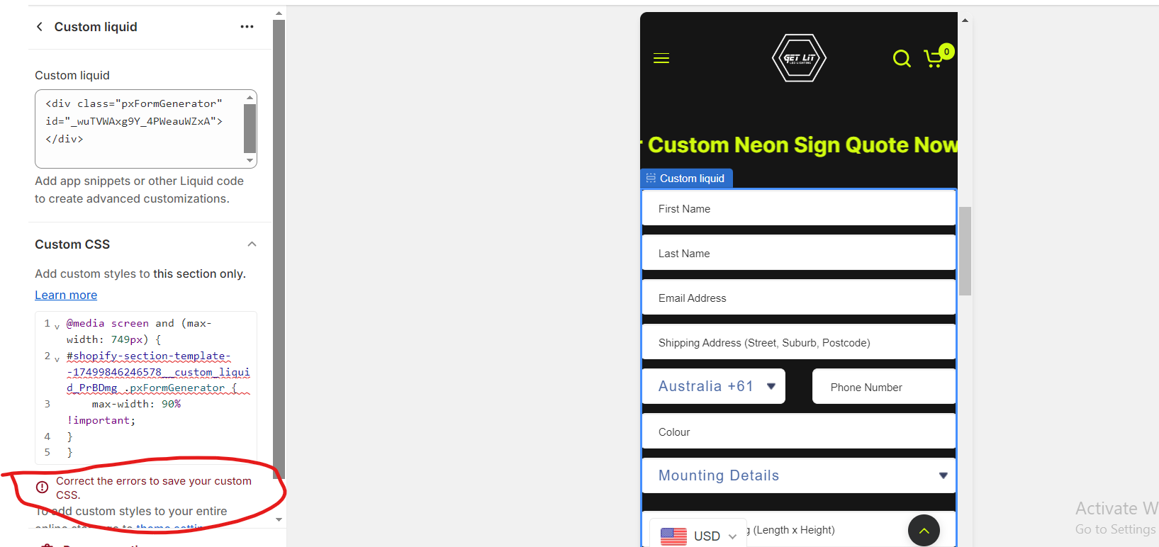
Go to online store ----> themes ----> actions ----> edit code ---->assets ---->custom-neons.css
add this code at the end of the file.
#shopify-section-template--17499846246578__custom_liquid_PrBDmg .pxFormGenerator {
max-width: 60% !important;
}
result
If this was helpful, hit the like button and accept the solution.
Thanks
Hi @learningdesign
Check this one.
From you Admin page, go to Online Store > Themes
Select the theme you want to edit
Under the Asset folder, open the main.css(base.css, style.css or theme.css)
Then place the code below at the very bottom of the file.
@media only screen and (min-width: 749px){
div#wizard-validation-form {
    max-width: 90%;
    margin: auto;
}
}
@media only screen and (max-width: 749px){
    div#wizard-validation-form {
    max-width: 95%;
    margin: auto;
}
}
And Save.
result:
Please don’t forget to Like and Mark Solution to the post that helped you. Thanks!
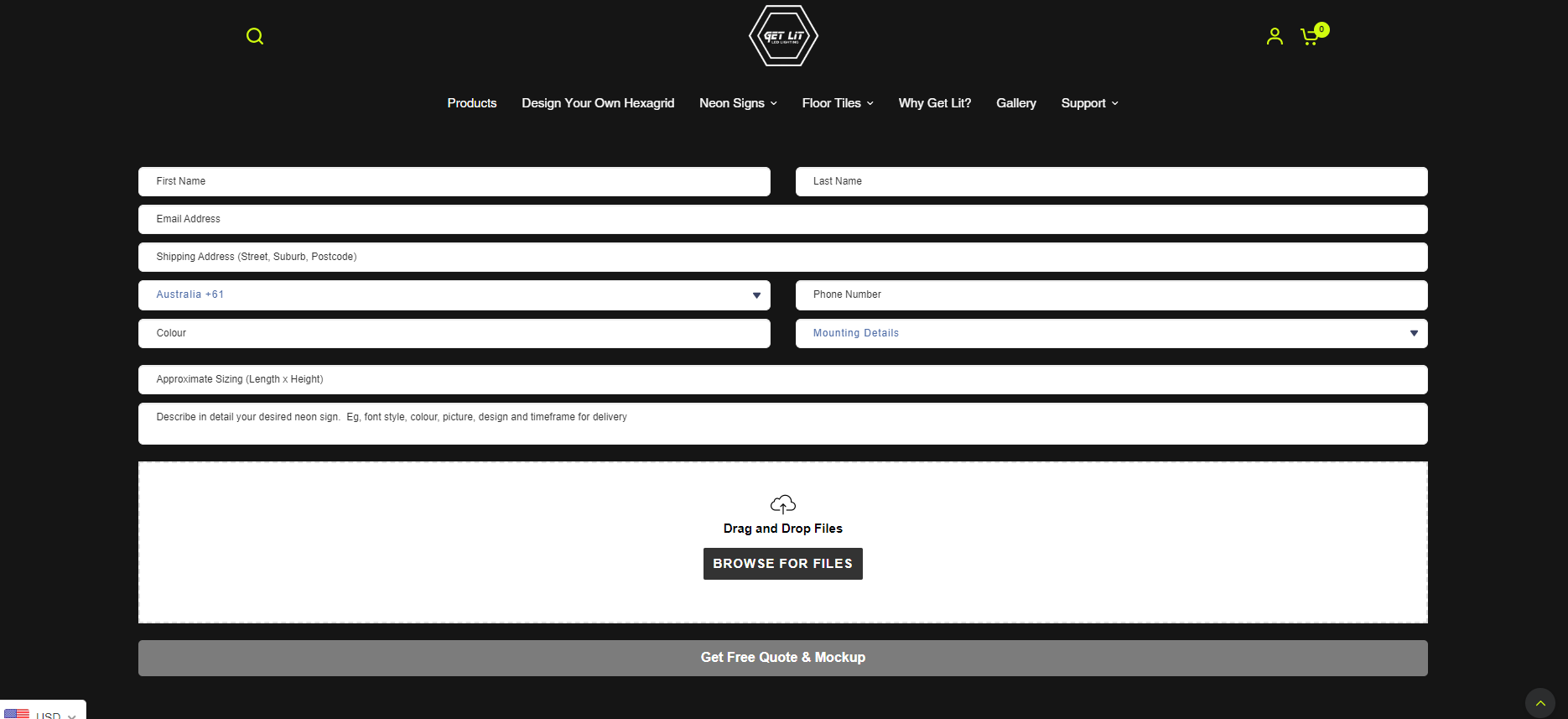
@Rahul_dhiman there is no custom neon css i have paste the code here please check in image its fine in desktop but now very bad in mobile
You can add code by following these steps
-
Go to Online Store → Theme → Edit code.
-
Open your theme.liquid file
-
Paste the below code before on theme.liquid
@media screen and (min-width: 768px){
#shopify-section-template--17499846246578__custom_liquid_PrBDmg .pxFormGenerator {
max-width: 60% !important;
}
}
@media screen and (max-width: 767px){
#shopify-section-template--17499846246578__custom_liquid_PrBDmg .pxFormGenerator {
max-width: 100% !important;
}
}
my reply helpful? Click Like to let me know!
your question answered? Mark it as an Accepted Solution.
@Tech_Coding sir its not in the middle now can you please send me another code
add this code below the custom css code
@media screen and (max-width: 749px) {
#shopify-section-template--17499846246578__custom_liquid_PrBDmg .pxFormGenerator {
    max-width: 90% !important;
}
}
Thanks
@Made4uo-Ribe did not worked
@Rahul_dhiman did not worked
You were suppose to add this code below the previous code.
but any how it seems that the issue is solved for both desktop and mobile.
Try to add !important. Like this.
@media only screen and (min-width: 749px){
div#wizard-validation-form {
    max-width: 90% !important;
    margin: auto !important;
}
}
@media only screen and (max-width: 749px){
    div#wizard-validation-form {
    max-width: 95% !important;
    margin: auto !important;
}
}
And Save.
Please don’t forget to Like and Mark Solution to the post that helped you. Thanks!
You can add code by following these steps
-
Go to Online Store → Theme → Edit code.
-
Open your theme.liquid file
-
Paste the below code before on theme.liquid
@media screen and (min-width: 768px){
#shopify-section-template--17499846246578__custom_liquid_PrBDmg .pxFormGenerator {
max-width: 60% !important;
margin: auto !important;
}
}
@media screen and (max-width: 767px){
#shopify-section-template--17499846246578__custom_liquid_PrBDmg .pxFormGenerator {
max-width: 100% !important;
margin: auto !important;
}
}
my reply helpful? Click Like to let me know!
your question answered? Mark it as an Accepted Solution.