Hey,
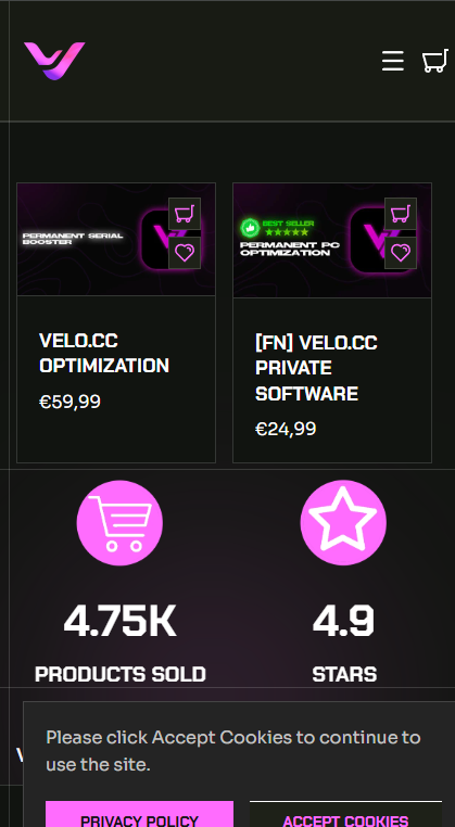
I would like to size up the featured category because they are way to small on mobile.
Im using a custome Theme.
The picture should be bigger and the text smaller.
Below you can find a picture how it currently looks
Website: https://velocc.shop/collections/all
Hello @LianYing
1 Go to Online Store > Themes > Edit Code.
2 Open base.css (or theme.css in some versions).
3 Scroll to the bottom and paste the CSS above.
4 Save and refresh your store.
@media screen and (max-width: 768px) {
    .product-grid .card {
        width: 100% !important;
    }

    .product-grid .card__media img {
        width: 100% !important;
        height: auto !important;
    }

    .product-grid .card__content {
        font-size: 12px !important;
    }

    .product-grid .card__title {
        font-size: 14px !important;
    }
}
Thankyou
Hey unfortunately it doesnt change anything
Hi LianYing
You can try to follow this step
Step 1: Go to Edit code
Step 2: Find file base.css and add this code at the end of the file
@media (max-width: 768px) {
.number-counter-icon {
    width: unset !important;
}

img.support-block-card__image {
    max-width: 128px !important;
    height: 115px !important;
}
}
Result:
Best,
Liz