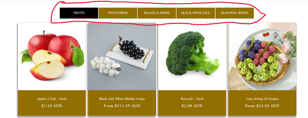
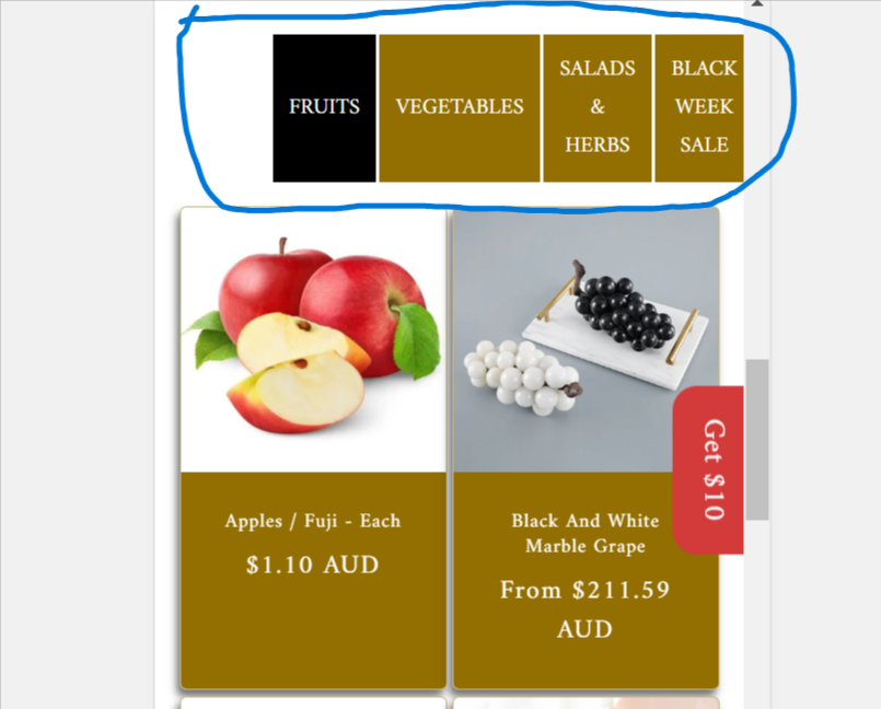
A user implemented custom collection tabs in their Dawn theme Shopify store that display well on desktop but poorly on mobile, with tabs extending beyond the viewport.
Problem: The mobile layout shows tabs in a single horizontal line that requires scrolling, rather than wrapping to multiple rows as desired.
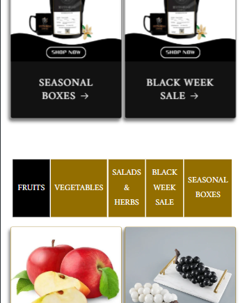
Solution Provided: DaisyVo offered CSS code to be added to the theme.liquid file above the </head> tag. The code uses media queries to adjust tab width and padding for screens under 768px, allowing tabs to wrap properly on mobile devices.
Result: The CSS solution successfully resolved the mobile display issue.
Follow-up Request: The user now wants to add a “View More” button to each collection tab. A respondent indicated this would require Liquid code modifications to link each button to its respective collection.
Status: Initial mobile layout issue resolved; “View More” button feature remains open for implementation.
Summarized with AI on October 31.
AI used: claude-sonnet-4-5-20250929.
I have added collection tabs through coding. I want the collection tab to look nicer in mobile mode. It looks great in desktop mode but not good in mobile mode. 3 or 4 tab menus on the top line and the rest of the menus below can be kept beautifully in mobile mode?