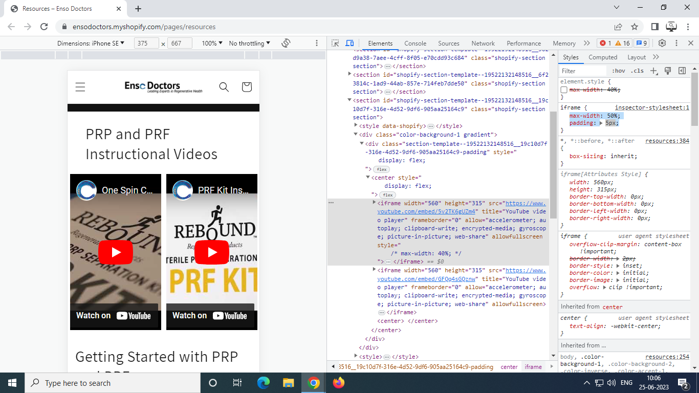
I am trying to use the custom liquid option in the Dawn theme so that I can add 2 videos side by side. I have embedded 2 videos side by side by they are wider in the mobile view and i cannot figure out how to fix it, I found a code that will make the videos responsive but now the videos are displaying on top of eachother. I would like them to display side by side. Any help is appreciated. Thank you!
Here is the code:
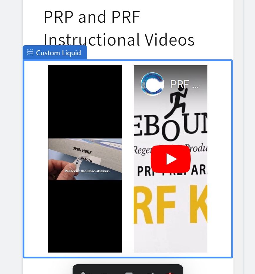
I want it to look like this but responsive on the mobile view.
@saraelizpor - can you please share this page link?
@saraelizpor - add this css to the very end of your base.css file and check
@media screen and (max-width:749px){
.section-template--19522132148516__19c10d7f-316e-4d52-9df6-905aa25164c9-padding center{display: flex;}
.section-template--19522132148516__19c10d7f-316e-4d52-9df6-905aa25164c9-padding center iframe{max-width: 50%; padding: 5px;}
}
Thank you! This worked as far as fixing the problem when viewed on mobile but can they be stacked now when viewed on a mobile device? Having the videos side by side looks great on the desktop but on a mobile device, it makes them very small when you hit play. Just let me know. Thank you for your help.
@saraelizpor - you can just remove the above code and it will be stacked again…
I removed the code but the videos are still side by side when viewing it on a mobile device. The video is displaying so small when they aren’t on top of eachother. I’d like them to be side by side on the desktop view and stacked on mobile view? Is that possible? When i removed the code it looked the same so I just added it back.
@saraelizpor - please add this css and check
@media screen and (max-width:749px){
#shopify-section-template--19522132148516__3091800e-2073-4555-ab98-9d7b7b0518cf .videos{width:100% !important;}
}