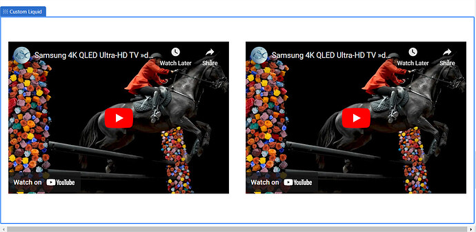
Hi awesome team!
I have the following code to embed a yt vid in custom html:
.embed-container { position: relative; padding-bottom: 56.25%; height: 0; overflow: hidden; max-width: 100%; } .embed-container iframe, .embed-container object, .embed-container embed { position: absolute; top: 0; left: 0; width: 40%; height: 40%; }
I have two questions please!
1- How do I center this video as it is now please? (it aligns to the left currently) and;
2 - How can I add another video beside it on the page on desktop, then have the two stack on top of each other on mobile or when the screen width narrows?
I want to embed two videos side by side, maybe even three if they all fit! Thanks so much as always,
1 Like
You can try the following CSS:
.embed-container{
   margin:auto;
}

@media only screen and (min-width: 900px) {
  .embed-container {
    display:flex;
    justify-content:center;
    }
}
This should be about it, but it’s hard to say for sure how well it’ll work without looking at your store. It would be easier to figure out the code if you could link it.
@p1simgear
Thank you for reaching out and posting this question!
Sorry you are facing this issue, it would be my pleasure to help you.
Welcome to the Shopify community! 
Thanks for your good question.
Please share your site URL,
I will check out the issue and provide you a solution here.
Hi, add this code to your Custom HTML section and let me know if it works?
<iframe src="https://www.youtube.com/embed/5oXvF1Wam7k?rel=0" allowfullscreen="" frameborder="0"></iframe>
<iframe src="https://www.youtube.com/embed/5oXvF1Wam7k?rel=0" allowfullscreen="" frameborder="0"></iframe>
If you want us to do it for you, you can check out our app. You can create any theme edit task in it. The first task is free!
Thanks, it does seem to want to work - then it kicks out this error:
Setting ‘custom_html_content’ can’t include Liquid syntax (‘{{’, ‘}}’, ‘{%’ or ‘%}’) without valid dynamic sources.
EDIT: ok solved that, there was an extra before the last .
}
One thing though, the container height doesnt scale with the width? Is it possible to do this as at wider widths the containers have a large black space above and below the video content.
Thanks again for your help,
}} is not accepted in custom html section so they need to be moved to next line,
Try this,
<iframe src="https://www.youtube.com/embed/5oXvF1Wam7k?rel=0" allowfullscreen="" frameborder="0"></iframe>
<iframe src="https://www.youtube.com/embed/5oXvF1Wam7k?rel=0" allowfullscreen="" frameborder="0"></iframe>
Hello @p1simgear ,
We have the solution to your problem, you can add the below-provided code to fix the same.
Add the below code.
.video-wrapper{
display: flex;
flex-direction: row;
justify-content:center;
}
.embed-container{
padding: 5px;
}
@media only screen and (max-width: 500px){
.video-wrapper{
display: flex;
flex-direction: column;
}
.embed-container iframe{
width: 350px; height: 200px;
}
}

