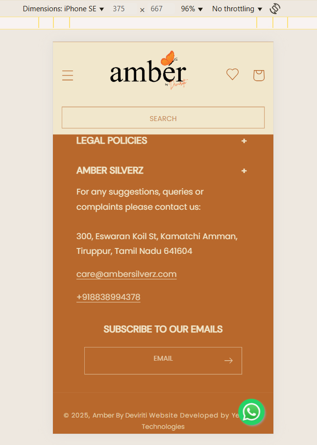
I’m using the Dawn theme, in that I want to customize the header search bar and the footer subscribe bar in mobile view’s letter spacing, and make them in the middle. I’ll attach the reference image. Please help me to rectify that.
First, duplicate your theme for safety and make the following edit on the new copy.
In your theme’s code editor, go to the file: assets/base.css.
Scroll to the very bottom of the file and paste this code:
/* Center and space mobile search/subscribe bars */
@media screen and (max-width: 749px) {
  .search-modal__form .search__input,
  .footer-block__newsletter .field__input {
    text-align: center;
    letter-spacing: 2px; /* Adjust as needed */
  }
}
Click Save.
Now, preview the theme on a mobile device to see the changes. If it looks correct, publish the theme.
Thanks for clarifying and sharing the reference image. Since you’re using the Dawn theme, you can adjust the header search bar and footer subscribe bar styling for mobile view with a little bit of custom CSS.
You can try adding the following code in your Online Store > Themes > Customize > Theme Settings > Custom CSS (or through base.css if you’re editing the code):
/* Center align search bar and subscribe bar on mobile */
@media screen and (max-width: 749px) {
  .header__search,
  .footer__newsletter {
    text-align: center;
    justify-content: center;
  }

  .header__search input,
  .footer__newsletter input {
    letter-spacing: 1px; /* adjust as needed */
    text-align: center;
  }

  .footer__newsletter form {
    display: flex;
    flex-direction: column;
    align-items: center;
  }
}
This will:
Center the search bar and subscribe bar on mobile view.
Adjust the letter spacing inside the input fields.
Ensure alignment is consistent with your design reference.
Once added, please clear your browser cache and check again on mobile.
