Hi @MarcodaSilva8 and @nb114 ,
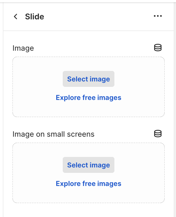
I apologize for the delayed response. I’ve provided a piece of code that you might find useful. This code is for the Dawn theme, version 12, and specifically focuses on the slideshow section. I’ve created a new section called slideshow-responsive, which includes a mobile image picker.
Slideshow responsive code
-
You need to add a new block (image picker for mobile view) in {% schema %}.
-
Adapt the code to render the image on mobile screens (search for the below mentioned classes) or just copy paste this piece of code if using the same Dawn version and slideshow section.
-
Don’t forget to add CSS classes (hidden_desktop and hidden_mobile) to component-slideshow.css
{{ 'section-image-banner.css' | asset_url | stylesheet_tag }}
{{ 'component-slider.css' | asset_url | stylesheet_tag }}
{{ 'component-slideshow.css' | asset_url | stylesheet_tag }}

{%- if section.settings.slide_height == 'adapt_image' and section.blocks.first.settings.image != blank -%}
  {%- style -%}
    @media screen and (max-width: 749px) {
      #Slider-{{ section.id }}::before,
      #Slider-{{ section.id }} .media::before,
      #Slider-{{ section.id }}:not(.banner--mobile-bottom) .banner__content::before {
        padding-bottom: {{ 1 | divided_by: section.blocks.first.settings.image.aspect_ratio | times: 100 }}%;
        content: '';
        display: block;
      }
    }

    @media screen and (min-width: 750px) {
      #Slider-{{ section.id }}::before,
      #Slider-{{ section.id }} .media::before {
        padding-bottom: {{ 1 | divided_by: section.blocks.first.settings.image.aspect_ratio | times: 100 }}%;
        content: '';
        display: block;
      }
    }
  {%- endstyle -%}
{%- endif -%}

{%- if request.design_mode -%}

{%- endif -%}

{% schema %}
{
  "name": "Slideshow responsive",
  "tag": "section",
  "class": "section",
  "disabled_on": {
    "groups": ["header", "footer"]
  },
  "settings": [
    {
      "type": "select",
      "id": "layout",
      "options": [
        {
          "value": "full_bleed",
          "label": "t:sections.slideshow.settings.layout.options__1.label"
        },
        {
          "value": "grid",
          "label": "t:sections.slideshow.settings.layout.options__2.label"
        }
      ],
      "default": "full_bleed",
      "label": "t:sections.slideshow.settings.layout.label"
    },
    {
      "type": "select",
      "id": "slide_height",
      "options": [
        {
          "value": "adapt_image",
          "label": "t:sections.slideshow.settings.slide_height.options__1.label"
        },
        {
          "value": "small",
          "label": "t:sections.slideshow.settings.slide_height.options__2.label"
        },
        {
          "value": "medium",
          "label": "t:sections.slideshow.settings.slide_height.options__3.label"
        },
        {
          "value": "large",
          "label": "t:sections.slideshow.settings.slide_height.options__4.label"
        }
      ],
      "default": "medium",
      "label": "t:sections.slideshow.settings.slide_height.label"
    },
    {
      "type": "select",
      "id": "slider_visual",
      "options": [
        {
          "value": "dots",
          "label": "t:sections.slideshow.settings.slider_visual.options__2.label"
        },
        {
          "value": "counter",
          "label": "t:sections.slideshow.settings.slider_visual.options__1.label"
        },
        {
          "value": "numbers",
          "label": "t:sections.slideshow.settings.slider_visual.options__3.label"
        }
      ],
      "default": "counter",
      "label": "t:sections.slideshow.settings.slider_visual.label"
    },
    {
      "type": "checkbox",
      "id": "auto_rotate",
      "label": "t:sections.slideshow.settings.auto_rotate.label",
      "default": false
    },
    {
      "type": "range",
      "id": "change_slides_speed",
      "min": 3,
      "max": 9,
      "step": 2,
      "unit": "s",
      "label": "t:sections.slideshow.settings.change_slides_speed.label",
      "default": 5
    },
    {
      "type": "header",
      "content": "t:sections.all.animation.content"
    },
    {
      "type": "select",
      "id": "image_behavior",
      "options": [
        {
          "value": "none",
          "label": "t:sections.all.animation.image_behavior.options__1.label"
        },
        {
          "value": "ambient",
          "label": "t:sections.all.animation.image_behavior.options__2.label"
        }
      ],
      "default": "none",
      "label": "t:sections.all.animation.image_behavior.label"
    },
    {
      "type": "header",
      "content": "t:sections.slideshow.settings.mobile.content"
    },
    {
      "type": "checkbox",
      "id": "show_text_below",
      "label": "t:sections.slideshow.settings.show_text_below.label",
      "default": true
    },
    {
      "type": "header",
      "content": "t:sections.slideshow.settings.accessibility.content"
    },
    {
      "type": "text",
      "id": "accessibility_info",
      "label": "t:sections.slideshow.settings.accessibility.label",
      "info": "t:sections.slideshow.settings.accessibility.info",
      "default": "Slideshow about our brand"
    }
  ],
  "blocks": [
    {
      "type": "slide",
      "name": "t:sections.slideshow.blocks.slide.name",
      "limit": 5,
      "settings": [
        {
          "type": "image_picker",
          "id": "image",
          "label": "t:sections.slideshow.blocks.slide.settings.image.label"
        },
        {
          "type": "image_picker",
          "id": "image_mobile",
          "label": "Image on small screens"
        },
        {
          "type": "inline_richtext",
          "id": "heading",
          "default": "Image slide",
          "label": "t:sections.slideshow.blocks.slide.settings.heading.label"
        },
        {
          "type": "select",
          "id": "heading_size",
          "options": [
            {
              "value": "h2",
              "label": "t:sections.all.heading_size.options__1.label"
            },
            {
              "value": "h1",
              "label": "t:sections.all.heading_size.options__2.label"
            },
            {
              "value": "h0",
              "label": "t:sections.all.heading_size.options__3.label"
            }
          ],
          "default": "h1",
          "label": "t:sections.all.heading_size.label"
        },
        {
          "type": "inline_richtext",
          "id": "subheading",
          "default": "Tell your brand's story through images",
          "label": "t:sections.slideshow.blocks.slide.settings.subheading.label"
        },
        {
          "type": "text",
          "id": "button_label",
          "default": "Button label",
          "label": "t:sections.slideshow.blocks.slide.settings.button_label.label",
          "info": "t:sections.slideshow.blocks.slide.settings.button_label.info"
        },
        {
          "type": "url",
          "id": "link",
          "label": "t:sections.slideshow.blocks.slide.settings.link.label"
        },
        {
          "type": "checkbox",
          "id": "button_style_secondary",
          "label": "t:sections.slideshow.blocks.slide.settings.secondary_style.label",
          "default": false
        },
        {
          "type": "select",
          "id": "box_align",
          "options": [
            {
              "value": "top-left",
              "label": "t:sections.slideshow.blocks.slide.settings.box_align.options__1.label"
            },
            {
              "value": "top-center",
              "label": "t:sections.slideshow.blocks.slide.settings.box_align.options__2.label"
            },
            {
              "value": "top-right",
              "label": "t:sections.slideshow.blocks.slide.settings.box_align.options__3.label"
            },
            {
              "value": "middle-left",
              "label": "t:sections.slideshow.blocks.slide.settings.box_align.options__4.label"
            },
            {
              "value": "middle-center",
              "label": "t:sections.slideshow.blocks.slide.settings.box_align.options__5.label"
            },
            {
              "value": "middle-right",
              "label": "t:sections.slideshow.blocks.slide.settings.box_align.options__6.label"
            },
            {
              "value": "bottom-left",
              "label": "t:sections.slideshow.blocks.slide.settings.box_align.options__7.label"
            },
            {
              "value": "bottom-center",
              "label": "t:sections.slideshow.blocks.slide.settings.box_align.options__8.label"
            },
            {
              "value": "bottom-right",
              "label": "t:sections.slideshow.blocks.slide.settings.box_align.options__9.label"
            }
          ],
          "default": "middle-center",
          "label": "t:sections.slideshow.blocks.slide.settings.box_align.label",
          "info": "t:sections.slideshow.blocks.slide.settings.box_align.info"
        },
        {
          "type": "checkbox",
          "id": "show_text_box",
          "label": "t:sections.slideshow.blocks.slide.settings.show_text_box.label",
          "default": true
        },
        {
          "type": "select",
          "id": "text_alignment",
          "options": [
            {
              "value": "left",
              "label": "t:sections.slideshow.blocks.slide.settings.text_alignment.option_1.label"
            },
            {
              "value": "center",
              "label": "t:sections.slideshow.blocks.slide.settings.text_alignment.option_2.label"
            },
            {
              "value": "right",
              "label": "t:sections.slideshow.blocks.slide.settings.text_alignment.option_3.label"
            }
          ],
          "default": "center",
          "label": "t:sections.slideshow.blocks.slide.settings.text_alignment.label"
        },
        {
          "type": "range",
          "id": "image_overlay_opacity",
          "min": 0,
          "max": 100,
          "step": 10,
          "unit": "%",
          "label": "t:sections.slideshow.blocks.slide.settings.image_overlay_opacity.label",
          "default": 0
        },
        {
          "type": "color_scheme",
          "id": "color_scheme",
          "label": "t:sections.all.colors.label",
          "default": "background-1"
        },
        {
          "type": "header",
          "content": "t:sections.slideshow.settings.mobile.content"
        },
        {
          "type": "select",
          "id": "text_alignment_mobile",
          "options": [
            {
              "value": "left",
              "label": "t:sections.slideshow.blocks.slide.settings.text_alignment_mobile.options__1.label"
            },
            {
              "value": "center",
              "label": "t:sections.slideshow.blocks.slide.settings.text_alignment_mobile.options__2.label"
            },
            {
              "value": "right",
              "label": "t:sections.slideshow.blocks.slide.settings.text_alignment_mobile.options__3.label"
            }
          ],
          "default": "center",
          "label": "t:sections.slideshow.blocks.slide.settings.text_alignment_mobile.label"
        }
      ]
    }
  ],
  "presets": [
    {
      "name": "t:sections.slideshow.presets.name",
      "blocks": [
        {
          "type": "slide"
        },
        {
          "type": "slide"
        }
      ]
    }
  ]
}
{% endschema %}
If you use another theme, you will need to adapt the code accordingly. You can also use already existing classed for hiding elements on different screen sizes. Get inspired by this code. 
Hope this helps!