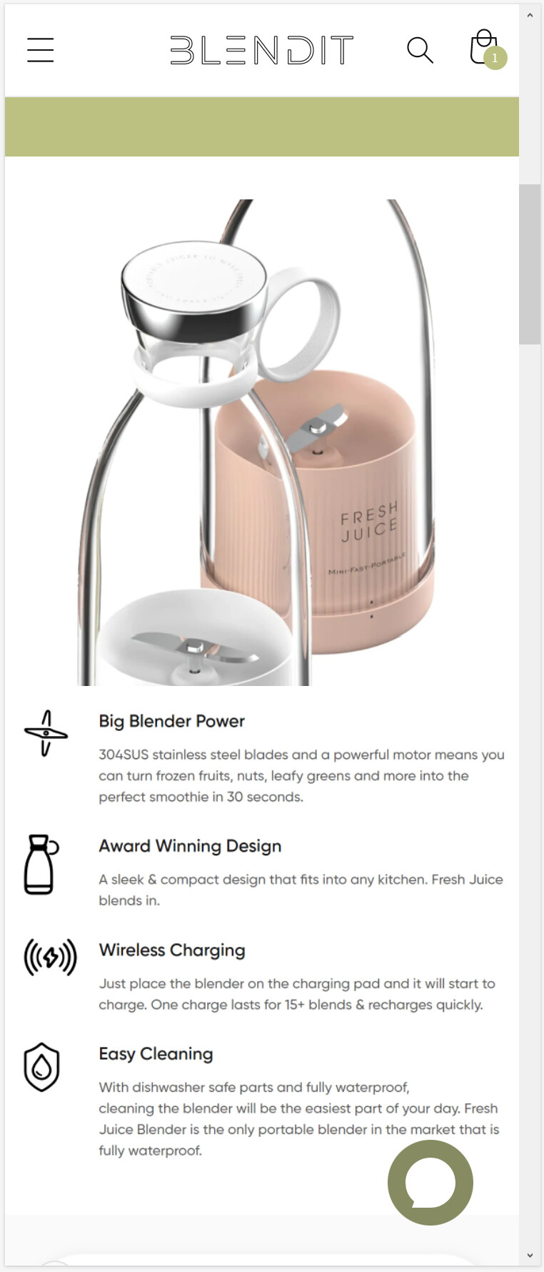
I just went live with the Dawn theme, but the image banner does not seem to scale to fit the first and second image but rather crop it to fit. This differs for different aspect ratios.
How may I scale the images so that both always fit within the space.
This is our site: https://suorix.myshopify.com/
I also have image stacking so that when viewed on mobile it would look like this:
Can I set the width of the screen required in which image stacking takes place, so as to make the images stack when on mobile or when holding an IPad portrait, but not to stack when viewed on a desktop or when holding an IPad landscape.
Sorry for the hassle
Any advice would be appreciated!
1 Like
@TheOneFaze
Add the following CSS code to your assets/section-image-banner.css bottom of the file.
@media screen and (max-width: 749px){
.banner--large.banner--mobile-bottom:not(.banner--adapt) .banner__media, .banner--large.banner--stacked:not(.banner--mobile-bottom):not(.banner--adapt)>.banner__media {
    height: 29rem !important;
}
}
Thanks!
@TheOneFaze
Second solution
Add the following CSS code to your assets/section-image-banner.css bottom of the file.
@media screen and (max-width: 749px){
.banner--stacked .banner__media-image-half {width: 100%; background-size: contain;}
}
Thanks!
Hello @dmwwebartisan ,
Unfortunately the CSS code did not work. Attached is the CSS code for the Image Banner Section.
Thanks.