Dawn Theme. - Mobile home page banner sizing issue

Hi Team,

I am using dawn theme 15.3.0.

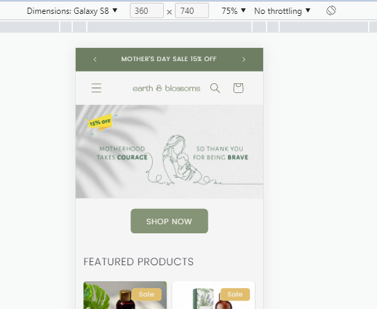
When I uploaded a new hero banner, the desktop version is working correctly, how ever the mobile version, what ever I tried does not work in terms of adjusting the size to fit the mobile.

I have tried multiple sizes, images as per guidelines and still not working

Would you please help me here?

regards

Joseph

1 Like

Hello @earthnblossoms

  1. In your Shopify Admin go to online store > themes > actions > edit code
  2. Find Asset > base.css and paste this at the bottom of the file:
@media screen and (max-width: 749px) {
.banner--mobile-bottom:not(.banner--adapt) .banner__media,
.banner--large.banner--stacked:not(.banner--mobile-bottom):not(.banner--adapt) > .banner__media {
height: auto !important;
min-height: 180px;
display: block;
position: relative;
}
.banner__media img {
width: 100% !important;
height: 100% !important;
object-fit: cover;
display: block;
}
}

1 Like

thanks @devcoders that works and is it possible to reduce the space above and below the shop now button

1 Like

Hello @earthnblossoms

  1. In your Shopify Admin go to online store > themes > actions > edit code
  2. Find Asset > base.css and paste this at the bottom of the file:
.banner--mobile-bottom .banner__box {
    padding: 2rem 3.5rem;
}

1 Like

thanks

1 Like

Hello @earthnblossoms
Thank you for your response. It’s good to know that it’s worked for you. Kindly feel free to get back to me if you need any further assistance. If helpful, please like all posts.