Dawn theme mobile product image not on center

Hello! I’ve been trying to use the Dawn theme, but I realised that the product image is not on the center. I get that it’s supposed to be like a carousel that connects to the next image, but I would still like it right in the middle (especially when there’s only one image).

https://hanamicases.com/products/black-checkered-1

(however the desktop page is fine, I just want it changed on mobile)

@eksk325 Go to assets/section-main-product.css and paste below css bottom of file.

@media screen and (max-width: 749px)
.product__modal-opener
{
width: 93% important ;
}

It didn’t work… I even tried adding the ! in front of important but it still didn’t work. Thank you though :slightly_smiling_face: !!

Hi @eksk325 ,

If you use dawn theme, you can try follow the instruction below:

  1. Go to Online Store → Theme → Edit code.
  2. Asset → /base.css paste code below into end of the file.
@media screen and (max-width: 767px){
.slider.product__media-list .product__media-item {
    padding: 0 !important;
    margin: 0 !important;
    width: 100% !important;
}
}

If you feel like my answer is helpful, please mark it as a SOLUTION. Let me know if you have any further questions.

2 Likes

Omg it worked!!! Thank you so much youre a genius

Hi @eksk325

Did you get it fixed ?

Yeah for mobile, the first image is now full width, but the second image is still the same (because it’s like a carousel). I don’t think it’s a big deal for the second image.

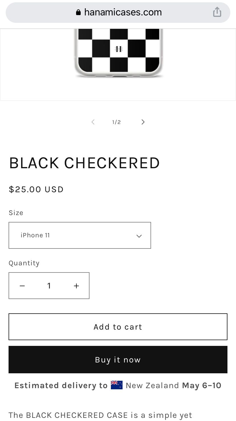
Hello! I have more questions about the website. On the right side of this page, I want the title, price, drop down menus, buttons and descriptions to all be aligned in the center because the estimated shipping time is on the center alone, so it looks weird. Also can I integrate this on the mobile page as well?

Hi,

This helped fix the first image but the images after that are now all showing aligned to the right so some part of the images are getting cut. How Can I make all of them the same