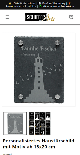
Hey guys the dawn theme has got some annoying product picture sizing. for any reason you can see part of the second picture, any workaround to set this right? so that really only one picture in the screen ?
Hello @marvinsignpoint ,
A we know this is a feature so customers can know another image is also available in the gallery.
btw still if you don’t need it you have you find its JS and change this attribute
centerMode: true
to
centerMode: false
Thanks
Hey @marvinsignpoint
Welcome to Shopify Community! Can you share your Store URL so I can have a look on it? Also, if you have password enabled then please share the password as well. Your cooperation would be greatly appreciated.
Best Regards,
Moeed
Hello @marvinsignpoint
your website is password protected.
pw; is schiefer :))
Hey @marvinsignpoint
Follow these Steps:
-
Go to Online Store
-
Edit Code
-
Find theme.liquid file
-
Add the following code in the bottom of the file above tag
RESULT:
If I managed to help you then, don’t forget to Like it and Mark it as Solution!
Best Regards,
Moeed
hey moeed this doesnt looks like an acceptable solution because the product image then will be not centered as seen in your picture.
best
marvin
hey guleria,
do you may know which JS file this is?
best marvin
Go to online store ----> themes ----> actions ----> edit code ---->base.css
add this code at the end of the file.
@media screen and (max-width: 749px) {
.grid--peek.slider--mobile .grid__item {
margin: 10px !important;
}
}
result
If this was helpful, hit the like button and accept the solution.
Thanks
hey Rahul,
is there any solution to center the picture after adding this code? It looks good but the product image is not centered then ![]() the is more space on the right side
the is more space on the right side
OKay please remove previous code and use this one .
@media screen and (max-width: 749px) {
.product-media-container.constrain-height {
    margin-right: 20px;
    margin-left: 20px;
}
}
this didnt work ![]()
this one worked!
@media screen and (max-width: 749px) {
.grid–peek.slider–mobile .grid__item {
margin-right: 20px;
margin-left: 20px;
}
}


