Hello!
I want to use a drop down menu, the standard 3 lines in your left corner that lists all of your pages when you click on it.
And I actually have it enabled- and it works perfectly on mobile, and even in the destop view on my editor it looks fine, but in full screen mode it decides it wants to just list them from left to right on my header. This is not want I want.
How can I make it so my dropdown menu stays consistent no matter what device my customers use?
www.doggiedutytexas.com
Hi @kbrightkrite
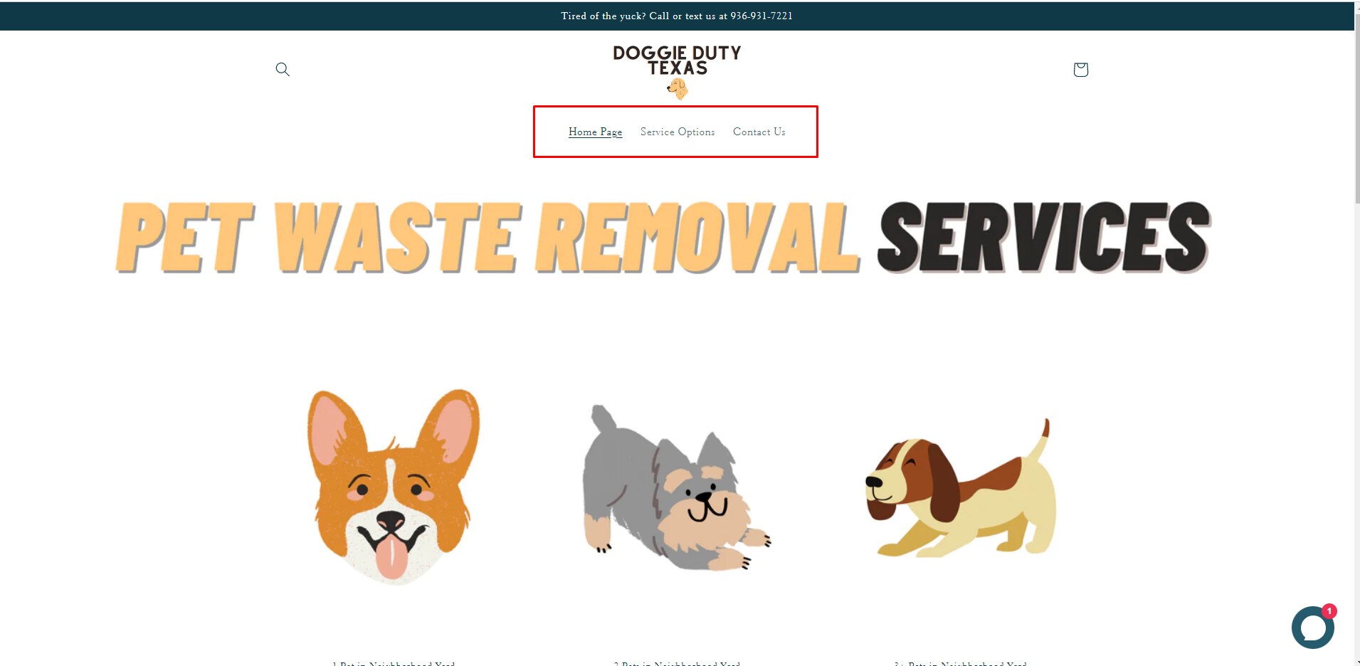
We checked your site and see that currently, on desktop or full-screen mode, it’s showing like the image below, without any dropdown.
We see that dropdown is only displayed on mobile:
This is completely normal because it’s your website’s responsive mode. Besides, you are editing in the editor and see the error, so we won’t be able to check it for you. If possible, please publish it. Then, we can check it on your site and help you fix the problem.