Hello,
i want to custimize controls on all my featured collections, i want the arrows to be on the side or somewhere in the level of heading with the view all button also. Please let me know if its posibble or tell me other options. Thank you for your help. 
https://81e325-28.myshopify.com/
0007
Add This css in your edit code > base.css file
.collection button.slider-button.slider-button--prev,.collection button.slider-button.slider-button--next {
    position: absolute;
    top: 30%;
    transform: translate(-50%, 0);
    z-index: 999;
}
.collection button.slider-button.slider-button--next{
    right: -5%;
}
.collection button.slider-button.slider-button--prev {
    left: 0;
}
.collection button.slider-button.slider-button--prev svg.icon.icon-caret,.collection button.slider-button.slider-button--next svg.icon.icon-caret {
    width: 30px;
    height: 30px;
}
.collection .slider-counter.caption {
    display: none;
}
@media screen and (max-width:767px){
    .collection button.slider-button.slider-button--prev {
        left: 5%;
    }
}
Hi Raj-webdesigner!
I had the same question as RadaApeta and came across your solution when looking for an answer.
I added your code to my base.css file but unfortunately had some problems with it. Is there any chance you would be able to help me with this?
The slider arrows works and looks great on our mobile layout but I can’t seem to get the arrows to work for my desktop layout. I can see just the edge of the left arrow when viewing the desktop layout fullscreen but I don’t see the right arrow at all. But then when I manually minimise the window on my desktop I can eventually see the right arrow too and then both arrows fully when the window keeps gets smaller/narrower.
How do I make both arrows visible when viewing our website on a desktop?
Many thanks for any help xx
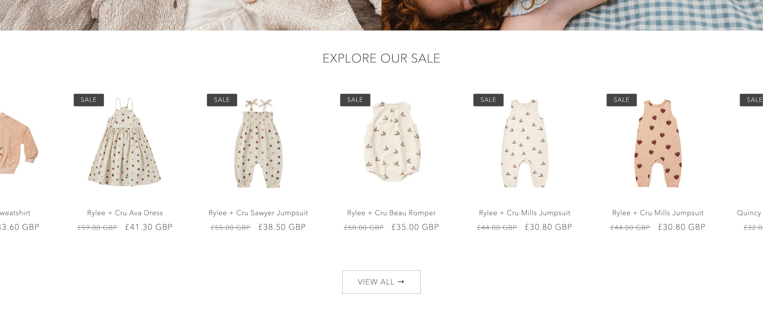
Desktop:
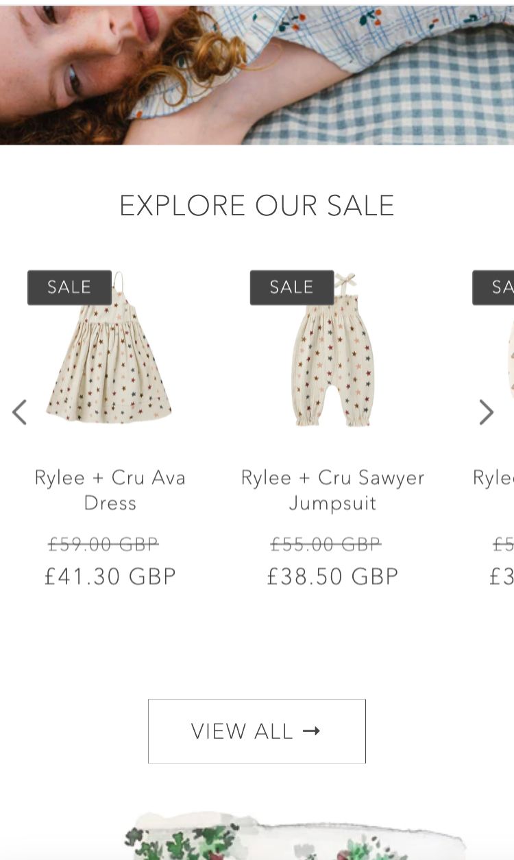
Desktop window is minimised halfway:
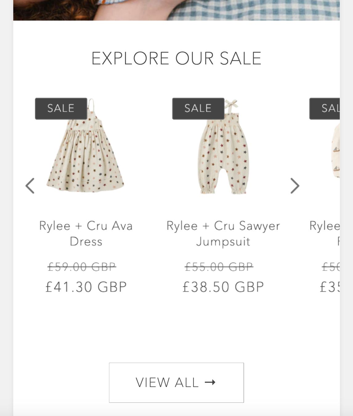
Mobile:
try This
.collection button.slider-button.slider-button--prev,.collection button.slider-button.slider-button--next {
    position: absolute;
    top: 30%;
    transform: translate(-50%, 0);
    z-index: 999;
}
.collection button.slider-button.slider-button--next{
    right: 2%;
}
.collection button.slider-button.slider-button--prev {
    left: 2%;
}
.collection button.slider-button.slider-button--prev svg.icon.icon-caret,.collection button.slider-button.slider-button--next svg.icon.icon-caret {
    width: 30px;
    height: 30px;
}
.collection .slider-counter.caption {
    display: none;
}
@media screen and (max-width:767px){
    .collection button.slider-button.slider-button--prev {
        left: 5%;
    }
}
1 Like
It works great for the desktop layout now, thank you so much!
But now we unfortunately have a small problem with the right arrow on the mobile layout. Both arrows moved a bit inwards compared to where they were before. I managed to move the left arrow to where we want it to be but I can’t figure out how to move the right arrow. What code would I need to move the right arrow for the mobile layout?
This is what it looks like now:
Many thanks for any help!
Okay add this
.collection button.slider-button.slider-button--prev,.collection button.slider-button.slider-button--next {
    position: absolute;
    top: 30%;
    transform: translate(-50%, 0);
    z-index: 999;
}
.collection button.slider-button.slider-button--next{
    right: 2%;
}
.collection button.slider-button.slider-button--prev {
    left: 2%;
}
.collection button.slider-button.slider-button--prev svg.icon.icon-caret,.collection button.slider-button.slider-button--next svg.icon.icon-caret {
    width: 30px;
    height: 30px;
}
.collection .slider-counter.caption {
    display: none;
}
1 Like
That worked perfectly! Thank you so much for all your help!