Hello we are looking for criticals for , reviews our store and tell us whats wrong here and why we not make sales , and wich sections its need improve for get a better and profesional store wich its a machine of money. please a bit help
Hi there, I’m Kate from PageFly - Shopify Landing Page Builder.
I love your website, the design looks really informative & majestic. It’s clear that you’ve put a lot of thought and effort into creating an online presence. From my Conversion Rate Optimization expertise, I would like to give you some suggestions regarding the store design to make the store more stunning and better convert.
General
Announcement bar: Making the announcement bar sticky will keep important messages visible. A well-designed announcement bar with countdown timer can highlight promotions and create urgency.
You can take this as a reference:
Homepage
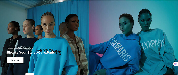
- Improve the hero banner image
The hero banner in the homepage is an important touchpoint to impress your customers when they first land on the site. Your current one is a bit confusing as the text and CTA button are made vague in the background.
Reference:
- Add About us section:
Visitors who land on your site for the first time might seek out who is behind the product, and why they should buy from you. So consider adding an About Us section to introduce your brand.
For example,
- Add Testimonials to your homepage
Testimonials are an important touch point especially with first time visitors. I understand your store is new but you still should consider adding a section on your product page to showcase them. Remember to add customer avatars & star rating to increase authenticity to testimonials and the chance to convert.
Reference:
- Add Featured product section
Showcase the best-selling or the featured product of your store on the homepage to catch the visitor’s attention right away. Remember to add an “Explore more” button to encourage them to keep exploring.
Product page
- Add a sticky Add to cart (ATC) button
It remains visible on the screen as users scroll through product details, images, and reviews. This reduces friction and ensures the call-to-action is always accessible, making it easier for shoppers to make a purchase decision without having to scroll back up.
Reference:
- Include Review/Testimonial section into your product page
I understand your store is new, but just a friendly-reminder, don’t forget reviews are essential to the shopping experience. You should add a testimonial section to build trust for your products’ quality. If there are not enough rating stars, consider using text & images to showcase feedback of your first orders.
Reference:
That’s all of my feedback. I hope it will increase your website’s conversion rate. Feel free to reach me in the reply section if you need further discussions. Wish you luck and endurance on your entrepreneurship journey!
Cheers,
Kate | PageFly Team
Hello @CalyxParis ! I’m Lindsey from BON Loyalty, the essential loyalty program for Shopify busineses.
I checked out your store and I can see you’re really putting in the work to build something solid — love the energy behind your message and your goal to turn it into a “money-making machine.” Here’s what I noticed that could be holding you back from making sales, and what I’d recommend improving:
1. Website speed & performance — first impressions matter
The homepage looks super stylish, no doubt about it. You’ve got a strong fashion vibe and a clean, modern layout. But the first thing I noticed is that the website feels a bit slow and laggy, especially because of the video banner at the top. It takes a few seconds to load, and the Spin-to-Win popup also delays a bit.
- Why this matters: Slow load = people drop off before even exploring your products. A slow or heavy homepage makes the store feel less professional, and that hurts trust (and conversions).
- Suggestion: Try switching to static images or optimizing your video for web performance. Make sure your popups are light and don’t block navigation right away.
2. Product pages — clean but missing conversion triggers
Your product pages are visually strong — good model photos, layout, and styling. But there are two things to work on:
- You’re using a lot of motion and transitions, which can feel a bit distracting. Too many animations can overwhelm visitors, especially when they just want to focus on buying.
- There are no product reviews. This is a big one. Reviews help build social proof, which is super important for turning visitors into buyers — especially when you’re a newer brand.
Start collecting reviews (even a few per product is better than none). Consider adding a “Top Rated” or “Customer Favorites” section to highlight bestsellers.
3. Branding — needs more personality
Right now, the store looks clean and modern, but the branding feels a little too generic. The logo, fonts, and color scheme don’t clearly express what Calyx paris is about.
- Are you aiming for bold streetwear? Minimal Parisian fashion? Premium basics? If I can’t tell within 10 seconds what makes your brand special, that’s a missed opportunity.
- Think about how you can tell your story better — maybe through an About section, storytelling banners, or product naming. Bring out what makes you different.
You’re definitely on the right track. You’ve already nailed some key parts like layout and visual identity. With a few tweaks to speed, product trust, and brand messaging, you can take this to the next level. Keep pushing forward, and don’t hesitate to drop more questions here if you need help with anything specific. I am happy to help! ![]()
![]()
Best,
Lindsey
Hi @CalyxParis ,
Thanks for reaching out to the community. We are MooseDesk, a comprehensive Live Chat, FAQ & Helpdesk App designed to elevate your customer support experience.
Congrats on your new store! It looks amazing with a consistent brand style. I just wanted to give a few more comments to make your website look even better. Please kindly check
1. Add date delivery to check out page
Offering a firm delivery date can set you apart from competitors who only provide estimates, potentially influencing purchasing decisions.
Also, customers can plan around a definite date, which is especially important for time-sensitive purchases like gifts or event-related items.
Arrives “April 10th to April 14th” is still better than “3-7 Business Days”
2. Make these icons clickable
Clickable icons can increase engagement and conversions by providing a clear path to the desired explanation.
I suggest that you link these icons to a suitable landing page, which provides visitors with more detailed information. For example:
- “Unmatch quality” can link to a blog post to showcase your product materials in detail
- “Worn by trendsetters” can open your Instagram account to see more influencers wearing your product
3. Add a search bar to your FAQ page
A search bar will help your customers find relevant information quickly without having to scroll down all the way to the bottom.
I suggest exploring MooseDesk App - a free Live Chat, FAQ & Helpdesk. MooseDesk provides auto-reply features during non-business hours, a proactive help center, and a user-friendly widget layout, offering an effective solution to enhance customer support on your platform.
—
As an expert/enthusiast in UX, I recommend implementing these changes to improve customer experience when scrolling through your store.
If this is helpful for you, please let me know by giving me a ‘LIKE’. If your question is answered please mark this as 'SOLUTION’.
Thank you for reading. Wish you a nice day ahead!
MooseDesk - All-in-one Shopify FAQ & Helpdesk App
Aright we instaled it , please re-check our store and give us a new feedback please
Done it sir , we did some changes on here , are you amable for re-check our store and tell us what think now?
Hi kate , done we make your changes sugerated , are you amable for re-check our store and give us a new feedback?
Hello @CalyxParis
I found one situation when accessing your store homepage, it seems like some review contents are the same as each other and it may leave visitors a bad impression, as they will be suspected as fake reviews. If available, please kindly correct this part and make it more professional, a kind reminder here!


