Hero banner differnt video on Mobile/desktop

Hello, Is it possible to show a different Hero banner video on Mobile/desktop. Using the new Shopify Savor theme.

I have used the slideshow banner code but does not work in the custom css.

@media (max-width: 749px) {
hero-component {
display: none !important;
}
}

Any idea, thanks

  1. Go to Online Store → Theme → Edit code.
  2. Open your theme.css / based.css file and paste the code in the bottom of the file.
.hero-video-mobile { display: none; }

@media (max-width: 749px) {
  .hero-video-desktop { display: none !important; }
  .hero-video-mobile { display: block !important; }
}

Thank you, unfortunately this hasn’t worked. I am using two hero sections, one for mobile and one for desktop. i need them to show on different screen sizes.

Please share the website URL. @DASCPA

Hi @DASCPA , kindly provide your store URL please and if it is password protected, please share the password as well. Thanks

1 Like

hi https://www.formafinalis.com/ password: JSFF25

hi https://www.formafinalis.com/?pb=0 password: JSFF25

Hello @DASCPA

Yes, it’s absolutely possible to show a different Hero banner video for mobile and desktop on the Shopify Savor theme, but there are a few important things to keep in mind:

Why Your Current Code Isn’t Working:- The hero-component is likely a custom element (not a valid CSS selector unless properly defined).

  • Also, Shopify themes often use dynamic components and lazy loading, so hiding elements with CSS alone might not always behave as expected.

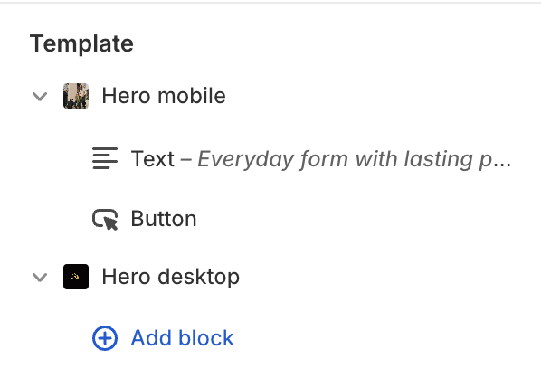
Recommended Approach:1. Use two separate hero sections in the theme code:

  • One for desktop (video optimized for larger screens)

  • One for mobile (lighter video or image to improve speed)

  1. Wrap each section with media query logic in Liquid or use class=“hidden” utility classes combined with media-specific CSS.

Example using Shopify’s Liquid + CSS:

{% if request.device_type == 'mobile' %}
  <!-- Mobile Hero -->
  <div class="mobile-hero">
    <video autoplay muted loop playsinline>
      <source src="{{ 'mobile-video.mp4' | asset_url }}" type="video/mp4">
    </video>
  </div>
{% else %}
  <!-- Desktop Hero -->
  <div class="desktop-hero">
    <video autoplay muted loop>
      <source src="{{ 'desktop-video.mp4' | asset_url }}" type="video/mp4">
    </video>
  </div>
{% endif %}
  1. Alternatively, use CSS classes to show/hide each video:
.desktop-hero {
  display: block;
}
.mobile-hero {
  display: none;
}

@media (max-width: 749px) {
  .desktop-hero {
    display: none !important;
  }
  .mobile-hero {
    display: block !important;
  }
}

Let me know if you have any questions!

1 Like
  1. Go to Online Store → Theme → Edit code.
  2. Open your theme.css / based.css file and paste the code in the bottom of the file.
.hero__media-wrapper video:first-of-type {
  display: block;
}

.hero__media-wrapper video:last-of-type {
  display: none;
}

@media (max-width: 749px) {
  .hero__media-wrapper video:first-of-type {
    display: none !important;
  }
  .hero__media-wrapper video:last-of-type {
    display: block !important;
  }
}
1 Like

i have attepmted this and both vidoes are showing on both screens, am i muissing something? i have added your css

Hi @DASCPA

  1. Go to Online Store → Theme → Edit code.
  2. Replace your video tag code with this code.

/* Hide mobile video by default */
.video-mobile {
  display: none;
}

If my reply is helpful, kindly click like and mark it as an accepted solution.
Thanks!