Per title, the new Horizon theme has a menu feature where it can show Featured Collections. However, I notice that it automatically selects the first two collections only and doesn’t let me select the collections manually. Does anyone know some custom code to be able to select the collections manually? I’d really appreciate it.
Topic summary
Issue: The Horizon theme’s menu automatically displays only the first two collections as featured items, with no built-in option to manually select which collections appear.
Initial Solutions:
- Reordering menu items works but isn’t practical when wanting to feature new collections without restructuring the entire menu
- CSS workarounds to hide first items were suggested but deemed complex
Working Solution (by wo):
A custom code modification enables manual collection selection:
-
Code changes required:
- Modify
_header-menu.liquidto add a toggle setting - Update
mega-menu-list.liquidto check for custom featured collections before defaulting to first two items - Uses collection metafields to store featured collection selections
- Modify
-
Setup process:
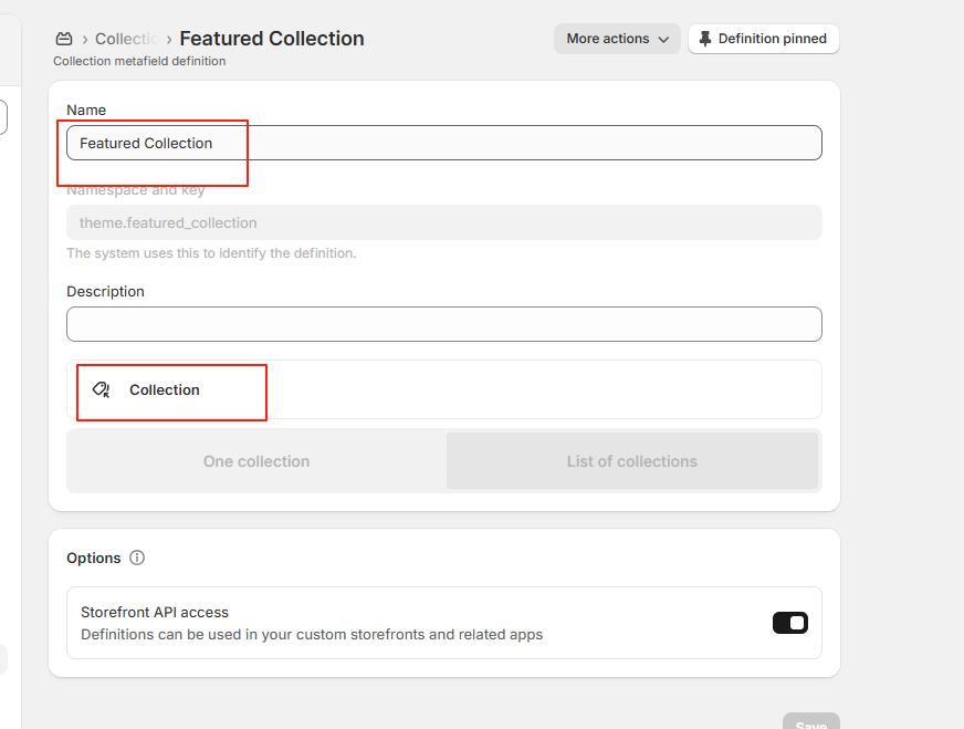
- Add collection metafields in Shopify Settings
- Create a “featured_collection” metafield (list of collections)
- Assign desired collections via metafields to the first collection in each menu dropdown
Current Status: Solution confirmed working. The latest iteration (post #12) uses metafields to allow different featured collections per menu dropdown, addressing the requirement to customize featured collections for each category (e.g., different selections for CLOTHING vs SPORTS menus).


The theme pulls them from the Menu, first 2 menu items are shown as collection cards.
So maybe you can simply re-order your menu items?
I was thinking that maybe you can hide 2 first menu items with CSS, but on narrow desktop it shows only one collection, so the CSS rule can be complex’ish:
li:first-child:has(.mega-menu__link[href*="/collections/"]) {
  display: none;
}

@media screen and (width > 990px) {
  li:nth-child(2):has(.mega-menu__link[href*="/collections/"]) {
    display: none;
  }
}
Hi Tim, thank you for your response.
I actually thought about reordering the menu items already, but say when we have a new collection or so we’d like for it to be featured instead of having to reorder the items.
find _header-menu.liquid, add code.

find mega-menu-list.liquid, replace code.

{% assign collection_handles = collection_handles | split: ',' | uniq %}


        {% if block.settings.featured_collections != blank %}
           {% for handle in block.settings.featured_collections limit: max_featured_collections %}
          {% # todo: ensure the hidden iamge assets don't get lazy loaded initially %}
          - {% render 'resource-card',
                resource: handle,
                resource_type: 'collection',
                style: 'overlay',
                image_width: 600,
                image_aspect_ratio: content_aspect_ratio
              %}


        {% endfor %}
          {% else %}
          {% for handle in collection_handles limit: max_featured_collections %}
          {% # todo: ensure the hidden iamge assets don't get lazy loaded initially %}
          - {% render 'resource-card',
                resource: collections[handle],
                resource_type: 'collection',
                style: 'overlay',
                image_width: 600,
                image_aspect_ratio: content_aspect_ratio
              %}

        {% endfor %}
        {% endif %}

Hi @wo , thank you so much for your response. Correct me if I’m wrong, but your code is supposed to let me choose two featured collections, and lock it, right? So in my website, if I select two featured collections for CLOTHING, they’ll also show in the other dropdowns?
Is it possible to select the featured collections for each dropdown as well? For example, for CLOTHING I want these two featured collections, and for SPORTS, I want two other featured collections.
In this case, you need to modify it to use the collection metafields. Modify the code and set the metafields corresponding to the collection of the menu item. and the value of the metafields is the collection you want to display.
Hi Wo,
This worked to perfection. However, when it is displayed on desktop. It is not in the original position as before. It appears vertical instead of horizontal and orientated to the right. Can you help me with this? I just want it to be as it originally was but now with the selected collections. Thank you for all your help!
Can you post your modified code?
{%- doc -%}
Renders mega menu list markup and optional featured content.
@param_1 {object} parent_link - The linklist to render.
@param_1 {string} id - Unique ID to assign to the <ul> element.
@param_1 {number} [grid_columns_count] - Number of grid columns for the mega menu.
@param_1 {number} [grid_columns_count_tablet] - Number of grid columns for the mega menu on tablets.
@param_1 {number} [grid_columns_count_collection_images] - Number of grid columns when menu_content_type is ‘collection_images’.
@param_1 {string} [menu_content_type] - Type of content: ‘featured_products’, ‘featured_collections’, ‘collection_images’, or ‘text’.
@param_1 {number} [content_aspect_ratio] - Aspect ratio for content images.
@param_1 {number} [image_border_radius] - Border radius for content images.
@example
{% render ‘mega-menu-list’, parent_link: link, id: ‘MegaMenuList-1’, grid_columns_count: 6, menu_content_type: ‘featured_products’ %}
{%- enddoc -%}
{% liquid
comment
open_column_span tracks when a vertical column in the mega menu is open. Links will be stacked
in the column until the code closes the column span.
endcomment
assign open_column_span = false
assign column_count = 0
assign links_before_wrap = 10
assign max_menu_columns = grid_columns_count | default: 6
assign max_menu_columns_tablet = grid_columns_count_tablet | default: 4
if menu_content_type == ‘collection_images’
assign collection_links = parent_link.links | where: ‘type’, ‘collection_link’
if collection_links.size != parent_link.links.size
assign menu_content_type = ‘text’
endif
endif
if menu_content_type == ‘featured_collections’
if parent_link.type == ‘collection_link’
assign collection_handles = parent_link.object.handle | append: ‘,’
endif
assign collection_links = parent_link.links | where: ‘type’, ‘collection_link’
for collection_link in collection_links
assign collection_handles = collection_handles | append: collection_link.object.handle | append: ‘,’
endfor
endif
if menu_content_type == ‘featured_products’
if parent_link.type == ‘collection_link’
assign collection_object = parent_link.object
else
assign menu_content_type = ‘text’
endif
endif
%}
-
{% for link in parent_link.links %}
{% liquid
# Decide whether to open a column span, and how many columns of the grid to span
if forloop.first or open_column_span == false
assign open_column_span = true
- ’
endif
%}{% if menu_content_type == 'collection_images' %} {{ link.object.featured_image | image_url: width: 1024 | image_tag: loading: 'lazy', class: 'mega-menu__link-image', sizes: 'auto' }} {% endif %} {{- link.title -}} {% if link.links != blank %}-
{% for childLink in link.links %}
{% assign break_after_modulo = forloop.index | modulo: links_before_wrap %}
- {{- childLink.title -}} {% endfor %}
{% liquid
Check conditions for closing the span at the end of each iteration, then close the span if needed
assign next_linklist = parent_link.links[forloop.index]
if forloop.last
assign open_column_span = false
elsif menu_content_type == ‘collection_images’
assign open_column_span = false
elsif next_linklist.links != blank
assign open_column_span = false
elsif link.links != blank and next_linklist.links == blank
assign open_column_span = false
endifif open_column_span == false
echo ‘ ’
Don’t allow orphan links in a column
assign break_after_modulo = link.links.size | modulo: links_before_wrap
if break_after_modulo == 1
assign links_before_wrap = links_before_wrap | minus: 1
endif
assign break_after_float = links_before_wrap | times: 1.0
assign column_span = link.links.size | divided_by: break_after_float | ceil | at_least: 1
assign column_count = column_count | plus: column_span
assign should_break_columns = true
assign span_class = ‘mega-menu__column mega-menu__column–span-’ | append: column_span
if menu_content_type == ‘collection_images’
assign should_break_columns = false
temporary fix to use 8 column grid (spanning 2) when fewer than 5 collection image links
if parent_link.links.size < 5
assign span_class = span_class | append: ’ mega-menu__column–collection-image’
endif
endif
echo ‘
endif
%}
{% endfor %}
{% liquid
decide how many grid columns are needed for the menu list, and how many columns are needed for the featured content
prioritize a minimum of 1 featured_collection (2 columns), and minimum 2 featured_products (2 columns)
assign min_products = 2
assign max_products = 3
assign min_products_tablet = 1
assign max_products_tablet = 3
assign min_collections = 1
if menu_content_type == ‘featured_products’
desktop breakpoint
assign temp_column_count = column_count | plus: min_products
if temp_column_count > max_menu_columns
assign max_product_columns = 2
else
assign max_product_columns = max_menu_columns | minus: column_count | at_most: max_products
endif
assign max_product_columns = max_product_columns | at_most: collection_object.products.size
assign max_featured_products = max_product_columns
assign max_menu_columns = max_menu_columns | minus: max_product_columns
tablet breakpoint
assign temp_column_count = column_count | plus: min_products_tablet
if temp_column_count > max_menu_columns_tablet
assign max_product_columns_tablet = 1
else
assign max_product_columns_tablet = max_menu_columns_tablet | minus: column_count | at_most: max_products_tablet
endif
assign max_product_columns_tablet = max_product_columns_tablet | at_most: collection_object.products.size
assign max_featured_products_tablet = max_product_columns_tablet
assign max_menu_columns_tablet = max_menu_columns_tablet | minus: max_product_columns_tablet
endif
if menu_content_type == ‘featured_collections’
desktop breakpoint
assign min_featured_collection_columns = min_collections | times: 2
assign temp_column_count = column_count | plus: min_featured_collection_columns
if temp_column_count > max_menu_columns
assign max_collection_columns = 2
else
assign max_collection_columns = max_menu_columns | minus: column_count
endif
assign max_featured_collections = max_collection_columns | divided_by: 2 | floor
assign max_menu_columns = max_menu_columns | minus: max_collection_columns
tablet breakpoint
assign max_collection_columns_tablet = 2
assign max_featured_collections_tablet = 1
assign max_menu_columns_tablet = max_menu_columns_tablet | minus: max_collection_columns_tablet
endif
%}
{% style %}
[data-menu-grid-id=“{{ id }}”] {
{% if menu_content_type == ‘collection_images’ and parent_link.links.size < 5 %}
–menu-columns-desktop: {{ grid_columns_count_collection_images }};
–menu-columns-tablet: {{ grid_columns_count_tablet }};
{% else %}
–menu-columns-desktop: {{ grid_columns_count }};
–menu-columns-tablet: {{ grid_columns_count_tablet }};
{% endif %}
}
[data-menu-list-id=“{{ id }}”] {
{% if menu_content_type == ‘collection_images’ and parent_link.links.size < 5 %}
–menu-columns-desktop: {{ grid_columns_count_collection_images }};
–menu-columns-tablet: {{ max_menu_columns_tablet }};
{% else %}
–menu-columns-desktop: {{ max_menu_columns }};
–menu-columns-tablet: {{ max_menu_columns_tablet }};
{% endif %}
}
{% endstyle %}
{% case menu_content_type %}
{% when ‘featured_products’ %}
<span
class=“mega-menu__content”
style=“–menu-content-columns-desktop: {{ max_product_columns }}; --menu-content-columns-tablet: {{ max_product_columns_tablet }}; --resource-card-corner-radius: {{ image_border_radius }}px;”
-
{% paginate collection_object.products by max_featured_products %}
{% for item in collection_object.products %}
- {% render 'resource-card', resource: item, resource_type: 'product', image_hover: true, image_aspect_ratio: content_aspect_ratio %} {% endfor %} {% endpaginate %}
-
{% for handle in collection_handles limit: max_featured_collections %}
- {% render 'resource-card', resource: collections[handle], resource_type: 'collection', style: 'overlay', image_aspect_ratio: content_aspect_ratio %} {% endfor %}
{% endcase %}
Where did you modify?
Apologies Wo. I forgot I removed it before I replied to this. Here is the updated code with the modification:
{%- doc -%}
Renders mega menu list markup and optional featured content.
@param_1 {object} parent_link - The linklist to render.
@param_1 {string} id - Unique ID to assign to the <ul> element.
@param_1 {number} [grid_columns_count] - Number of grid columns for the mega menu.
@param_1 {number} [grid_columns_count_tablet] - Number of grid columns for the mega menu on tablets.
@param_1 {number} [grid_columns_count_collection_images] - Number of grid columns when menu_content_type is ‘collection_images’.
@param_1 {string} [menu_content_type] - Type of content: ‘featured_products’, ‘featured_collections’, ‘collection_images’, or ‘text’.
@param_1 {number} [content_aspect_ratio] - Aspect ratio for content images.
@param_1 {number} [image_border_radius] - Border radius for content images.
@example
{% render ‘mega-menu-list’, parent_link: link, id: ‘MegaMenuList-1’, grid_columns_count: 6, menu_content_type: ‘featured_products’ %}
{%- enddoc -%}
{% liquid
comment
open_column_span tracks when a vertical column in the mega menu is open. Links will be stacked
in the column until the code closes the column span.
endcomment
assign open_column_span = false
assign column_count = 0
assign links_before_wrap = 10
assign max_menu_columns = grid_columns_count | default: 6
assign max_menu_columns_tablet = grid_columns_count_tablet | default: 4
if menu_content_type == ‘collection_images’
assign collection_links = parent_link.links | where: ‘type’, ‘collection_link’
if collection_links.size != parent_link.links.size
assign menu_content_type = ‘text’
endif
endif
if menu_content_type == ‘featured_collections’
if parent_link.type == ‘collection_link’
assign collection_handles = parent_link.object.handle | append: ‘,’
endif
assign collection_links = parent_link.links | where: ‘type’, ‘collection_link’
for collection_link in collection_links
assign collection_handles = collection_handles | append: collection_link.object.handle | append: ‘,’
endfor
endif
if menu_content_type == ‘featured_products’
if parent_link.type == ‘collection_link’
assign collection_object = parent_link.object
else
assign menu_content_type = ‘text’
endif
endif
%}
-
{% for link in parent_link.links %}
{% liquid
# Decide whether to open a column span, and how many columns of the grid to span
if forloop.first or open_column_span == false
assign open_column_span = true
- ’
endif
%}{% if menu_content_type == 'collection_images' %} {{ link.object.featured_image | image_url: width: 1024 | image_tag: loading: 'lazy', class: 'mega-menu__link-image', sizes: 'auto' }} {% endif %} {{- link.title -}} {% if link.links != blank %}-
{% for childLink in link.links %}
{% assign break_after_modulo = forloop.index | modulo: links_before_wrap %}
- {{- childLink.title -}} {% endfor %}
{% liquid
Check conditions for closing the span at the end of each iteration, then close the span if needed
assign next_linklist = parent_link.links[forloop.index]
if forloop.last
assign open_column_span = false
elsif menu_content_type == ‘collection_images’
assign open_column_span = false
elsif next_linklist.links != blank
assign open_column_span = false
elsif link.links != blank and next_linklist.links == blank
assign open_column_span = false
endifif open_column_span == false
echo ‘ ’
Don’t allow orphan links in a column
assign break_after_modulo = link.links.size | modulo: links_before_wrap
if break_after_modulo == 1
assign links_before_wrap = links_before_wrap | minus: 1
endif
assign break_after_float = links_before_wrap | times: 1.0
assign column_span = link.links.size | divided_by: break_after_float | ceil | at_least: 1
assign column_count = column_count | plus: column_span
assign should_break_columns = true
assign span_class = ‘mega-menu__column mega-menu__column–span-’ | append: column_span
if menu_content_type == ‘collection_images’
assign should_break_columns = false
temporary fix to use 8 column grid (spanning 2) when fewer than 5 collection image links
if parent_link.links.size < 5
assign span_class = span_class | append: ’ mega-menu__column–collection-image’
endif
endif
echo ‘
endif
%}
{% endfor %}
{% liquid
decide how many grid columns are needed for the menu list, and how many columns are needed for the featured content
prioritize a minimum of 1 featured_collection (2 columns), and minimum 2 featured_products (2 columns)
assign min_products = 2
assign max_products = 3
assign min_products_tablet = 1
assign max_products_tablet = 3
assign min_collections = 1
if menu_content_type == ‘featured_products’
desktop breakpoint
assign temp_column_count = column_count | plus: min_products
if temp_column_count > max_menu_columns
assign max_product_columns = 2
else
assign max_product_columns = max_menu_columns | minus: column_count | at_most: max_products
endif
assign max_product_columns = max_product_columns | at_most: collection_object.products.size
assign max_featured_products = max_product_columns
assign max_menu_columns = max_menu_columns | minus: max_product_columns
tablet breakpoint
assign temp_column_count = column_count | plus: min_products_tablet
if temp_column_count > max_menu_columns_tablet
assign max_product_columns_tablet = 1
else
assign max_product_columns_tablet = max_menu_columns_tablet | minus: column_count | at_most: max_products_tablet
endif
assign max_product_columns_tablet = max_product_columns_tablet | at_most: collection_object.products.size
assign max_featured_products_tablet = max_product_columns_tablet
assign max_menu_columns_tablet = max_menu_columns_tablet | minus: max_product_columns_tablet
endif
if menu_content_type == ‘featured_collections’
desktop breakpoint
assign min_featured_collection_columns = min_collections | times: 2
assign temp_column_count = column_count | plus: min_featured_collection_columns
if temp_column_count > max_menu_columns
assign max_collection_columns = 2
else
assign max_collection_columns = max_menu_columns | minus: column_count
endif
assign max_featured_collections = max_collection_columns | divided_by: 2 | floor
assign max_menu_columns = max_menu_columns | minus: max_collection_columns
tablet breakpoint
assign max_collection_columns_tablet = 2
assign max_featured_collections_tablet = 1
assign max_menu_columns_tablet = max_menu_columns_tablet | minus: max_collection_columns_tablet
endif
%}
{% style %}
[data-menu-grid-id=“{{ id }}”] {
{% if menu_content_type == ‘collection_images’ and parent_link.links.size < 5 %}
–menu-columns-desktop: {{ grid_columns_count_collection_images }};
–menu-columns-tablet: {{ grid_columns_count_tablet }};
{% else %}
–menu-columns-desktop: {{ grid_columns_count }};
–menu-columns-tablet: {{ grid_columns_count_tablet }};
{% endif %}
}
[data-menu-list-id=“{{ id }}”] {
{% if menu_content_type == ‘collection_images’ and parent_link.links.size < 5 %}
–menu-columns-desktop: {{ grid_columns_count_collection_images }};
–menu-columns-tablet: {{ max_menu_columns_tablet }};
{% else %}
–menu-columns-desktop: {{ max_menu_columns }};
–menu-columns-tablet: {{ max_menu_columns_tablet }};
{% endif %}
}
{% endstyle %}
{% case menu_content_type %}
{% when ‘featured_products’ %}
<span
class=“mega-menu__content”
style=“–menu-content-columns-desktop: {{ max_product_columns }}; --menu-content-columns-tablet: {{ max_product_columns_tablet }}; --resource-card-corner-radius: {{ image_border_radius }}px;”
-
{% paginate collection_object.products by max_featured_products %}
{% for item in collection_object.products %}
- {% render 'resource-card', resource: item, resource_type: 'product', image_hover: true, image_aspect_ratio: content_aspect_ratio %} {% endfor %} {% endpaginate %}
-
{% if block.settings.featured_collections != blank %}
{% for handle in block.settings.featured_collections limit: max_featured_collections %}
{% # todo: ensure the hidden iamge assets don't get lazy loaded initially %}
- {% render 'resource-card', resource: handle, resource_type: 'collection', style: 'overlay', image_width: 600, image_aspect_ratio: content_aspect_ratio %} {% endfor %} {% else %} {% for handle in collection_handles limit: max_featured_collections %} {% # todo: ensure the hidden iamge assets don't get lazy loaded initially %}
- {% render 'resource-card', resource: collections[handle], resource_type: 'collection', style: 'overlay', image_width: 600, image_aspect_ratio: content_aspect_ratio %} {% endfor %} {% endif %}
{% endcase %}
Because the theme version is different, the code structure is slightly different. The following is the correct code. At the same time, I modified the original code to better meet your needs.
Horizon Version 1.0.5
mega-menu-list.liquid
{% assign collection_handles = collection_handles | split: ',' | uniq %}


      {% if block.settings.enable_featured_collections %}
        {% assign link_collection_handle = collections[collection_handles.first] %}
        {% assign featured_collection = link_collection_handle.metafields.theme.featured_collection.value  %}
        {% for handle in featured_collection limit: max_featured_collections %}
        {% # todo: ensure the hidden iamge assets don't get lazy loaded initially %}
        - {% render 'resource-card',
              resource: handle,
              resource_type: 'collection',
              style: 'overlay',
              image_width: 600,
              image_aspect_ratio: content_aspect_ratio
            %}


        {% endfor %}
        {% else %}
        {% for handle in collection_handles limit: max_featured_collections %}
          - {% render 'resource-card',
                resource: collections[handle],
                resource_type: 'collection',
                style: 'overlay',
                image_aspect_ratio: content_aspect_ratio
              %}

        {% endfor %}
        {% endif %}

_header-menu.liquid

then, find Settings, add collection metafields.


Finally, select the collection you want to display in the first collection in your menu

