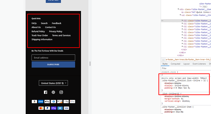
Hi Everyone,
Someone please help me adjust the footer menu on the mobile view to look like the desktop view. I have tried most of the solved suggestions on here to no avail. Thanks in advance.
J & M Multi Services Boutique™ | Fashion Online for Men and Women (jmmultiservicesboutique.com)
Desktop
Mobile
Thank you,
J&M Multi
Please add below css in bottom of assets/base.css file
@media only screen and (max-width: 749px)
.site-footer__linklist.list–inline > li {
padding: 10px 10px;
}
@media only screen and (max-width: 749px)
ul.site-footer__linklist.list–inline {
display: flex;
flex-wrap: wrap;
}
Thank you.
Hi @jmmultiservices
For mobile footer view same as like desktop you need to add following CSS in - theme.css file:
@media only screen and (max-width: 749px){
  .site-footer__linklist.list--inline > li{
    display: inline-block;
    padding: 0 30px 5px 0;
  }
}
When you add above CSS it will look like this:
I also found that there is some horizontal scrolling in page so you need to add following CSS in - theme.css file:
@media (max-width: 750px){
  .locale-selectors__content{
    margin: 0 auto !important;
  }
}
When you add above CSS it will look like this:
Thank you.


