Hello,
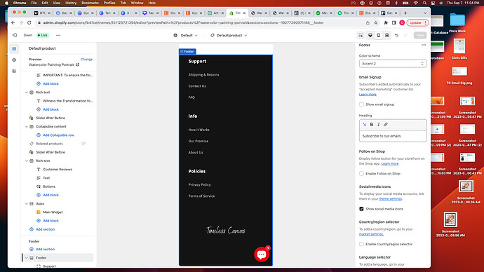
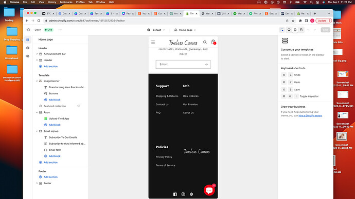
I want to change my footer menu on my mobile view. It looks ridiculous all spread out vertically. I want to adjust it to look like the desktop view or something a lot cleaner. I have attached a screenshots of what it looks like right now and what my desktop looks like.
suyash1
September 8, 2023, 3:15am
2
@MrGolfer - it is set vertically to avoid squeezing of menus, if you want then it can be done 2 column, can you share your page link?
How about drop down menus instead?
suyash1
September 8, 2023, 3:21am
7
@MrGolfer - please add this css to the very end of your base.css file and check
@media screen and (max-width: 749px){
.footer-block.grid__item {width: 50% !important; display: inline-block;}
}
1 Like
a little better. Can I do drop down?
suyash1
September 8, 2023, 3:25am
9
@MrGolfer - drop down will need a lot of coding changes, in that case I recommend to ask theme support if they can help for it
1 Like
Hello @MrGolfer
You can add some CSS code to split it to 2 columns.
About dropdown, it is not a standard pattern in modern websites nowadays.
Thank you for your advice. Any ideas? We changed it to 2 columns, but I don’t like it still.


