Hello All,
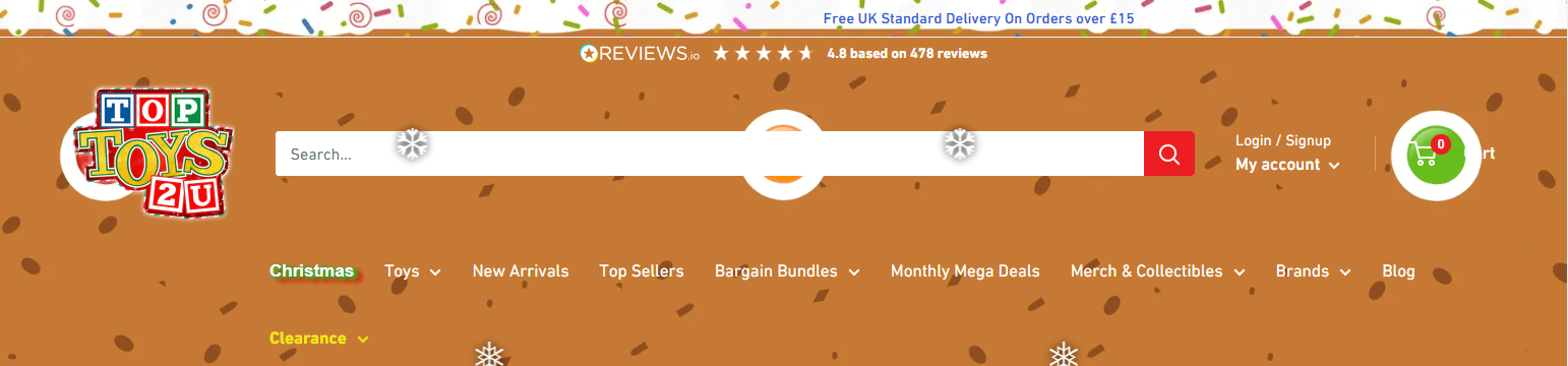
I would like to find out how to align the text to the center on the announcement bar.
For some reason it seems to work on pages without an image in the background, but if there is an image on the announcement bar, the text does not align correctly on displays with less than 1920x1080.
I have added some code onto the announcement bar asset on theme.css, but the changes do not go through unfortunately.
Please see the screenshots for reference.
The code I have added so far is here
.announcement-bar {
  position: relative;
  display: block;
  font-weight: var(--text-font-bolder-weight);
  font-size: calc(var(--base-text-font-size) - (var(--default-text-font-size) - 12px));
  border-bottom: 1px solid var(--header-border-color);
  text-align: center !important;
}
.announcement-bar__content {
  display: block;
  padding: 4px 0;
  margin-bottom: 0;
  text-align: center !important;
}
.announcement-bar__content--center {
  text-align: center !important;
}
@media screen and (max-width: 640px) {
  .announcement-bar__inner {
    text-align: center !important; /* Always centered on mobile no matter the setting */

  }
}
@media screen and (min-width: 641px) {
  .announcement-bar {
    font-size: calc(var(--base-text-font-size) - (var(--default-text-font-size) - 14px));
    text-align: left;
  }
  .announcement-bar__inner {
    display: flex;
    align-items: center;
  }
Would anyone be able to help with centering the text?
The website can be found here: https://toptoys2u.co.uk/
Appreciate any help!
Hi @Toptoys2uHS
It seems you have added css to your theme but it is not working yet. I will guide you through editing the code without deleting any code you added previously. You can follow these steps to put text in the middle of the banner:
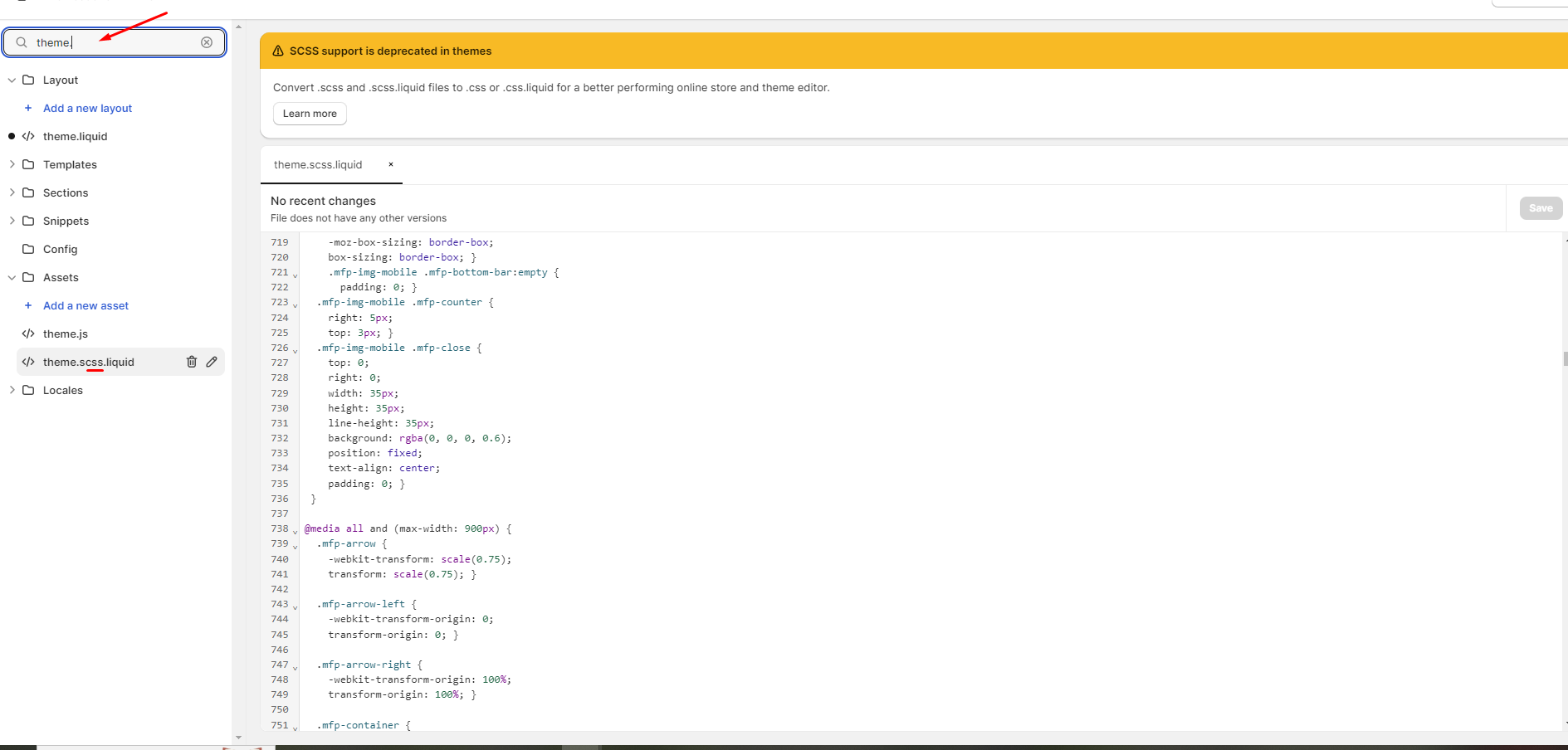
Step 1: Open Online Store → click edit code.
- Step 2: Enter in the search box “theme” → Search results have the file name theme and extension .css → Click to open the file
- Step 3: Scroll to the end of the file and add the following code:
.announcement-bar{
background-image: url(https://cdn.shopify.com/s/files/1/1779/2423/files/Christmas_Gingerbread_Announcement_Bar.webp?v=1699262767) !important;
background-repeat: no-repeat ;
}
.announcement-bar .announcement-bar__inner{
background: none;
}
.announcement-bar__content–center{
display: inline !important;
background: none !important;
}
→ Click save you will get results like this:
Hope it helps @Toptoys2uHS !
Hello @BSS-Commerce ,
Thank you for your reply.
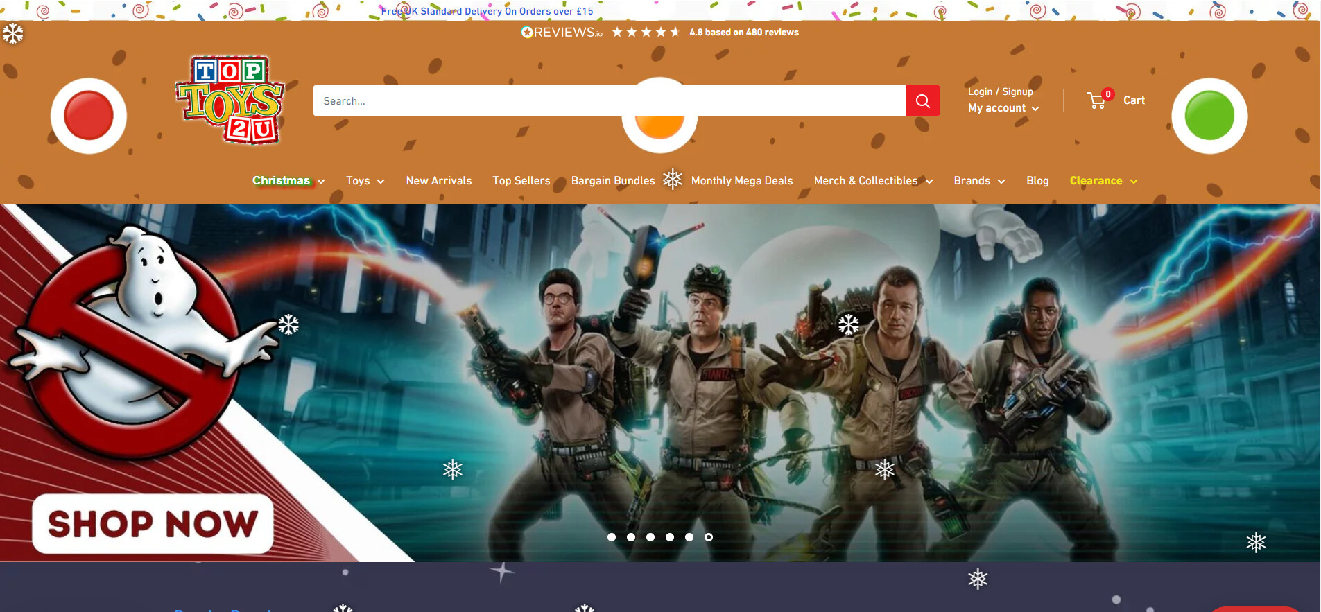
I have copy and pasted the code into the bottom of theme.css as you have instructed, however this unfortunately makes no change when viewing in “Macbook” dimensions, and stops center alignment when viewing in current dimension (1920x1080)
Please see the screenshots below for reference.
Before Code
After code
Would I need to delete any of this code or replace it in order for it to work?
/**
 * --------------------------------------------------------------------
 * ANNOUNCEMENT BAR
 * --------------------------------------------------------------------
 */

.announcement-bar {
  position: relative;
  display: block;
  font-weight: var(--text-font-bolder-weight);
  font-size: calc(var(--base-text-font-size) - (var(--default-text-font-size) - 12px));
  border-bottom: 1px solid var(--header-border-color);
  text-align: center !important;
}

.announcement-bar__content {
  display: block;
  padding: 4px 0;
  margin-bottom: 0;
  text-align: center !important;
}

.announcement-bar__content--center {
  text-align: center !important;
}

@media screen and (max-width: 640px) {
  .announcement-bar__inner {
    text-align: center !important; /* Always centered on mobile no matter the setting */

  }
}

@media screen and (min-width: 641px) {
  .announcement-bar {
    font-size: calc(var(--base-text-font-size) - (var(--default-text-font-size) - 14px));
    text-align: left;
  }

  .announcement-bar__inner {
    display: flex;
    align-items: center;
  }

  .announcement-bar__content {
    padding: 7px 0;
    margin-right: auto;
  }

  .announcement-bar__content--center {
    margin-left: auto;
    padding-left: 0px;
    padding-left: var(--announcement-bar-button-width, 0px); /* We have to shift by the button width to center visually */
  }

  .announcement-bar__button {
    padding: 7px 18px 7px 15px;
    background: var(--header-accent-color);
    color: var(--secondary-background);
    box-shadow: 0 1px var(--header-accent-color);
  }

  .announcement-bar__button svg {
    display: inline-block;
    width: 20px;
    height: 17px;
    margin-right: 12px;
    vertical-align: text-bottom;
  }

  .announcement-bar__close-container {
    position: relative;
  }

  .announcement-bar__close {
    position: absolute;
    top: 25px;
    right: 0;
    color: var(--heading-color);
    transition: color 0.2s ease-in-out;
  }

  .announcement-bar__close:hover {
    color: var(--accent-color);
  }

  .announcement-bar__close svg {
    width: 19px;
    height: 19px;
  }

  .announcement-bar__newsletter {
    height: 0;
    overflow: hidden;
    visibility: hidden;
    text-align: center;
    transition: height 0.5s cubic-bezier(0.77, 0, 0.175, 1), visibility 0.5s cubic-bezier(0.77, 0, 0.175, 1);
  }

  .announcement-bar__newsletter[aria-hidden=false] {
    visibility: visible;
  }

  .announcement-bar__newsletter-inner {
    margin: 50px 0;
  }
}
I appreciate any help!


