Hello,
I have tried everything suggested in custom tool, in this discussion, and videos. I even reached out to chat who could not fix the issue after they followed the directive from this board. I am frustrated that I cannot get a clean focused banner image. I even created from scratch my simple log and used the 3:2 ratio from inception.
Chat told me I would need to hire someone to fix it. It is the only image that there is a problem with. I’ve invested a lot of time on this one issue. Does anyone have a direct, clear answer on fixing this problem?
Thank you,
Frazzle Square
Hello @FrazzleSquare ,
Can you give me your Store URL( with pass if your store password is enabled) so I can check it for you?
Kind & Best regards,
GemPages Support Team
Hi @FrazzleSquare
Can you kindly share your store link (with the password, if any) with us? We will check it and suggest you a solution if possible.
Hello @FrazzleSquare ,
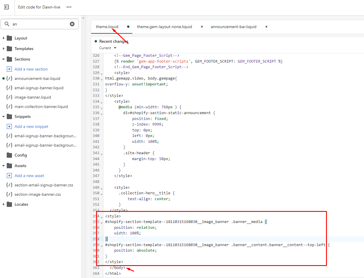
You can follow these steps to try it:
- Go to Online Store->Theme->Edit code
- Open your theme.liquid file, paste the below code before
I hope the above is useful to you.
Kind & Best regards,
GemPages Support Team
Hello GemPages,
I followed the above and the result was a blank section:
I have removed the above steps, as the solution did not work as intended.
@BSS-Commerce do you have any ideas on how to fix this?
Thank you,
FS
Hello GemPages,
This solution did not work. It made the image banner blank. I uploaded an
image in the community thread. I have since removed it to at least get an
image/text and button back on the store.
I appreciate all your assistance on this issue.
Thank you,
Community,
If you are using the Dawn Theme and you are trying to get your image to look clear, readable, and have the image fit in the Image Banner, read on. First, it will depend on your image and the part you want visible in both the desktop and mobile views. I found I had to toggle between both and compromise on the final image in order for both to look good. I also, viewed the desktop on multiple monitor screens.
I had to fiddle with the ratio of 3:1, not 3:2 as the set up states. I would suggest starting with the banner height you want because the image will be depend on it. I wanted the medium height, so I fiddled with the font size and cropping multiple times until I got it to work. Also, make sure you use the focal point on the image. My ratio ended up at 2311 x 750; I’m comfortable with it, but it’s definitely not my ideal.
The blur and sharpness adjustment was suggested via chat, but it just made my image worse. No coding change was needed on this.
Thank you to all that offered suggestion!