Hello guys,
Little problem with my first page. Desktop layout looks fine, however mobile version looks stretched out. Is there any way I could change this and lift the slideshow images up a bit? Any help greatly appreciated! 

my website: www.aurorabe.com
1 Like
@maxroddy
sorry for any issue can you please try this code
- Go to Online Store->Theme->Edit code
- Asset->/theme.scss.liquid->paste below code at the bottom of the file.
@media screen and (max-width: 768px) {
.hero[data-adapt=false], .hero[data-adapt=false] .slideshow__overlay:before {
    height: 50vh;
}
}
1 Like
Hello,
thanks for helping out. But this option is already available on brooklyn theme. I was looking for this solution:
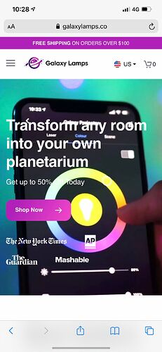
This website has normal first page when I enter from phone: galaxylamps.co
and when you enter my website, the first page is streched: aurorabe.com
any other solution maybe? Thanks in advance
1 Like
@maxroddy
yes please share your all issue images
1 Like
thank you for getting back to me 
This is my websites stretched look:
And this is what I would like to achieve:
more compact banner that fits the mobile phone screen.
@maxroddy , Streching the same Desktop image till the mobile view is not an good option, this will breakdown or image stretched issue may occurs in different screens.
I will recommend you to create new schema for Mobile view. With this you can apply two different images.
- for Desktop full size banner
- for Mobile different banner with the size of 480px in width.
Your reference site might also using the same concept.
Thank you for suggestion 
Can you suggest how can I do that on Brooklyn theme?
thanks in advance
![]()
![]()

