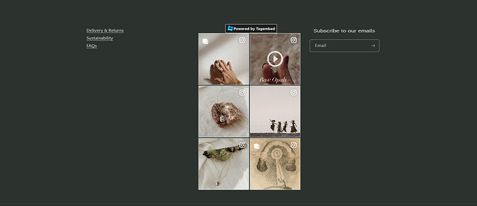
Hello, I’d like to know how I can form my footer with the Craft theme to be in columns. Currently I have 2 columns, one with text, one with an app. I’d like my subscribe form to sit alongside these 2 elements, but currently I can only add the subscribe underneath.
Can someone advise?
Thanks
1 Like
Hi @spellseels
Would you mind to share your Store URL website? with password if its unpublish. And format how youd like your footer design. Thanks!
Hi, I don’t want to share those details on a public thread.
I’d like to have three columns in the footer. One as a text block, one as an app, and on as a subscribe form. Can you advise? Thanks
I understand, but its hard to design when we cant see it.
Is there a way I can share it privately?
Hi, can you help? Here is the link: www.therealmstudio.com and the password is aoclod . Let me know if you can help. Thanks
1 Like
Thanks for the info, Do you mean like this?
If it is check this one.
- From your Shopify admin dashboard, click on “Online Store” and then “Themes”.
- Find the theme that you want to edit and click on “Actions” and then “Edit code”.
- In the “Assets” folder, click on “base.css, style.css or theme.css” file, depending on which file your theme uses to store its CSS styles. At the bottom of the file, add the following CSS code:
.footer-block--newsletter {
    display: flex;
    margin-top: 2rem !important;
    align-items: flex-start !important;
}

.footer__content-top {
    padding-bottom: 5rem;
    display: grid;
    grid-template-columns: 1fr auto;
    gap: 20px;
}
Please don’t forget to Like and Mark Solution to the post that helped you. Thanks!
That’s great, super helpful, thanks. Only problem, the columns are not equal in width. Any tips on how I can make the equal in width?
This is also sadly not mobile optimised - is it possible to make it so? Thanks!
The column are in equal width, it only depends on the content you have. You mean you like to column them also in mobile? The code are for all screen but if the specific sreen have set own design then it would not be render.
Hello,
I don’t want them to be columns in mobile view but they were, meaning that they were squashed together rather than stacked. Can you help?
Thanks
1 Like
Replace the code with this one.
@media only screen and (min-width: 898px){
.footer-block--newsletter {
    display: flex;
    margin-top: 2rem !important;
    align-items: flex-start !important;
}

.footer__content-top {
    padding-bottom: 5rem;
    display: grid;
    grid-template-columns: 1fr auto;
    gap: 20px;
}
}
And Save.
It will have different alignment on the mobile screens.
Please don’t forget to Like and Mark Solution to the post that helped you. Thanks!
