Move Footer Newsletter to Align with Columns - Craft Theme

Hello,

I need some help with my craft theme: the newsletter in my footer area is centered, I want it left aligned just like in my mockup to go up to where my columns are. Also need the footer height to be reduced since the newsletter would move up and I wouldn’t need all that empty space. (mockup attached of what I am seeking)

If anyone can help, this would be greatly appreciated, thanks so much.

1 Like

Hmm I am not seeing a way to have them on the same line with Craft. The email signup section is the only one you can add the form to. Are you open to editing the theme files eventually? I don’t think it’s possible otherwise

Totally am! Just need the code and location to place it. I appreciate the fast response!

Alright, open footer.liquid

Find this {%- if section.settings.newsletter_enable -%}

And copy the whole block before around line 70 where you see {%- for block in section.blocks -%}

Once you copypaste it, MAKE SURE you wrap that inside a div with class=“footer-block grid__item”

Then add the following to base.css

.footer-block:nth-child(1) {
flex: 3 1;
}
.footer-block:nth-child(2) {
flex: 1 1 ;
}
.footer-block:nth-child(3) {
flex: 1 1 ;
}

Attached is my result

Thanks for the response. Would it be possible to send the exact code with "inside a div with class=“footer-block grid__item”? Also where do I paste this into? I know the base.css part but not the first part.

Hi @jmd92

Check this one.

From your Shopify admin dashboard, click on “Online Store” and then “Themes”.

Find the theme that you want to edit and click on “Actions” and then “Edit code”.

In the “Assets” folder, click on “base.css, style.css or theme.css” file, depending on which file your theme uses to store its CSS styles. At the bottom of the file, add the following CSS code:

.footer__content-top.page-width {
    display: flex;
    flex-direction: row-reverse;
    gap: 20px;
}
.footer-block--newsletter.scroll-trigger.animate--slide-in {
    width: 30%;
}
.footer-block--newsletter {
    margin-top: 0px;
    align-items: start;
}
.footer__blocks-wrapper.grid.grid--1-col.grid--2-col.grid--4-col-tablet.scroll-trigger.animate--slide-in {
    gap: 0px;
    width: 70%;
}
.footer-block__heading {
    text-align: left;
}
.newsletter-form {
    margin-left: 0px;
    min-width: 20rem;
    width: 30rem;
}
@media only screen and (max-width: 749px){
.footer__content-top.page-width {
    flex-direction: column-reverse;
}
}

And Save.

Result:

Mobile:

Desktop:

Please don’t forget to Like and Mark Solution to the post that helped you. Thanks!

This was able to move it up into the column area, but just a couple issues (mocks attached too for reference) I appreciate the help


:

Desktop

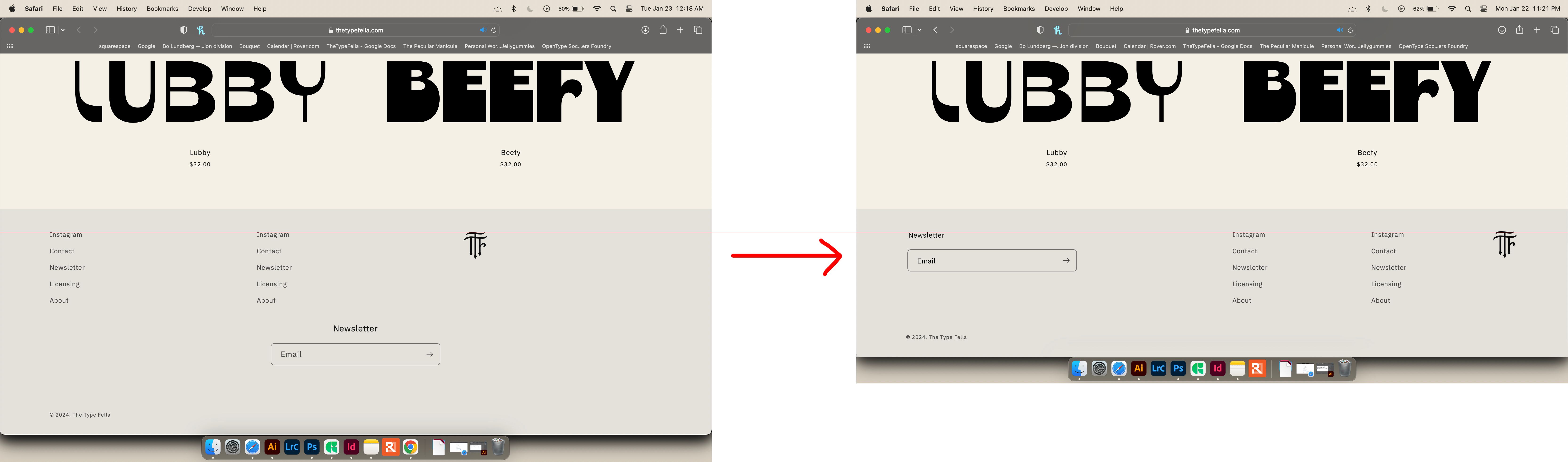
  1. The newsletter type is not left aligning to the email box below and it needs to top align with the same area of the other top column texts and be the same letter size
  2. need the monogram image to right align just like where the nav is right aligned

Mobile

  1. looks like on my end it is trimming off the email box and I need the monogram left aligned like the text above in each column

Hi there, I was able to move the social media icons with the help of your css code above, but the “subscribe to our emails” section still remains in place (please see screenshot). Any idea how I can fix it? Thanks in advance.

would you mind to share your store URL? Thanks!

Hi there,

My store is not live yet unfortunately. Is there any additional
informationI can provide?

Many thanks.

You can share the preivew. Thanks!