Hey everyone,
I’ve recently launched my online store and I’m reaching out to gather some constructive feedback on its design. I’ve put significant effort into crafting a user-friendly and visually appealing website, but I believe there’s always room for improvement.
I would greatly appreciate it if you could spare a few moments to review my store and share your insights. Whether it’s suggestions for enhancing the layout, improving navigation, or refining the product presentation, your input would be immensely valuable to me.
You can take a look at my store: https://www.beastmind.shop
Hi @comelespico ,
Kate here from the PageFly Shopify Landing Page Builder App. Based on my knowledge in Conversion Rate Optimization (CRO), I suggest several recommendations to elevate your conversion rates and enhance customer attraction. Important areas to focus on include:
HOMEPAGE
1. Hero banner
The hero banner currently lacks essential information. An optimal layout for the hero banner should include an image, heading, paragraph, and button.
- The heading and paragraph should provide an introduction to your product.
- The call-to-action (CTA) should be prominently placed and feature clear, compelling content. Its copy should focus on encouraging users to try the product rather than simply shopping for it**.**
- And the background should showcase the product you provide.
2. Avoid blank space
Empty or unused spaces on an online store should be minimized. This can be achieved by adding more products or content in these areas.
You can check this sample design for preference:
3. Our mission section
This section caters to humanistic shoppers, who will seek out who is BEHIND the product, and why they should buy from you. Currently, it lacks images to enhance the visibility of the content. You can consider adding image to this section:
4. Benefit section
This section is located beneath the customer reviews section, potentially causing the content to be overlooked. To remedy this, you can create a separate heading for the benefits section to distinguish it more clearly.
Like this:
PRODUCT PAGE
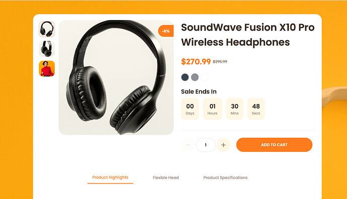
Sale badge
In general, the product page is fine, but the sale badge isn’t very noticeable. Customers are often drawn to sales and promotions, so you might want to make the sale badge more prominent.
You can check this sample design for preference:
These are some suggestions for improving the design.
Let me know if you have any questions.
Best regards,
Kate | PageFly Team


