How can I increase sales for my new online store?

I recently opened my store and I have not made any sales. I hired someone through fiver to help me with the design but the only way I get traffic is with google Ads, and if I don’t get any sales it’s money that is not recovered. I opened this business to be a present mom to my autistic son and would love to make it work. I am not experienced with coding and I am aware that some things are not working, for example swatches.

I need some help desperately!!! I am open to anything!!

Thank you so much!!

My website is the following:

www.littlechicprints.com

Hi @Littlechicprint ,

This is Kate from PageFly - Shopify Landing Page Builder App.

Your website is beautifully designed and elegant. It’s clear that you’ve put a lot of thought and effort into creating a great online presence.

From my experience, I noticed a few things that could be improved on your website.

HOMEPAGE

1. Call to Action

The content “Get It Right Now” is a call to action, but it can’t be clickable. This will confuse customers. You should add a real button here.

The “Shop Now” button is very important, but it’s currently in a hard-to-see location and doesn’t stand out. Please add a button that customers can see immediately upon accessing the page, instead of making them search for it.

2. Product Price

Product price should be aligned in a straight line.

3. Add hover to each button

Hover effects make the interaction with buttons more engaging, and a positive user experience can lead to increased conversions.

PageFlyKate_3-1712810928655.png

4. Add “Add to cart" button to each product

An add-to-cart button is especially effective for visually-driven products that require little information to be bought. In these cases, an add-to-cart button allows people to quickly grab and checkout without being directed to many pages

PROMOTION

Mother’s Day campaign

As Mother’s Day draws near, and with many businesses already gearing up for the occasion, your offerings are ideally matched for this festive period. It’s strongly advised to implement these strategies to fully capitalize on the festivities.

Overall

  • Theme color: Opt for soft pastel colors such as light pink, lavender, mint green, and baby blue. These hues inspire emotions of affection, gentleness, and comfort, making them ideal for honoring mothers.
  • High-Quality Product Image: Use high-resolution images that showcase your products from multiple angles and in different contexts. Allow users to zoom in for a closer look to inspect details and quality.
  • Mobile responsiveness: Optimize your website for mobile devices to provide a seamless browsing experience across different screen sizes.
  • Layout: Maintain a straightforward layout that centers on the page’s main goal, be it showcasing a particular product, presenting a time-sensitive deal, or gathering email subscriptions…

That’s all of my feedback. Hope it helps to increase your conversion rate.

Cheers,

Kate | PageFly team

1 Like

Hi @Littlechicprint,

Thanks for reaching out to the community. This is MooseDesk - Customer Support Helpdesk/FAQ App.

Congrats on your new store! Your store looks stunning. I can tell you have put a lot of effort into building this. However, I have some comments to make the good get even better. Here are some of my recommendations for better customer experience, please kindly check.

1. Promotion Section

The section at the top of the homepage about your free shipping policy should remain visible as users scroll down. Currently, it disappears, potentially causing users to overlook promotions. Ensuring its constant visibility will increase its effectiveness.

This is the section I mention about:

MooseDesk_0-1712809090316.png

Additionally, consider either removing this section or transforming it into a promotion banner to attract users:

2. Navigation menu

To ensure a smooth navigation experience, we suggest condensing the menu into a single line. This change will enhance both functionality and visual appeal, making it easier for users to explore your store seamlessly.

3. Homepage

3.1. Hero Banner Optimization

Your current hero banner may contain excessive information, potentially overwhelming users. You should consider simplifying it by focusing on your product offerings and unique selling points. High-quality images, concise and appealing descriptions, and a centered call-to-action button will improve engagement.

Here is an example for you:

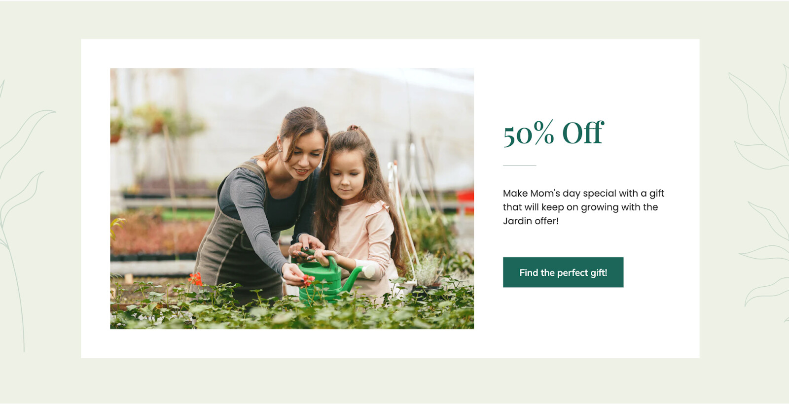
3.2. Section Grouping

Here are some sections I suggest grouping together for a better user experience.

First, you should consider grouping all banners that introduce your featured products into one section. This helps users find what they’re looking for more easily and reduces distractions, allowing them to focus on your products. You can use a slider to showcase all your featured products’ banners.

This is one example of those banners I’m talking about:

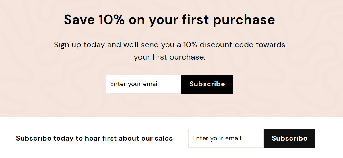
Second, the two sections for email subscribing and receive discount after subscribing are serving the same purpose: encourage users to subscribe to your email list. Therefore, grouping them together will streamline the user experience.

Here is what I mention about:

3.3. About Us Section

An About Us section is vital for sharing your brand’s story, values, and mission with users. Incorporating an About Us section will build trust with users by providing insight into your store and enhancing credibility.

3.4. Benefits Section

Consider introducing a Benefits section to help customers understand why they should choose you. This sets you apart from competitors and encourages customer loyalty and advocacy.

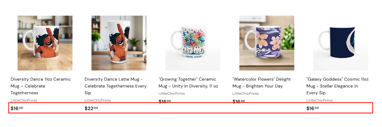
4. Collection Page Optimization

To make your product collection page look more professional, use eye-catching images instead of leaving blank spaces. This not only makes your page look better but also grabs users’ attention, making them more likely to engage and make a purchase.

This is the section I mention about:

5. Product Page Optimization

You should provide comprehensive product specifications beyond a general description to aid users in making informed purchasing decisions. Also, organizing shipping and contact info into dedicated pages makes it easier for users to find what they need, boosting their satisfaction and trust in your brand.

6. FAQ Page

I’ve seen that your store lacks an FAQ page, which may cause hesitation among users who need basic information before purchasing. Adding this self-service option can increase confidence in your brand by providing clarity and transparency on policies. It will simplify the customer journey and reinforce trust and credibility among your audience.

To address this, I recommend using MooseDesk, an app for creating unique FAQ pages for your customers. Besides helping you creating your FAQ page, we also provide a helpdesk/ticketing system for your customer support.

Great news, we also have Contact us template so you can customize your page too!

Since our app is now available for free, all current users will be considered as early-bird users and get to enjoy all our current features for free forever!

As an expert/enthusiast in UX, I recommend implementing these changes to improve customer experience when scrolling through your store.

If this is helpful for you, please let me know by giving me a ‘LIKE’. If your question is answered, please mark this as 'SOLUTION’.

Thank you,

MooseDesk - Customer Support Helpdesk/FAQ app

1 Like

Hello,

I hope you are doing good and welcome to the Shopify Community!

I am San from MS Web Designer

Thank you for sharing your store URL. We have gone through your shopify store.

You have a beautiful website. I believe a few adjustments may be required to make it more professional and appealing to customers.

Here are some recommendations:

Header:

  1. Wishlist option will help in making selection easier for the customer.

  2. Social Media icon missing on header

    SAN_MSWEB_0-1712812058596.png

    You can follow this.

Homepage: (First Impression is the last impression)

The homepage is the first landing page your customers will see after opening the website. Yours is done beautifully.

  1. Add Trust Badges on Your Home Page to enhance the trust of the customers.
  2. Highlight the USP of your Products or services.
  3. Add a Lead magnet section on the Home Page.
  4. Include user generated content on homepage like instagram feed.

SAN_MSWEB_1-1712812058611.png

Trust Badges is a significant feature on the homepage so that people will trust your store.

Collection and Product Page:

  • Add Sticky add to Cart and Buy now Button

  • Add Product Badges like New, 10% Off, You Save 20$ or Free Shipping.

  • Slow product loading pages.

-Use a price calculator to calculate the price in different sizes of the product as per the need of the customer.

Price can be calculated for different sizes

Good Example of Collection Page

Please feel free to contact us for any further help that you might require.

Best regards,

San.