Hi all, I will like my banner to auto size and match my banner picture size on different aspect, so the slideshow won’t crop when viewed, is there any way that this can be done?
The Theme our website using is Craft, and here is our website link: https://mzbooks.shop/
Certainly! To ensure your banner auto sizes and matches your banner picture size across different aspects on the Craft theme, you can follow these steps:
Edit Theme Settings: Log in to your Shopify admin, navigate to Online Store > Themes > Customize. In the theme editor, look for options related to the slideshow or banner settings.
Adjust Image Settings: Explore the settings that control the banner or slideshow images. Look for options like “Image Scaling” or “Image Fit” and select a setting that ensures the entire image is displayed without cropping. Options might include “Fit to Screen” or “Cover.”
Check Responsive Settings: Ensure that the theme has responsive design settings. This ensures that the banner adjusts to different screen sizes and maintains the aspect ratio.
Theme Documentation: Check the theme documentation for specific guidance on adjusting the banner size. It might provide insights into the available options and recommended settings.
CSS Customization: If the theme settings do not provide the flexibility you need, you may consider custom CSS to adjust the banner size. However, be cautious with this approach, and if you’re not comfortable with coding, it’s advisable to seek assistance from a developer.
After making changes, preview the theme to see how the banner behaves on different devices. If you encounter any issues or need further assistance, feel free to share more details,
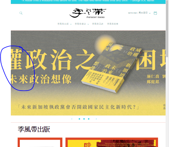
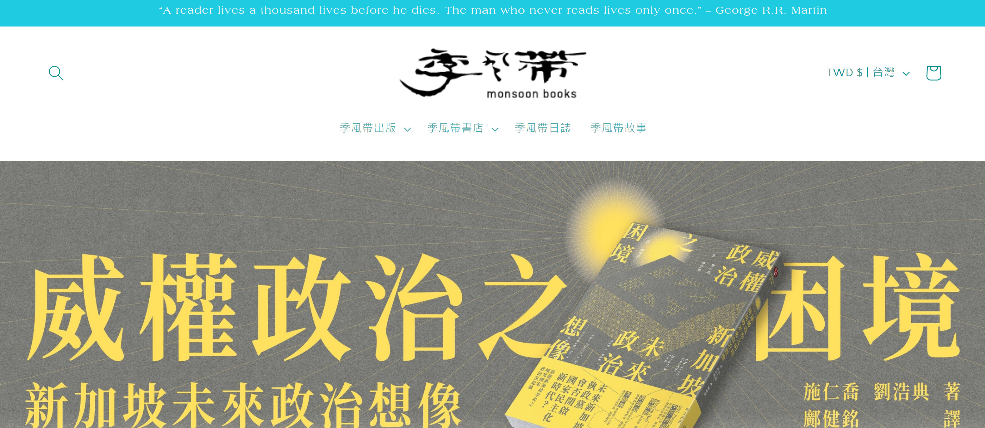
Thank you for your code, after I change it, the image is no more cropping, but now another issue is showing, the banner image is shrink by the banner size, is it possible to make banner shrink by the banner image size?
Hopefully the two picture below can explain what I am saying.