TBS2022
1
Hello
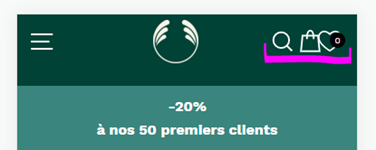
I have added a Wishlist App and now have an Icon in my header - great
However how can I alternate the places. I would like to Cart icon to be after the Wishlist heart
also in mobile view the icons are too close together
I am using the impulse theme
www.thebodyshop.re
password: lahays
thanks in advance
1 Like
Hi @TBS2022,
You can try this code by following these steps:
Step 1: Go to Online Store->Theme->Edit code.
Step 2: Search file theme.css
Step 3: Paste the below code at bottom of the file → Save
@media(max-width:767px){
[href="/apps/wishlist"]{
transform:translateX(-20px) !important
}
[href="/cart"]{
transform:translateX(30px) !important
}
}
Hope my solution works perfectly for you!
Best regards,
Victor | PageFly
Hello There,
Admin go to online store → themes → actions → edit code
Find Asset >theme.css and paste this at the bottom of the file:
a.th_wlc_position_relative {
    position: absolute;
    right: 35px;
}
.header-layout.header-layout--center {
    position: relative;
}
@media only screen and (max-width: 769px) {
    a.th_wlc_position_relative {
        position: absolute;
        right: 79px;
    }
    a.site-nav__link.site-nav__link--icon.js-search-header.medium-up--hide {
        padding: 10px;
    }
}
1 Like
You can add code to the top of the file. Because have one error structure so my code to push the bottom doesn’t work
TBS2022
7
what about in mobile view
TBS2022
8
on another note - is there anyway to move the search icon to the right with the other icons?
thanks
@TBS2022
Please add the following CSS code to your assets/theme.css bottom of the file.
.site-nav__icons {padding: 0px 10px 0px 10px !important;}
Thanks!
Thank you for your response. It’s good to know that it’s worked for you. Kindly feel free to get back to me if you need any further assistance.
Hello There,
Admin go to online store → themes → actions → edit code
Find Asset >theme.css and paste this at the bottom of the file:
@media only screen and (max-width: 1017px) {
    .header-layout.header-layout--center {
        position: relative;
    }
    a.th_wlc_position_relative {
        position: absolute;
        right: 40px;
    }
    a.site-nav__link.site-nav__link--icon.js-search-header.medium-up--hide {
        padding: 10px;
    }
}
@media only screen and (max-width: 769px) {
    a.th_wlc_position_relative {
        right: 11%;
    }
}
@media only screen and (max-width: 600px) {
    a.th_wlc_position_relative {
        right: 15%;
    }
}
I have added this code in the bottom its not working. After I have added in the top but still does not happening any thing.
I said this is not worked


