Hello! A lot of my customers browse on mobile, but I’m not sure if my store (Checkout) is optimized for that experience. Does the mobile layout look good and function well?
1 Like
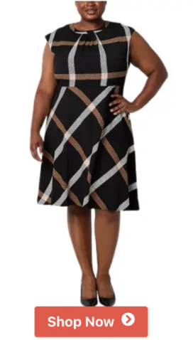
Hello there @Johnbutler I’m currently using my phone to check out your site but everytime I click on the “shop now” button no action seems to be taken for some reason, have you had similar complaints before?
Hi @Johnbutler , thanks for your sharing.
I’ve reviewed your store on mobile and have a few suggestions for improvement:
1. Fix non-working buttons: The “See More” and “Shop Now” buttons are not functional. Please check again and ensure all buttons work smoothly, significantly improving navigation and encouraging customers to explore your products.
2. Unify star ratings and reviews: Currently, star ratings are displayed inconsistently across product pages. Standardizing this looks more professional and builds trust with your customers.
3. Use high-quality product images: I recommend you consider replacing some product pictures with higher-quality alternatives. Actually, clear and professional images can make your products more appealing.
4. Add key sections to the Main Menu: I suggest you include sections like FAQs, About Us, and Blogs in the main menu, which will definitely enhance navigation and provide more value to visitors.
I hope my feedback is helpful.
Liz
Hi @Johnbutler ,
Thanks for reaching out to the Shopify Community! I’m Mia from MooseDesk , your go-to Live Chat, WhatsApp and FAQ App here to help you enhance your customer support experience
Congrats on your new store! Your store looks stunning. I can tell you have put a lot of effort into building this. However, I have some comments to make the good get even better. Here are some of my recommendations for better customer experience, please kindly check:
1. Add CTA Button for your Hero Image
The hero image is the first thing users see when they land on your store. Without a clear CTA, they might not know what action to take next. A well-placed CTA, like “Shop Now” or “Explore New Arrivals,” directs users to your products immediately.
2.Shorten Product Descriptions to Make Content Clear and Concise
Mobile users often skim content. If your product descriptions are too lengthy, they might lose interest or get frustrated. Clear, concise descriptions highlight the key benefits without overwhelming users.
3. Using high quality image
You should replace any low-quality images with high-resolution ones that showcase your products clearly. Ensure these images are optimized for mobile loading speeds to avoid slow page performance.
4. Fix your CTA Button
I can see your CTA button now are not re not functional. Please check to make it prominent and functional. If buttons are too small, not contrasting enough, or misaligned, users might miss them or struggle to interact with them.
5. Using Help widget/ Live chat for your store front
Customers often have questions or need support before making a purchase. A live chat or help widget can provide real-time assistance, which can make the difference between a sale and a lost customer.
I can see that your website lacks a help widget and live chat feature to allow customers to contact you immediately. Therefore, I suggest exploring MooseDesk, a free Live Chat, WhatsApp & FAQ App. You can easily reach customer support via WhatsApp, ensuring immediate assistance for inquiries. Also, the widget provide multi self-Service options such as order tracking and an FAQ section empower customers to resolve common questions on their own, reducing the need for direct support.

—————
As an expert/enthusiast in UX, I recommend implementing these changes to improve customer experience when scrolling through your store.
If this is helpful for you, please let me know by giving me a ‘LIKE’. If your question is answered please mark this as 'SOLUTION’.
Thank you for reading. Wish you a nice day ahead! 
Hi @Johnbutler , I’m Tracy from BON Loyalty, the top-rated Shopify loyalty app.
As many store owner may not aware the importance of the mobile experience optimization, it’s great to see that you value it. After browsing your store using my mobile phone, I see that there are some parts that may need to be improved:
1. Re-sturture the mobile menu layout
The items on the menu seem a bit scattered, it feels like they are groupped illogically. Grouping similar categories (e.g., Pants, Dresses, Shorts, Tops under “Clothing”) would make it more intuitive for customers to find what they’re looking for. Meanwhile, items like “Perfume” and “Purses” could be grouped under “Accessories” if they belong there, which simplifies the layout. You should move the most popular or essential category to the top, especially if it’s expandable. This draws attention to the variety offered. A more user-friendly approach would make navigation smoother and prevent confusion for mobile users.

2. Unify the design of the Call-To-Action buttons
I notice that you are using different design for all your CTA buttons, especially with the “Shop now” one. The first “Shop now” button has a bold, modern look with a shadow effect, making it stand out, while the second button has a simpler design and different color. Unify the design by choosing one consistent button style, including color, font, and any icons. For better branding, the buttons should have a consistent design style across the store. Kindly unify the design by choosing one consistent button style, including color, font, and any icons. You can consider testing both designs to see which performs better with your audience.

3. Ensuring functionality for effective store feedback
As per checking, it seems like every CTA buttons and links on your site are currently non-clickable and not functioning. I’m not sure if this was intentional or if the store is still in the process of being built. I’d kindly suggest ensuring everything is fully functional before requesting reviews. This will allow us to test the entire user experience, including key areas like the checkout process, which is crucial for optimizing the store.
Let me know once it’s ready—I’d be happy to revisit and provide more thorough feedback!
If you find these suggestions helpful for you, please let me know by giving BON Loyalty a ‘LIKE’ or marking it as a ‘SOLUTION’. 
Best,
Tracy from the BON Loyalty team
Hi @Johnbutler
Mobile optimization is a huge deal since so many people shop on their phones. To see how your store performs on mobile, here’s what you can do to check both the layout and functionality:
1. Preview Your Store on Mobile Devices- Go to your Shopify admin, navigate to Online Store > Themes, and click on Customize.
- In the top toolbar, switch to the mobile view icon to see how your store looks on a smaller screen.
- This will give you an idea of the layout, text sizes, images, and how everything flows.
2. Run Google’s Mobile-Friendly Test- Use Google’s Mobile-Friendly Test tool. Just paste your store’s URL, and it will analyze whether your site is mobile-optimized. It also points out issues, like text that’s too small or clickable elements that are too close together.
3. Test on Real Devices- If you can, check your store on different devices (iPhone, Android, tablets). Pay attention to:
- Navigation: Are menus easy to access and use?
- Loading Speed: Does it load quickly? (Slow sites lose customers fast!)
- Checkout Process: Is it smooth and easy to complete an order?
4. Use Shopify Analytics or Tools Like Hotjar- Go to Shopify Analytics to see the percentage of traffic coming from mobile users. This will help you prioritize fixing mobile-specific issues.
- Tools like Hotjar can show you heatmaps of how mobile visitors interact with your site—where they scroll, click, or get stuck.
5. Key Things to Watch Out For- Responsive Design: Make sure images, text, and buttons adjust well to smaller screens.
- Thumb-Friendly Buttons: All buttons should be big enough to tap without accidentally hitting something else.
- Clear Fonts: Use readable fonts and sizes for smaller screens.
- Fast Loading Times: Compress images and reduce unnecessary scripts to speed things up.
- Smooth Checkout: Ensure forms, payment options, and the entire checkout process are mobile-friendly.
Example: Check Your Mobile View
Here’s some simple CSS code you can add to your theme to make sure buttons and clickable elements are mobile-friendly:
button, a {
padding: 12px 20px;
font-size: 16px;
margin: 10px auto;
display: block;
width: 100%;
}
And here’s an illustration of how a clean mobile-friendly layout should look:
(Placeholder image)
If something feels off or you’re still unsure, let me know, and I can guide you on how to improve specific areas.
If you need any other assistance, feel free to reply and I will try my best to help.
Best regards,
Daisy
Hi johnbutler,
Thanks for your query.
Here is your Mobile performance report on mobile ran by google’s pagespeed insight
https://pagespeed.web.dev/analysis/https-thelizclaiborne-com/oasx96ue2e?form_factor=mobile

To increase the performance score you would need to go through
- CSS, JS minify
- image Video optimize
- old code analysis
- image lazy load
Feel free to ask if you have any questions.
kind Regards