Hi everyone,
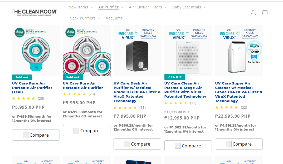
I have a problem with the product cards inside my collection page. How Can I adjust the spacing in the desktop view without altering the spacing in my mobile view. See photo for reference.
Store Preview Link: https://bgtz765ufz7gbbgl-13830324282.shopifypreview.com

Hi @IntechCarl
You can try to follow this step
Step 1: Go to Edit code
Step 2: Find file base.css and add this code at the end of the file
li.grid__item.scroll-trigger.animate--slide-in {
    margin: 0 6px !important;
}
Result
Best,
Liz
1 Like
Hi @LizHoang Does it only affect the desktop view? Because I only want the desktop view to have the spacing.
Hi @IntechCarl
You can try to follow this step
Step 1: Go to Edit code
Step 2: Find file base.css and add this code at the end of the file
@media (min-width: 990px) {
li.grid__item.scroll-trigger.animate--slide-in {
    margin: 0 6px !important;
}
}
1 Like
Thank you @LizHoang This one works!