How to adjust footer issues on Craft Theme for mobile?

Hello,

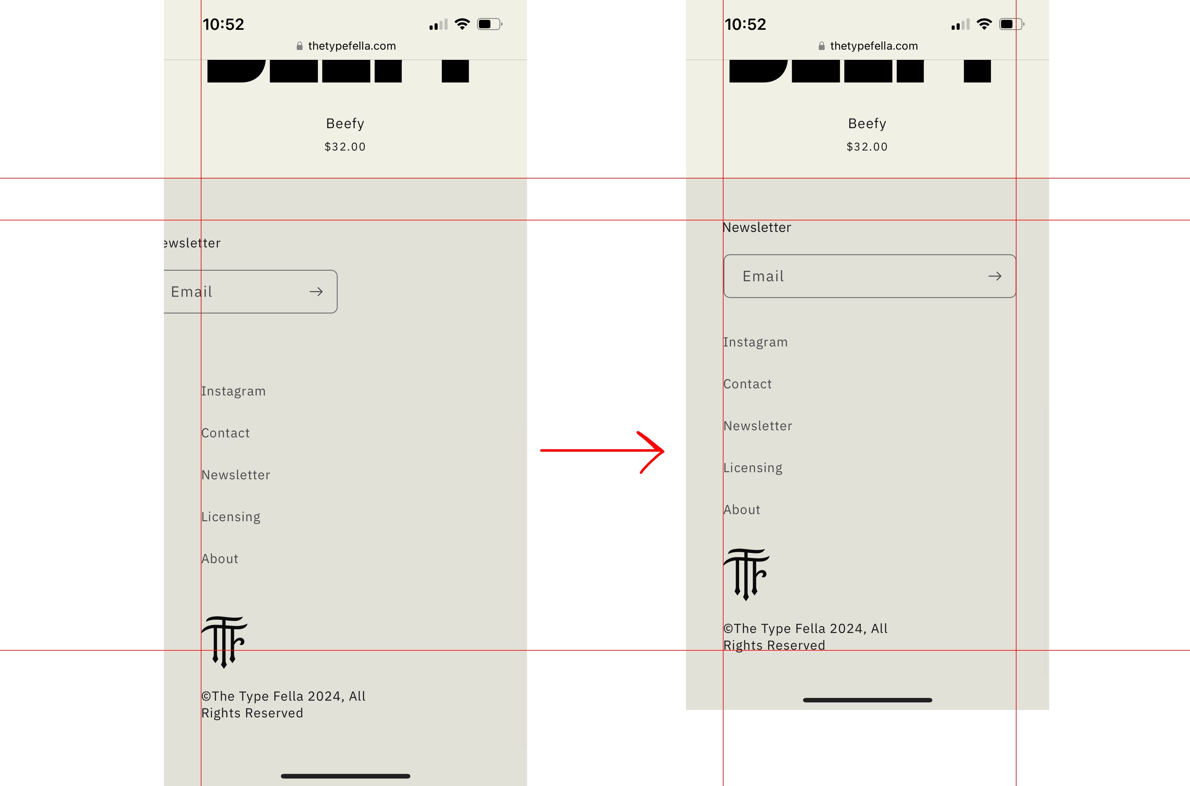
I can’t figure how to fix this to save my life. Just on mobile, my email newsletter is going off the page and the overall spacing is super loose. I attached a mockup of what I am seeking to tighten things up and to move the email newsletter over so you can actually see it. Can anyone give me the proper code to fix these issues just for mobile only? Desktop needs to stay the same. Thank you so much.

Hi @jmd92 ,

Can you please share the store url here. so that i can look into the issue?

Thanks

oh whoops yes thank you so much! http://thetypefella.com

Hi @jmd92

please paste below code into your base.css file at the end and hit save thats it.

@media screen and (max-width: 580px) {
  .footer-block--newsletter.scroll-trigger.animate--slide-in {
		width: 100%;
		flex-direction: unset;
	}
}
  • Online Theme

  • Edit Code

  • Find base.css file

  • Paste the code

  • Hit Save

Dont forget to like and mark as accepted solution :slightly_smiling_face:

Thanks

1 Like

Hi @jmd92

Go to your Online store > Themes > Edit code > open base.css file, find this code

.footer-block--newsletter.scroll-trigger.animate--slide-in {
    width: 30%;
}

Change it to this.

@media (min-width: 768px) {
.footer-block--newsletter.scroll-trigger.animate--slide-in {
    width: 30%;
}
}

1 Like

Worked perfect, thank you so much wow!

1 Like

@jmd92

dont forget to accept it as solution.

Thanks

sure thing, looks like I did on my end, let me know if not!

1 Like

@jmd92

Much appreciated

Thanks