Hello guys, how are you?
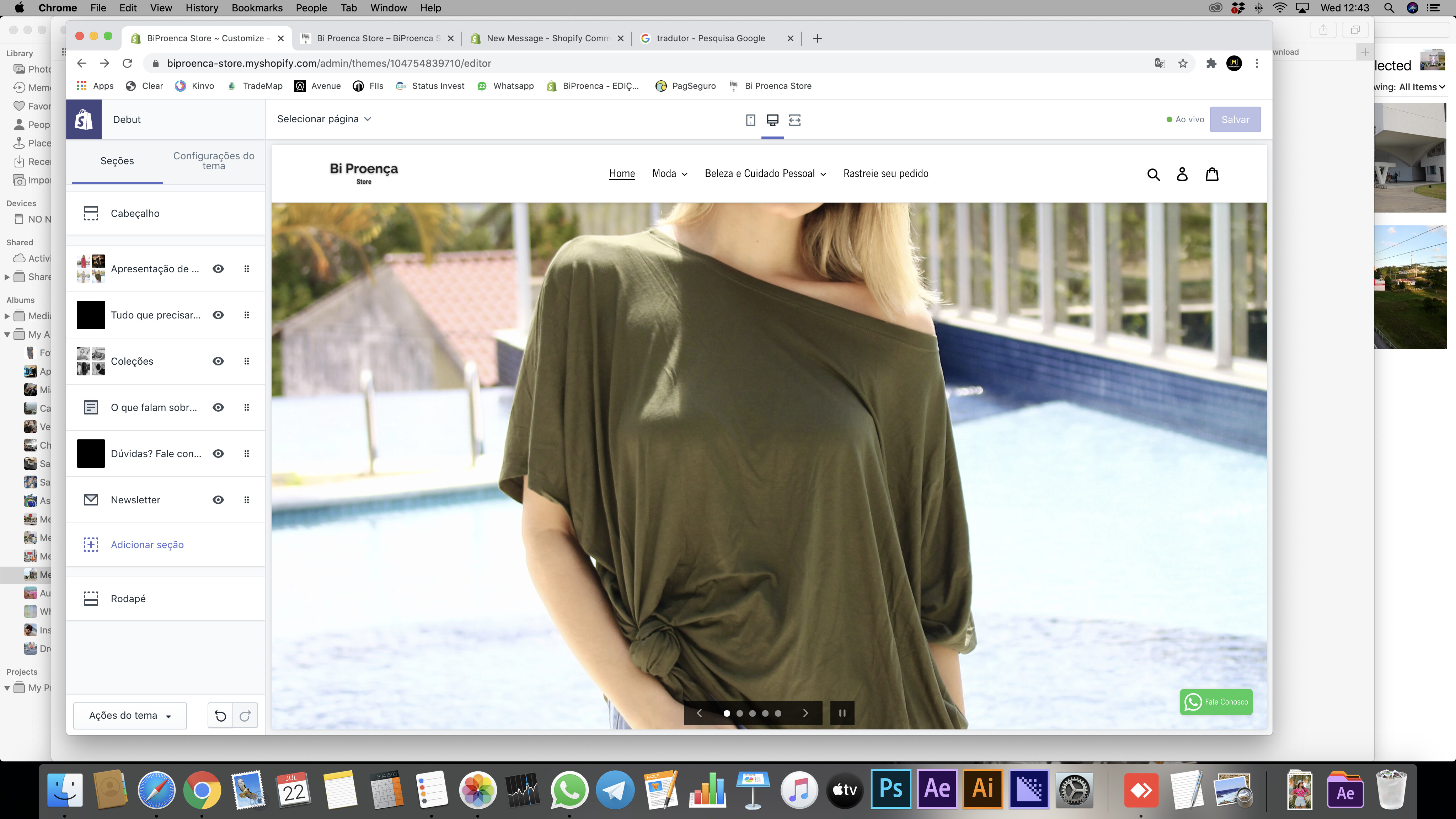
I don’t know what more I can try to fit the same photo on the slides images of my site.
I,ve tried to put the photo on the horizontal, vertical, crops and everything but it always cut or on mobile mode, or desktop mode.
There is a code to make it adapt the site to recognize if the user are using on mobile or desktop and apply different photos, or zoom out on the desktop?
I mean, my focus is on mobile, 'cause the most clients enter on my site through mobile, but i would like to see nice on both of them.
Link: biproencastore.com
Thank you
Here is photos how it show:
Desktop
Mobile
Hello @SalomaoBraga
The recommended image size is 1200px to 2000px width, and 400px to 600px height. When switching to a mobile/small screen view there is some resizing and cropping that is done, so the image won’t be identical. I would recommend, when setting up the images for the slide, to make them middle aligned. This should make things look a bit better, as it will be the top/bottom and left/right that will get cropped out instead of part of the middle.
It is also going to act differently than Brooklyn because each theme handles the images differently when switching between desktop and mobile views.
Hope that helps 
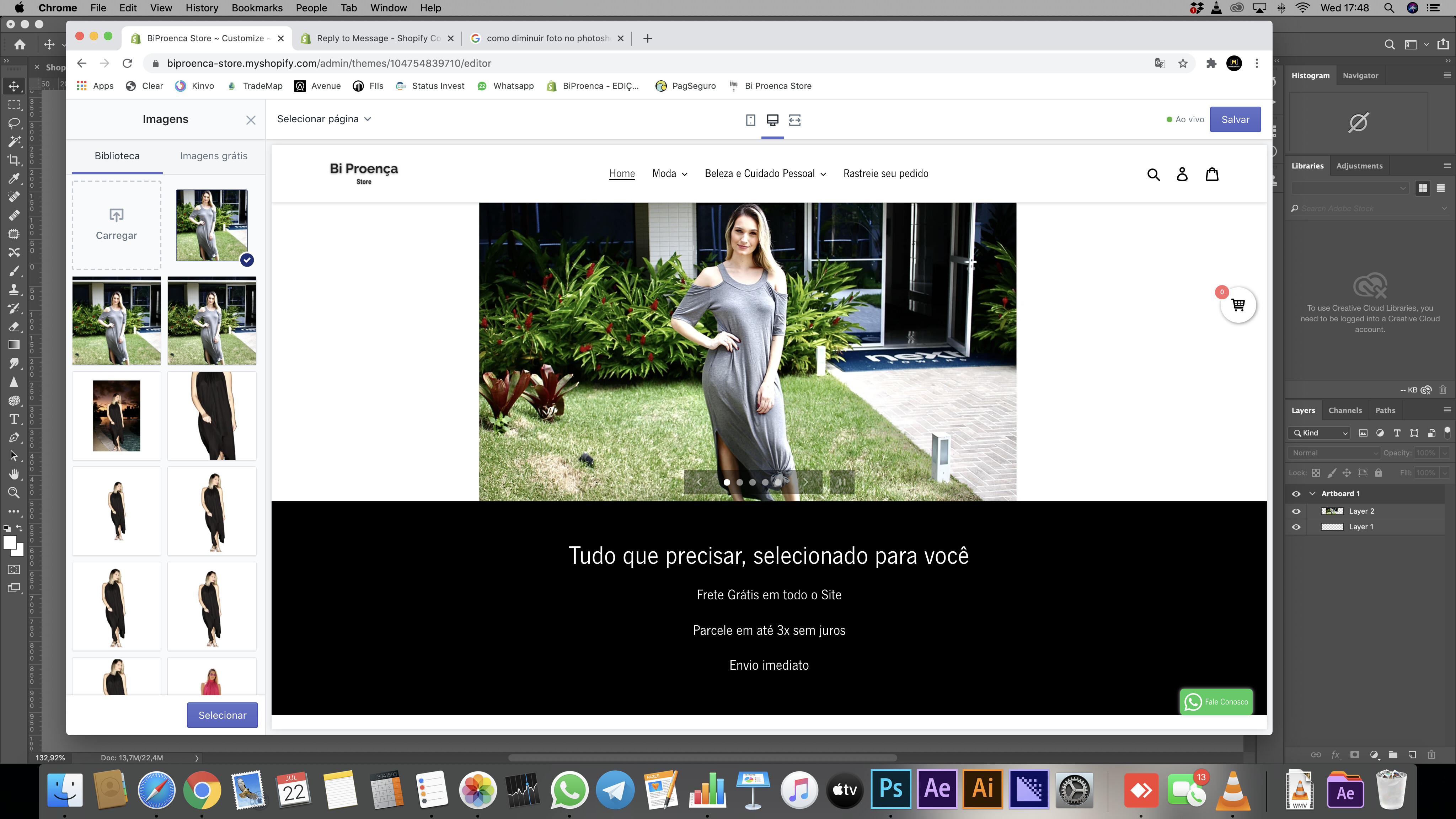
I’ve tried to use this resolution that you suggest, but look the results.