Hi, I believe i have added code in the backend of my store that has caused this image issue.
Desktop Image is perfectly fine, mobile image is cut short. I would like the entire image to take up the mobile screen upon entry to store.
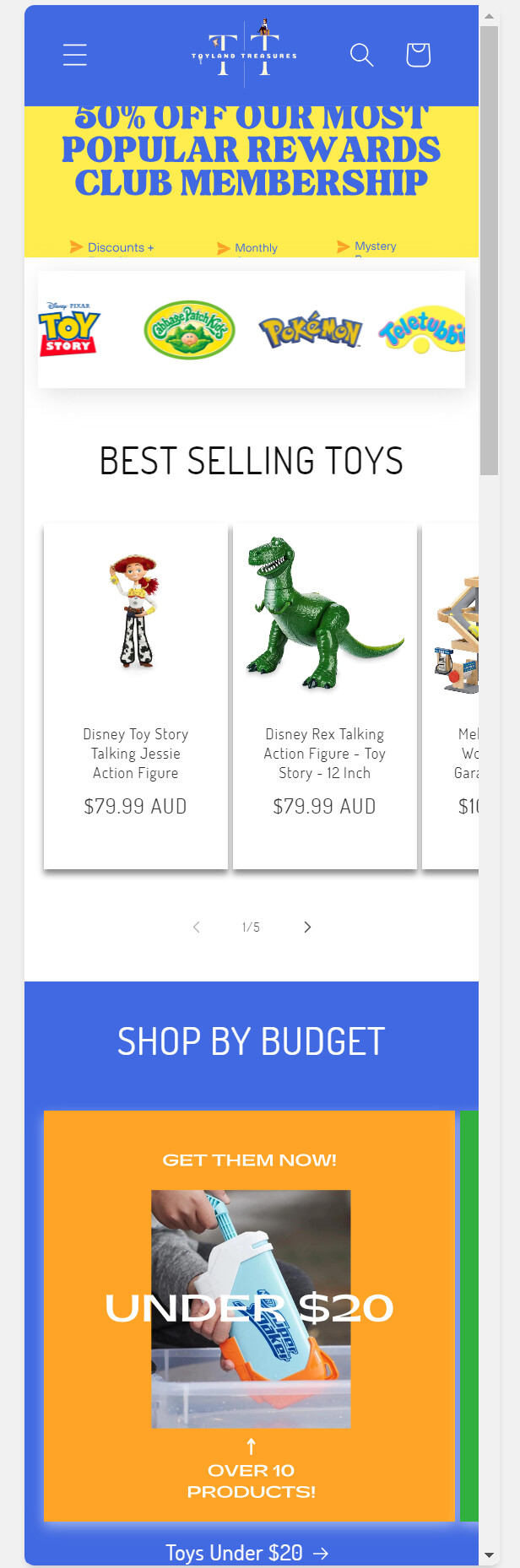
Current Display:
Desired Display:
Any help would be appreciated, thank you!
Hi @gianlucca
Can you please share the store url so that i can look into it in detail and get back to you with a best solution.
Thanks
Hi @Liquid_xPert_SJ ,
Thank you for the prompt reply.
Below is the url.
https://www.toylandtreasures.com.au/
Thanks,
Luca
Hi @gianlucca
can you please put the below css code into your theme customizer?
@media only screen and (max-width: 767px) {
 #Banner-template--21338829127959__image_banner_KczepK {
	height: 100vh;
}
}
Thanks
Hi @Liquid_xPert_SJ
Thank you for this! This is how it looks now.
How do I go about getting it to fit the screen correctly?
Let me know,
Thank you
@gianlucca
you can reduce the number according to fit the screen: like 80vh
Thanks
@Liquid_xPert_SJ
This then cuts the top & bottom of the image rather than fitting the content. I tried a png & jpeg, same thing.
Any other tips?
@gianlucca
you created the image according to the mobile resolution? i mean mobile friendly?
Because it seems like the images is not created for small devices.
Thanks
hi i’m having problems in my store , my store announcement bar is only visible on desktop devices but not on mobile devices can you please help to solve this code problem ??
my store url is – https://mansaroverfurnishings.com/
@manan123
please put below css code into your theme customizer or base.css file into your theme code files.
@media only screen and (max-width: 767px) {
.utility-bar {
	display: block !important;
}
}
Thanks
1 Like
@Liquid_xPert_SJ
I have made the image 1200 x 600 px which is the recommended image size from what I have seen.
What resolution do you recommend?
@gianlucca
please use this one.
@media only screen and (max-width: 767px) {
 #Banner-template--21338829127959__image_banner_KczepK {
	height: 90vh;
}
#shopify-section-template--21338829127959__image_banner_KczepK #Banner-template--21338829127959__image_banner_KczepK .banner__media img {
	object-fit: contain !important;
	object-position: top center !important;
}
}
Thanks
Thanks !! its visible now but its not auto rotating itself & how to make that text appears only in one line
@manan123
reduce the font size by putting this css code.
p.announcement-bar__message.h5 {
	font-size: 8px !important;
}
Thanks
1 Like
Thanks you so much works perfectly!!
can you please help me i’m having issue on product page when i select another variant buy now button gets disappeared please help me in the code i don’t know what to do its gets disappeared after selecting variant
store URL :- https://mansaroverfurnishings.com/