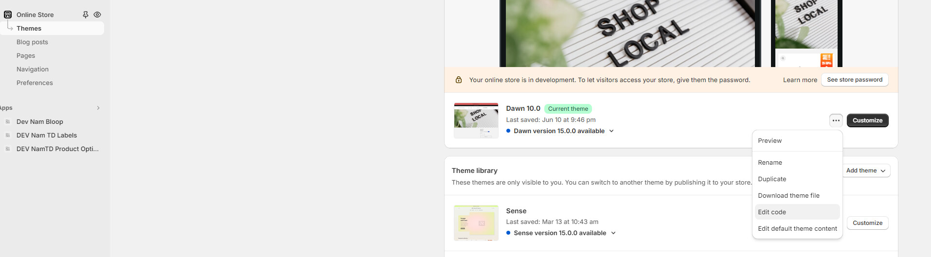
Hello,
Is there a way for me to make my products pictures all one size? I would like there to be two pictures per row.
Here is an example of what I want:

Here is what mine looks like:
Thank you
A user wants to standardize product image sizes and display two images per row on their store. They provided screenshots showing their current layout versus their desired uniform grid layout.
Two CSS solutions were offered:
First approach: Edit the base.css file by adding CSS targeting .product__media-list .product__media-item.is-active with a calculated width property using CSS variables for grid spacing.
Second approach: Add CSS to main.css (or base.css/style.css) using a media query for desktop screens (min-width: 900px) that targets product media items, setting width and max-width to unset.
Implementation steps for both solutions:
Both responses included before/after screenshots demonstrating the uniform image sizing result. The discussion remains open for the original poster to test these solutions.
Hello,
Is there a way for me to make my products pictures all one size? I would like there to be two pictures per row.
Here is an example of what I want:
Here is what mine looks like:
Thank you
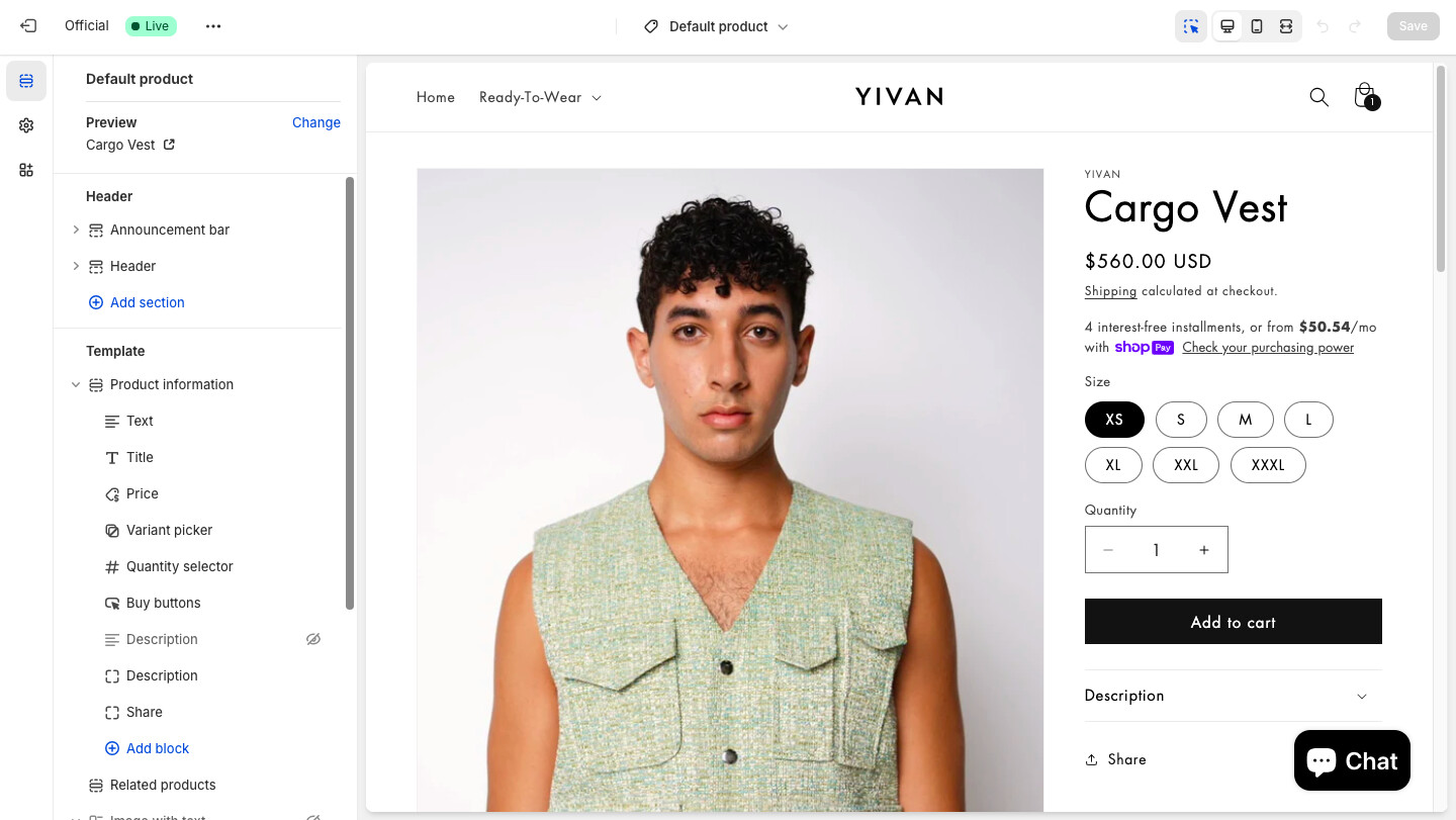
Hi @YIVAN
you can try this way:
Result:
Hope this can help you,
If our suggestions are useful, please let us know by giving it a like or marking it as a solution. Thank you
Hi @YIVAN
Check this one.
@media screen and (min-width: 990px) {
    .product:not(.product--columns) .product__media-list .product__media-item:first-child {
        width: unset;
        max-width: unset;
    }
}
And Save.
Result: